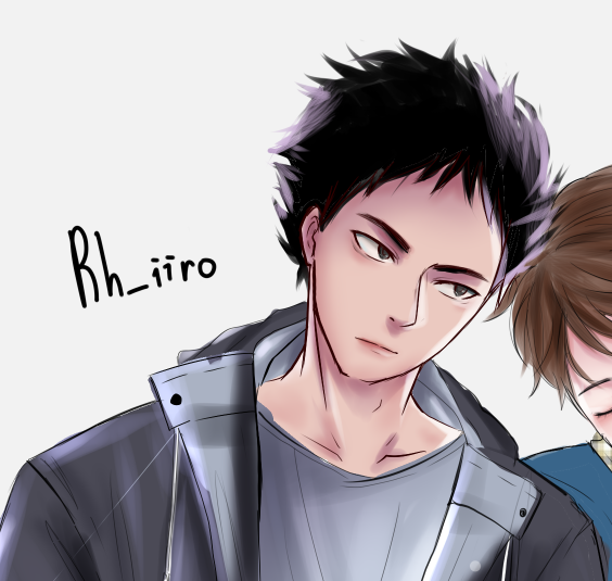
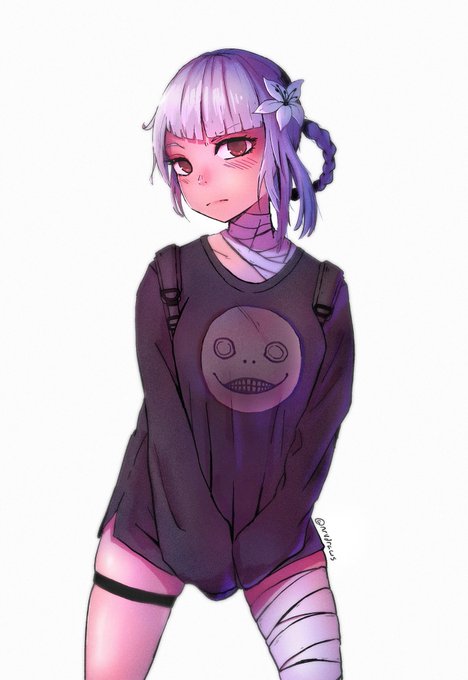
ContrasのTwitterイラスト検索結果。 10,815 件中 282ページ目


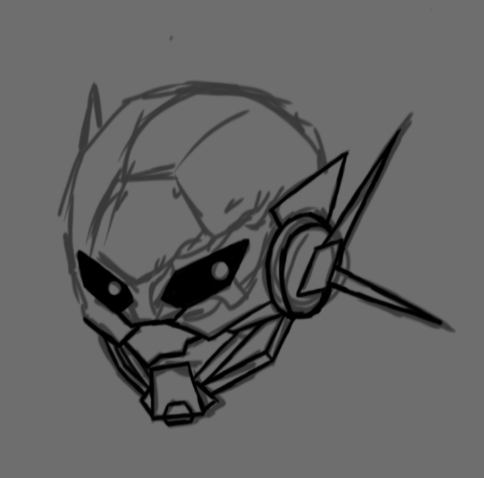


Early drawings I did when designing Spectre, she was going to have a dark grey and purple aesthetic with a white mouth and eye to contrast, but then I tried a lighter pallet and loved it
The mask was something I thought would be awesome looking and unique, along with her scar


Recolor, I wasn't super happy with how the reds all looked the same so I changed it for more contrast.


💦💦💦💦
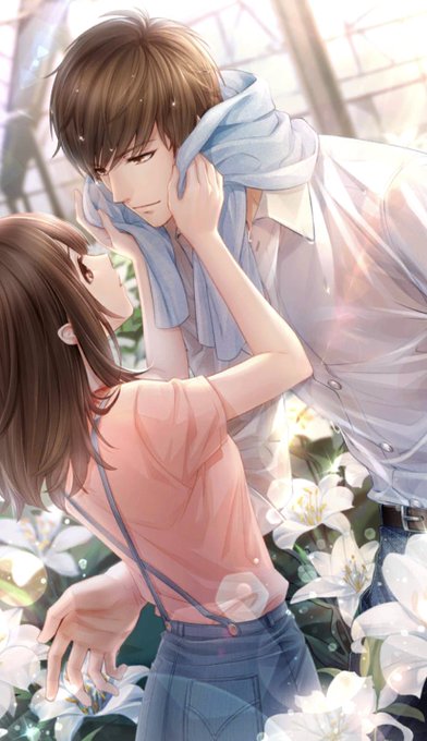
That soft to sexual tension contrast LOL

Thank you for the love in this one!!
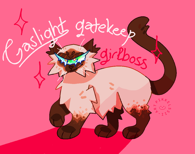
Here's also a version with fixed contrast since I realized the word girlboss almost gets lost on the bg 😅


@WolverSteve @xmentas @markypotter316 @mrjafri @The1stBAT @JWalkerII @warwolf782 @BlueSpider450 @Sp1derV3n0m @JamesGavsie @KEVINTOMIRANDA @pheltzcomics @MikeSchmidt09 @RegAndy76 @itsthewolverine @WolverineMovie Woooowieeee! Wonderful contrast between the black&white and that blue butterfly! 🦋
Really cool! 💙
Good Morning and Have a Great #WolverineWednesday! 👐


Spirits Seekers | @pikaedition
@onigunsou joue de ses personnages contrastés afin d'en faire une histoire complète abordant différents points de vue.
Un manga à la fois passionnant et marquant...
https://t.co/Bd7hpkqcvd
#Critique #Manga #Seinen


For example, @AGWishingrad's The Verdigris Pawn and REA can be used as a Compare and Contrast in terms of fantasy settings, the effect of a powerful and unjust ruler, diff approaches to problem-solving, & in the case of REA insights into a new culture and country! #MGBookChat https://t.co/BXI3tSdf54


@EggiiSnail I always liked gloomy bear for some reason :,)) I thought he was kinda funny in contrast to the rest of them ^^ personality wise caffeine and drawing is the best ideas I have ;^;


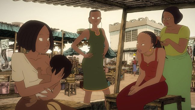
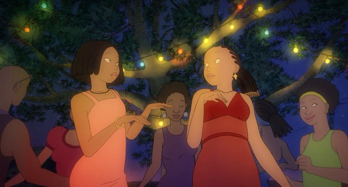

Aya of Yop City (2013): Aya is a studious young woman with dreams of studying medicine, but is opposed by her father, who wants her to get married and start a family. In contrast, Aya's best friends Bintou and Adjoua flirt with boys, party, and dream of opening beauty salons.


Love the contrast of these 2 @komodaharu - Cherokee has joined my collection today :) https://t.co/A3D6PHg8FJ


#togspoilers
Jsuis tjr époustouflée par le chara design de White. Le gars à une apparence angélique, divine, alors que c'est un démon. J'aime beaucoup ce contraste !

@redkeytar I enjoy all the CP skies. The old darker shade makes for a cool contrast.
The original gray skies from Peter Welleman's illustrations are also very nice. Gloomy arctic weather is such a vibe. ☁️❄️


