compareのTwitterイラスト検索結果。 289ページ目



I recommend Wake Up Girls.
Don't compare it to LL or iM@S, but it's worth checking. Its the music that really pull me on it, the visuals are descent, 2D dancing except 2nd season 3D made it worse.


Every time I draw Moon his hat gets longer
I’d compare it to my first drawing of him but that drawing is ASS so no


Since we heard this mashup, I had the idea of making this lil fanart
Now I found the perfect moment~
This is nothing compared to the things u do, but if it made you smile,then I'm happy~
Happy bday @Guixonalta, my love🧡
U make me so so proud...
Thank you for everything~🧡


1st, line art. Amor's line art looks loose, heavy, it "pops off" if you know what I mean. Badre's done a good job copying him but it looks thin and stiff. Don't believe me? Look at badre's sketches and compare it to Amor's.
1st image is Amor's
2nd is Badre's

@wakaburger I wish somebody compared my man Minoru with an existing character


@sugar_mew_mew I like my characters and creations to be compared to already existing media! Please do it with mine! (I know, quality isn't the best, also I should draw her more)

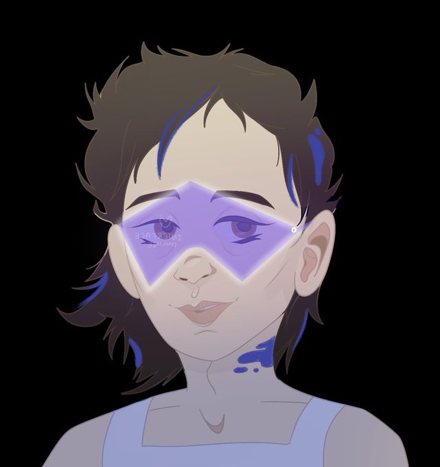


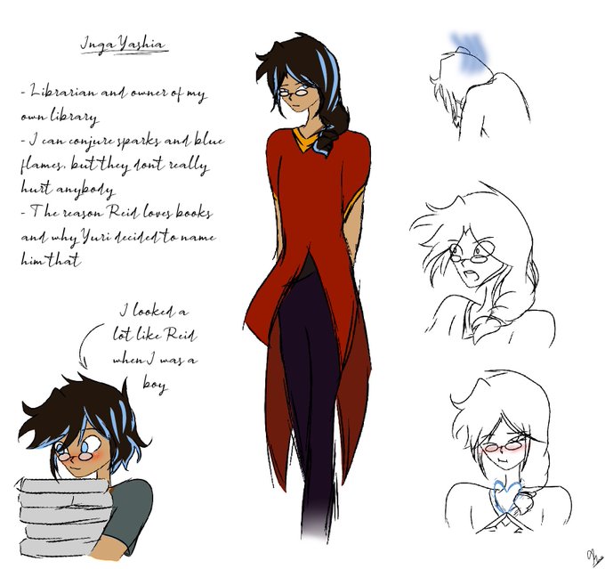
I drew up Reid’s father too. I don’t know what’s with me and drawing parents recently, but let’s go with it
Fun fact: Yuri first liked Inga because of how devoted he was to his own library and his work as a librarian. She found his quaint lifestyle adorable as compared to hers

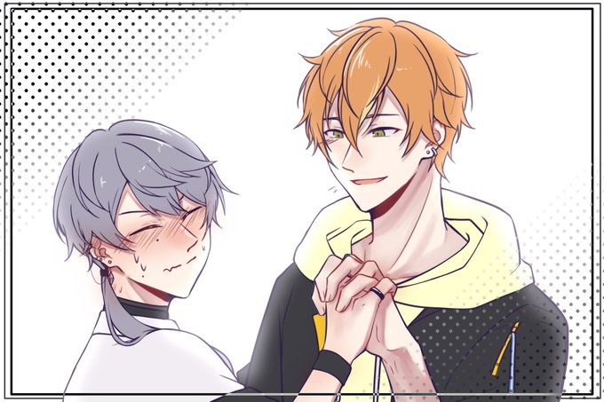
🧷"let's compare hand"
🥞"Sure"
🧷"As expected you're hand is big"
🥞"And yours small"
🧷"Fck u"
🧷"..." *Proceed to hold it without thinking*
🥞"..." *Hold it back just because*
🧷"the fa-?!" *Turn face away*
🥞"What? You start it first and now you're embarrassed?"
🧷"Shut up" https://t.co/lrzcq3jXjC


Viviz doodle 💙💜❤️
I love how Eunha looks super cute and innocent compared to the Purr duo
#VIVIZ #비비지 #vivizfanart #EUNHA #UMJI #SINB
@VIVIZ_official
#QUEENDOM2


A potential redesign for Castor and my art direction for the webcomic! I wanted Castor to have a more mature and refined appearance compared to Bella Booker’s childish appearance. #sketch


Keeping "the only person to compare yourself to is your younger self" more in mind and considering this was ~~5 years of improvement im????? Proud- thats weird to say but I'm genuinely proud at how far ive come , seeing now so fast. Epiphany


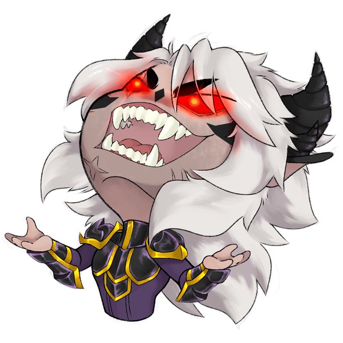
the other Muspell Resplendent wear black too but it looks different once you compare them to Gaius. They also have other colors as the main focus like blue and purple (gold and red are the signature colors of Muspell so they're always present on belts and armor pieces)



🚫do NOT trace, edit, sell or repost my art🚫
.
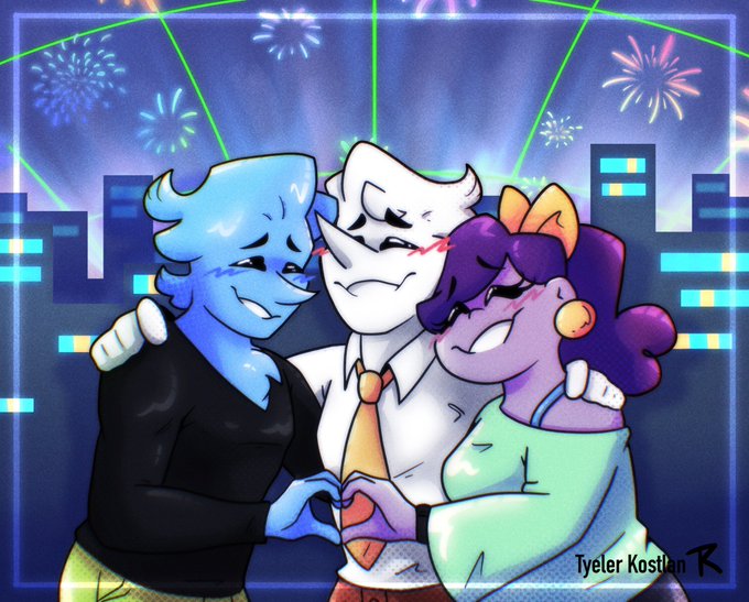
Here’s a little pic of the trio! I think they’d be the closest compared to the other addisons in the group. Sweet little babies that are full of generosity, loyalty and kindness. btw Blue is taller than both of them lol
#DELTARUNE

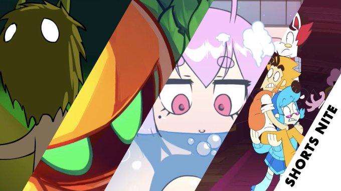
I really love the concept of fortnite shorts nite but this shorts nite is really bland, I like a lot of the ones for shorts nite 3 but compared to the 2nd shorts nite it’s really lackluster, LIKE LOOK AT SOME OF THE SHORTS FROM SHORTS NITE 2


@thehelmet_guy I doubt I'd be welcomed compared to all these famous peeps but thanks anyways! I could use a swim! 😋


cat juice was looking cheap compared to the cat clone floor. ~.1E downside. let's start the weekend right! gang mfin gang


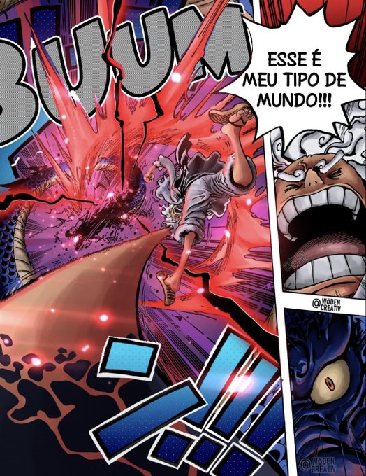
🐉🐲 | SORTEIO VOL. 21 DE ONE PIECE
Para participar, basta comparecer ao Pauta Secreta e mandar um “!sorteio” no chat. Boa sorte a todos :)
─ Este volume chama-se “Nação Ideal” (理想郷). Um título perfeito para homenagear o #ONEPIECE1049!
🔗 https://t.co/AJ7Z118DAJ