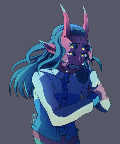
ContrasのTwitterイラスト検索結果。 10,815 件中 294ページ目


The contrast between my first ranboo fanart and my latest one lmao


8. DIO (Part 3: Stardust Crusaders): This is a case where I adore the impact DIO left afterwards to the characters rather than the character himself. I'll say that Araki did a good job in contrasting Part 1 Dio and Part 3 Dio in Vampirism: Part 1 is the mad dog kind of vampire...


Because I'm a sucker for thematic contrasts, she's a duo partner with Beary Cold
Ice/Energy Blaster [Old Art]


ハシモトヒロコ作品展『Contrast コントラスト』
◇ 4/25(日)~5/8(土)
◇ 丸亀市市民交流活動センターマルタス1F市民展示コーナー
◇ 9:00~21:30
https://t.co/3x3YmwuBTZ


I love the emotion and colors in these pieces of CJ that I got from the amazing @nicolebsicrete a while back. The contrast of warm and cool colors is sooooo good. 💖💖


Also, let's all take a moment to appreciate #_defi_'s collection...
A contrasty, colorful vibe including artworks from @imahmedamin, @markinducil, and @dreamfibre
👇👇
https://t.co/6Gk4R9YEVU


Again i dont know why twitter still slow the contrast of the draw, here´s the original


i find this specific art poster really interesting.
It has something that screams caos, renaissance, a good usage of color and contrast and a composition that really reminds the fibonacci structure.
Here are some artworks that radiate the same energy:
#ONEUS


March 2019 versus December 2020. I experiment more with different approaches these days, and I struggle with things like value and contrast instead of making near-flat color - I have a longer history with digital art than this shows, but not a lot has been kept. https://t.co/29OYX5nCzc


Sweet Mother of Mercy, I stopped using my Ricoh GR a few years ago because I thought I'd knocked the lens out of whack.
WRONG
Man, this camera is sorcery. There's no other explanation. Especially the High Contrast B&W mode.
Sorcery.

@CzBacklash Here's my attempt.
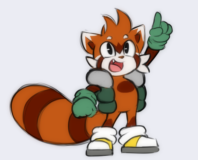
As much as I wanted to step away from the green color, it's a great contrast to the fur.


2012 (learned how to use lasso tool by this time)
2020
still use lasso tool, learned to use reference, blending modes (besides overlay), contrast
🌸shop:
cosmicloak.bigcartel. com https://t.co/r8dIg7MBhR


@hikarilovemail QRT with your first vs last digital piece!
not actually my first or my last but they really show some contrast!
2011 vs 2021


Watercolor #painting of the dramatic #storm sky, titled "Sky No. 6'" (30 x 40,8 cm, 2017). I just love those contrasting colors!
You can find the original watercolor and signed art prints of it here:
https://t.co/BO4WBzUoE0
https://t.co/cSVqObweKm


QRT with one of your first digital arts & a recent one
december 2015 vs this month.... . . gonna lose it at the contrast https://t.co/H3i9SPOSrh