ContrastのTwitterイラスト検索結果。 10,508 件中 298ページ目

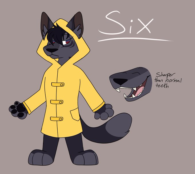
Did I mention I did Six? I can’t remember but if I did I’m sorry for posting her again.
She’s a fox cause Y’know why. I tried to show a lot of contrast between Six and Mono. Like marking and color wise

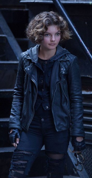
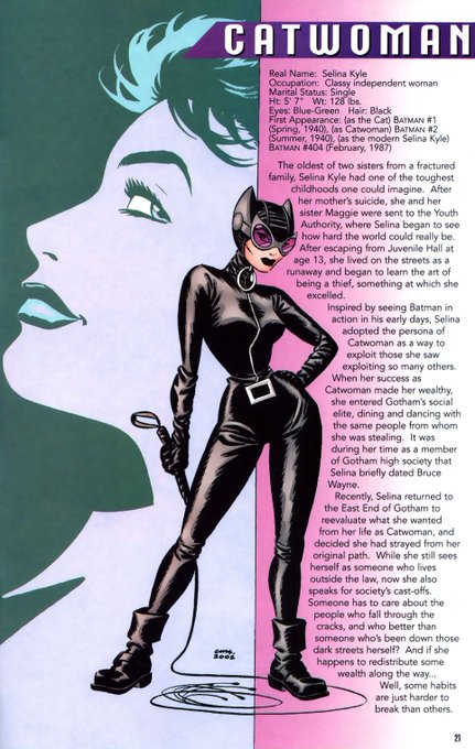
@me_kashiwa The rich socialite lifestyle, is Selina's reward. The key was using her childhood as a way to explain why she became #Catwoman. Her upbringing compares/contrasts to Bruce's, which defines their relationship. As she becomes more heroic, you see how her selflessness matches his.


Lesson 4
One of the things that I really like about this study is the strong lighting thats on the Templar contrasting with Indiana Jones who’s just barely standing out from the background. #AFrameADay


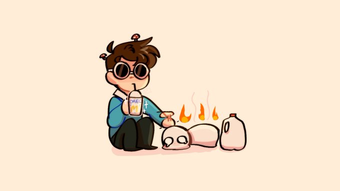


@H2Pokejuan OMGGGG HANTY MUCHAS GRACIAS AAAAAAA donde los encontraste?!! Están re lindoooos, están perfectos 😭😭😭😭


Venga con otro WIP.
Me ha gustado mucho dar una faceta de deportista a Nutty, aumenta el contraste que tiene con Erizo.


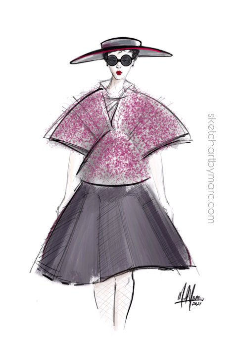
Just rethinking an earlier idea. Retro vibe. Contrasting metallic fabric skirt with Japanese Sakura floral influences. #sketch #art #FashionIllustrator #fashionart #fashionillustration #croquis #design #retrofashion #beauty #sakura #procreate


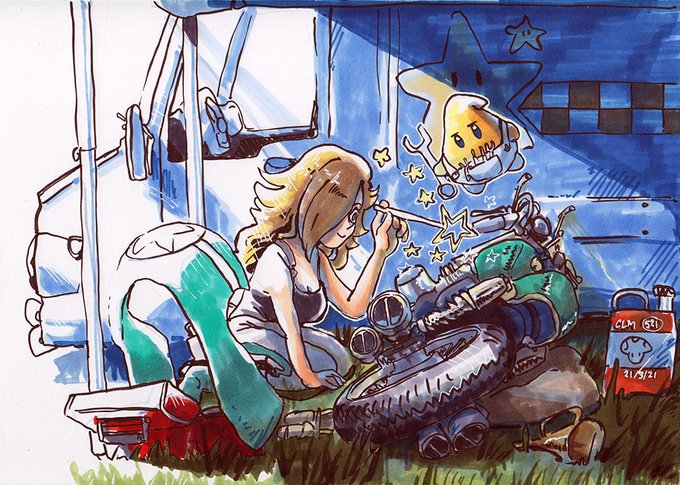
Rosalina adding some magic to her bike, the Luma doesn't seem particularly impressed with her work... ✨
I focused more on values and contrast here than anything else...! Hope it shows. Gonna practice more
#MarioKart

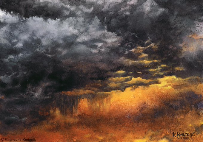
Watercolor #painting of the dramatic #storm sky, titled "Sky No. 6'" (30 x 40,8 cm, 2017). I just love those contrasting colors!
You can find the original watercolor and signed art prints of it here:
https://t.co/BO4WBzUoE0
https://t.co/cSVqObweKm


This doesn’t mean Kurt is innocent. He performs non-threatening-ness to reassure Meggan, and draw her in. Describing himself as “cute” & “charming” in contrast to the beastly Hank McCoy, he benefits from Meggan’s concern for his well-being, which inspires her to get closer. 8/11

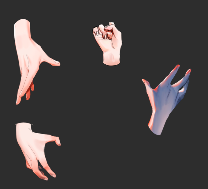


"The Darkness inside her" is now available at @ghostmarketio/@PhantasmaChain
Only two pieces! 275 $SOUL ✨
Buy now this piece full of feelings
https://t.co/sn3ZuaEkvx
#NFT #cryptoart #collectible #darkness #contrast $KCAL #NFTart #digitalpainting


.Contrasting Styles - #Colonial #USA #Military Portrait to Late C20th Century Watercolour in The Cato Crane 5Counties Early Summer Picture #Auction - Further Entries Invited 01244 680055 @shrewsmorris @CheshireLive @WalesOnline @cheshirelife @heswallmagazine @YOLiverpool #Art


@Briarfox13 thank you so much, and yes ofc !!
i’m not too sure how to explain in detail but usually i put down b&w values first and then color them in with a color layer!
i use higher saturation and high contrast to draw focus :)



before I go sleep imma just drop the two crumbs cause the contrast between them is funny
but yeah sleep time cause I gotta get up at 5 am


quote tweet with your fav colour schemes to use ✨
uhm cool colors with warm/pink contrast and warm sunset! or basically 11 am vs 5 pm lighting lol https://t.co/whNxr3ktLJ