contrasのTwitterイラスト検索結果。 10,762 件中 299ページ目


Ristar (1995, Sega) - Genesis/Mega Drive
RPi Emulator vs. PVM-20L2MD RGB
I am stunned by the way the CRT's deeper contrast transforms the purples and blues here.


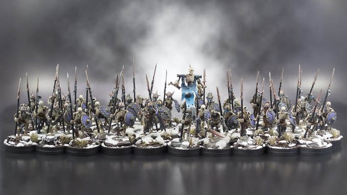

@Sixdiceskills Most of the highlights on here are just drybrushed on. My latest BB team used contrast paints in a new way and I'm hoping to get around doing a blog or something about it... I will be doing my Cursed City box in the same way.


Day 18: Deer
I was originally gonna draw Alastor from hazbin hotel, but instead I decided to go for a contrastingly aggressive looking design hehe. #characterdesign #witchtober #art #deer #lineless #digitalart #prompt #practice #experiment


Moitos dos relatos de Kenji Miyazawa que tiven a sorte de ilustrar repiten un mesmo esquema, un persoaxe cun arco de transformación moi contrastado. No caso da avenoiteira, un paxaro pasa de voar baixo a chegar moi arriba.


I don’t know why there’s such a contrast with Lady’s actual art style and the art style used for Lady’s Key Visual. Lady looks fine anyway but If I’m being completely honest I kind of like the key visual art style more and kind of wish the anime itself looked like it


Mysteria y Orias brillaban en medio del Gris, eran las ùnicas criaturas vivas en medio de las calles y mientras caminaban parecìan contrastar en color sobre los oscilantes y opacos caminos de la Noche…
#DigitalArt #Draw #Illustration #Oc #Creepy #Stories #Art

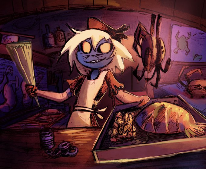
@Puapka1 Love the color palette so much! I think the character is very easy to read, but the rest not so much. I think you need to focus on separate the foreground, middleground and background with both contrast in values and colors. Hope I didn't overstep my boundaries by making an edit


No Swimming - a contrast of darks and lights. Now on the website - https://t.co/GF6VoQJCg7 via @http://twitter.com #artforsmallspaces #originalaffordableart


Me encanta que poniendo a estos dos juntos se nota un poco el contraste original


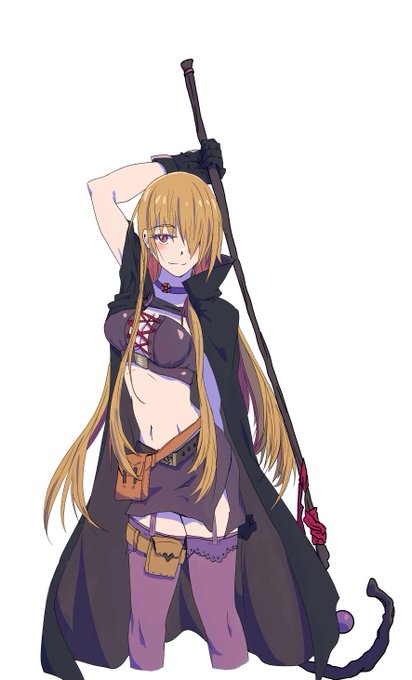
Process
I recommend to every artirst to practice flat shadowing at some point, helps to understand contrast.


@SaphireLattice Gotta have the human form to start! It's what makes turning into something else more meaningful through contrast and comparison!

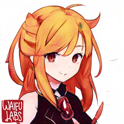
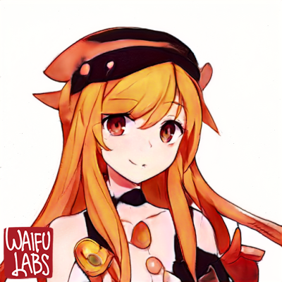
Waifu Labs Pics (Day 26 of ???) 💕
That is a really lovely orange hair colour,
I like how it contrasts well with the dark outfit~!
The hair itself is all over the place tho~ 💕
As always, still cute~!
#WaifuLabs


Repost porque o contraste desses dois lado a lado é muito bom
#Art #DigitalArt


Watercolor #painting of the dramatic #storm sky, titled "Sky No. 6'" (30 x 40,8 cm, 2017). I just love those contrasting colors!
You can find the original watercolor and signed art prints of it here:
https://t.co/BO4WBzUoE0
https://t.co/cSVqObweKm


Almost there! Day 30 of #inktober2020 was "ominous" so I came with idea of picture with many contrasts and some beast included.
#traditionalart #Inktober #artchallenge #artistsontwitter #blackandwhite #BeautyAndTheBeast #scary #furryart #furryartwork #furry #artwork #lineart

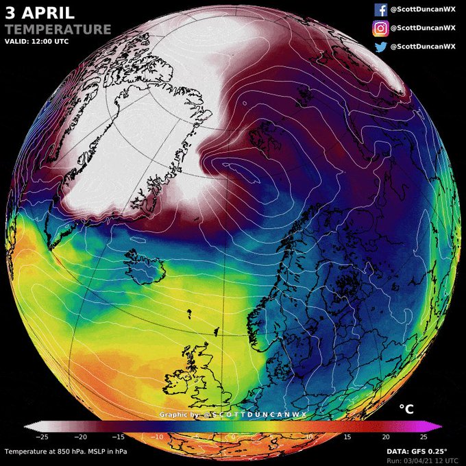
This Arctic blast was captured by weather forecast models many days in advance.
Large contrast is common at this time of year but this is incredible - a shock to the system.
More on instagram
⬇️⬇️⬇️
https://t.co/OeDnM1yxKj
⬆️⬆️⬆️


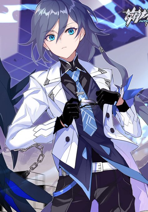


MY HERO ACADEMIA VOLUME 30 - ALTERNATE COVER
I thought it would be interesting to put Dabi's Fire behind Deku and the corpses, Dabi had a big highlight on that Volume! I ended up liking the contrast of blue to green, I liked the final result
Hope you guys like it too🙏✨❤


Look at this art by @jeremybooth and tell me that color palette doesn’t scratch that part of your lizard brain that itches for symmetry, contrast, and balance