CONTRASTのTwitterイラスト検索結果。 300ページ目


3/3
The airbrush color was great for doing that clean shade gradient, but imagine doing that for hundreds of frames!
The prince reveal lost out bc Glenn clearly layout lots of CONTRAST shadows & a low angle...which... did not happen in the final product. Leading to wonky faces


I FORGOT TO UPLOAD THIS.... In contrast to Koha who is a good boy, here's Vari, who is a little bastard (I say little but he's much taller than Koha...)


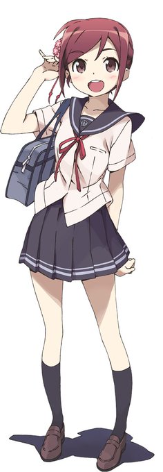
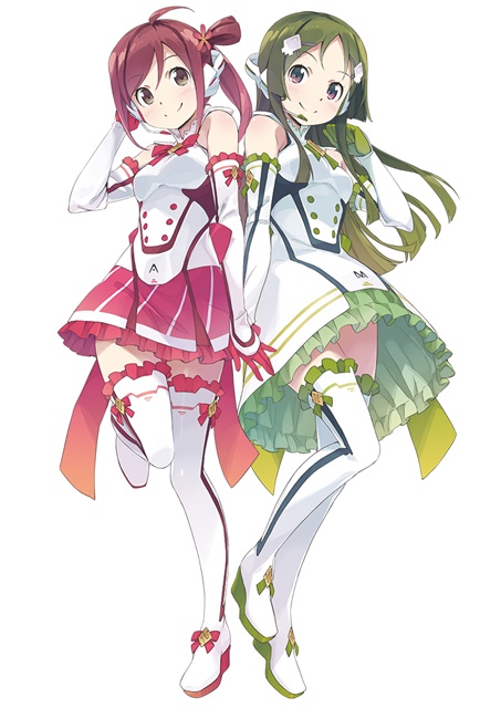
【VOCALOID4】The vocal synth of the hour is Masaoka Azuki.
Azuki is a cheerful girl who tends to act first and think later, in contrast to her best friend Kobayashi Matcha.
Originally released for VOCALOID2, her voicebank wasn’t public until her V4 release.


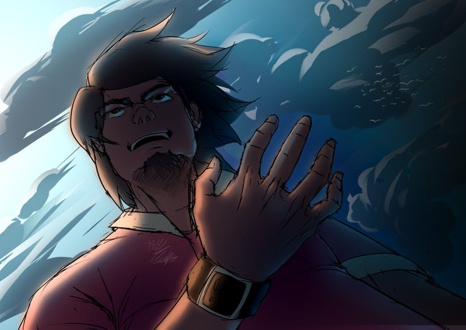
Here's a sketch of Miles Draker. In the later seasons of the series, he will possibly represent the contrast between Justice and Vengeance
#digitalart #art #sketch


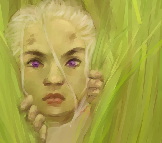

here's my WIP so far, the left bieng the before and the right being what i've got going right now
I feel like I really have developed a lot more in terms of understanding of color and contrast. I'm proud!!


Expression practice is finished! I probably need more contrast on the ears but Cassius is complete!
#furry #furryart #digitalart #bust #procreate


Now that I wanna start improving my painting skills again I really want to focus on being more daring w/ my colour and contrast usage! It's something I feel I used to be better at when I look at my older art ( also makes me miss my Sai multitool brush that I used for EVERYTHING).


things you won't see in the finished comic: i color the backgrounds using colors I like so that i find them more interesting to work with. they also have less contrast than the characters, so it looks great when i reduce it to greyscale


Loving Ep 4 of #HelluvaBoss
I love the contrasting colors between heaven and hell, so eye catching.
I do see IMP and Cherub becoming very bitter rivels in the future and personally I'm all for it.
Collin though..he's precious and we must protect him!


@RegretfulHarawi ok, i see how the blue might not fit well, so i tried to use the greens contrasting color


I love the contrast between them ☺️ also how Lu-Bu acts all soft around Diaochan 🥰


The female has two stripes on the neck and chest, and contrast stripy wind plumage. The blue around the eyes is apparent for both male and female.
#sexualdimorphism


I started working on a lineup of all of my D&D boys and just three drawings in the contrast here is already slaying me...


THIS IS SO UNFAIR!
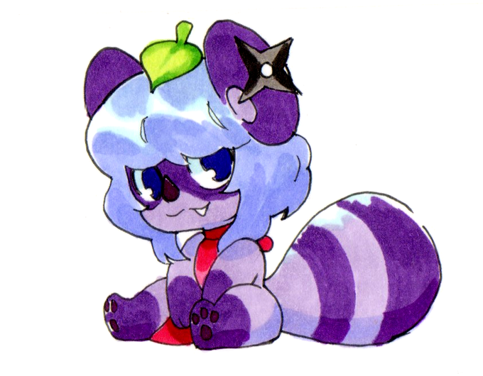
I bought some Ohuhu markers for my brother as a gift and finally picked them up today. I did a couple tests, and passing them throught the scanner LOOK HOW GOOD THEY LOOK, ALL I DID WAS UP THE CONTRAST LIKE 4 POINTS. my other markers require SO MUCH TAMPERING