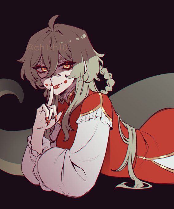
contrastingのTwitterイラスト検索結果。 1,086 件中 4ページ目


After working on her sprites, I felt like I had to tweak Miriel's design some, giving her more contrasting pauldrons and a generally wider build to make her look stronger.
Let me know what you think!


QRT with some of YOUR green art~!!
Can you tell I enjoy vibrant greens and contrasting colour schemes? Lol
(Had to go kinda far back for really green pieces. Just showing me that I gotta draw MORE GREEN) https://t.co/3j8nRHQQJO


2. Line of Action
Pretty sure I got this from Sonic LAKUSHGASKG
Don't know how to explain this to be honest, but I use it a bit
Basically, uhhh, bigger arcs/contrasting lines = more expressive (to me)


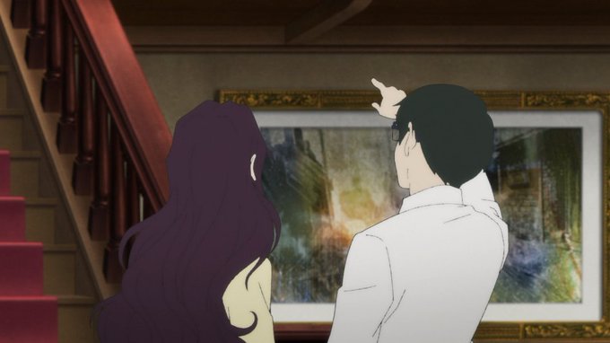
@AurekFonts @PhilSzostak @pabl0hidalgo It looks like he was playing with that detail before the black outfit with contrasting interior was settled on, so I'm guessing it wasn't part of the plan from the start, but that doesn't mean George didn't conceive of that symbolism when he saw it.


I mentioned this with the legendary duo, but the starters share this detail, too. They each have contrasting colors in their palettes!
#PokemonScarletViolet


Thinking about Manchester Black’s two very contrasting experiences with Superman’s Heat vision scalpel.


Watercolor #painting of the dramatic #storm sky, titled "Sky No. 6'" (30 x 40,8 cm, 2017). I just love those contrasting colors!
You can find the original watercolor and signed art prints of it here:
https://t.co/BO4WBzUoE0
https://t.co/cSVqObweKm


Something about his ^O^ face
He looks like a a tortured soul BUT HE'S CUTE??? LIKE WOW these contrasting reactions I have to him simultaneously are incredibly amusing to experience. HE'S CUTE AND NOSTALGIC-LOOKING BUT IF I SAW HIS FACE AT NIGHT?


@AzurLane_EN Pure white outfit for a (probably) pure girl. Usually I like contrasting colors more but this one actually fits Theseus well. Her lovely white wings and clothes making her smile all the brighter.

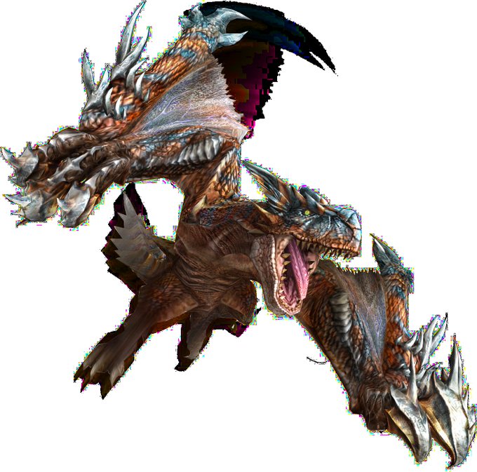

@AlatreonBestBoy If I ever had to choose actual redesigns I really don't like from Frontier it would be these two and they both do the same thing that I hate - they don't expand the designs and instead slap some sharp contrasting as hell edges on top of the sleek body of the OG monster.


Added a nice contrasting boarder to this piece.
Again, i prefer the boardered versions because it looks like it belongs on a sticker sheet!
But i hope you enjoy one or both versions! <3 <3
#applejack #mlpfim #digitalart #DigitalArtist


@jaren12072 Currently, it's this one.
Really warm with really contrasting colors!


Nice #art you should know about 👇
Artist @LisavetaRaii taps into themes of melancholy and nostalgia, the cosmos, and love and toxicity. We love how her style and contrasting colours reflect this. Plus, she’s part of a community supporting #womeninNFTs 💥
Give her a follow!


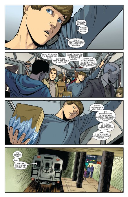
@SuperiorDawn Cyclops/Iceman was awakened in my brain bc of this cute mini. Just the way Bobby doesn't make fun of him for it and then actually encourages it? AND GETS HIM SNACKS? ITS SO NICE. There are so many things I love about their contrasting attributes. Wrote a fic and everything lol.


@kingfelli Wanted to incorporate more of a circular design with contrasting horizontal lines to show an inviting, but powerful, character.
Hopefully I did them justice!