jarringのTwitterイラスト検索結果。 595 件中 4ページ目


I went insane and drew a lot this year kfdjahdkjfda
I hoped I improved but also the colouring style change is so jarring im- ???😭😭
#2022artsummary


Gone through Chapter 4 to change the layout, add new small art to make it a little more lively, etc
I also updated this art, it looks much less jarring to me now


@visodette I’m really proud of the rendering style I managed on this face, I think the mouth is a bit jarringly cartoonish in comparison but I like the sketchy line thing I tried out


2/ the arrows piercing her neck. The words on the moon 🌚 ‘can’t wait to see how I’ll die’. The jarring contrast between the dark themes of the work and the bright exuberant colors. It’s a piece I’ve already spent considerable time thinking on since I first saw it.


2016 vs 2022 (6 years)
The difference is JARRING- #skillnottalent


@TruAuraGuardian It's quite a staggering difference. Not saying it's bad but it's jarring at first.


i did that one head turn thing except it looks jarring with how inconsistent my art style is +_+
#artwork #AnimeArt #Illustrations


@_Stratilex @SLOplays I mean I kinda dont mind it. I do agree that its jarring to go from goat aesthetic to chiseled MAN.
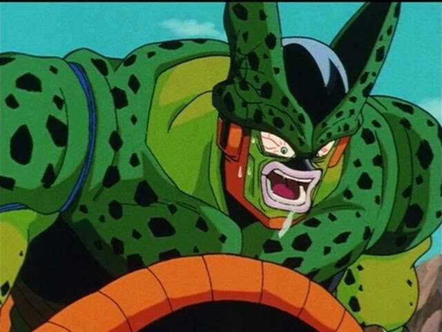
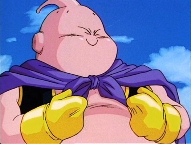
but lets not forget that frieza, cell, and buu also had jarring transitions going into their final form.


@GoldenPancake__ hello!!! what's a little jarring is that while the eyebrow is logically covered by the hair, the eye is not...If you are looking to have the hair a little over the eye without covering all of it you could reduce the opacity or have fewer strands. Make sure to keep it consistent!


is this covered enough to give difficulty in editing it out but not too jarring D:
another way is to post non-patterned watermark in my discord..


We have acquired all 5 pieces from the “SKIN” series by the undeniably unique @ozbren_xyz. 4 of the 5 are below.
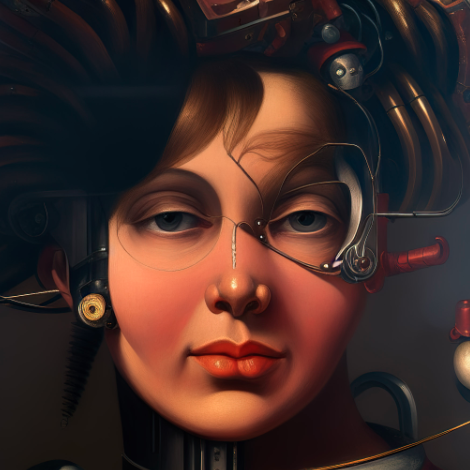
Ozbren’s jarring 3D imagery has been a topic of discussion for us since we came together as a group. A true master of evoking cringe and discomfort.
Welcome 🥃


GUESS WHO GOT THEIR NEW TABLET PEN
Anways, god, the jarring change in art, sorry, this is a warm up LOL #elzer https://t.co/7nZxADQNqi


since this is just my elden oc revamped i started debating putting his scar back on his face. i think i like the idea that he has such a jarring part of his face and shows it freely all the time whereas ghost hides his face https://t.co/mhSSiwI4T8

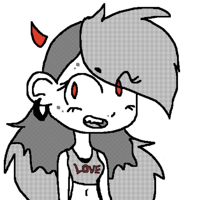
Melanie almost always smiles and is a generally chill person. I sorta gave her "Aurora" rules in a sense that when she isn't smiling, it should come off as jarring.


//mlb season 5 spoiler
Monarch’s design could have been so cool if they didn’t decide to have his ears poke out of his suit??? It looks so goofy why did they do that. THE EARS LOOK SO OUT OF PLACE AND JARRING COMPARED TO HAWKMOTH


#LostPoets are Transforming. Gotta say this is jarring and uncomfortable - I liked the old art a lot. I don't know these poets yet.

everytime i reread my 1st episode i always feel i didn't properly establish Mr. Agung as a horrifying figure and it GNAWS at me every time
my art has changed so much since and it'd be jarring if i reboot it, but maybe i could try to mimic my old art?
helppp..what do u think?


man, comparing the first one to a more recent one is just so jarring to me lmfao


@bleublaze1 @Nessaslatincorn Her profile shape in the storyboards looks more similar to how it appeared in the show in the other seasons. It’s just a noticeable and slightly jarring stylistic change when everyone else’s features seem pretty consistent with previous canon. I don’t know why they’d change it