comparingのTwitterイラスト検索結果。 3,739 件中 31ページ目
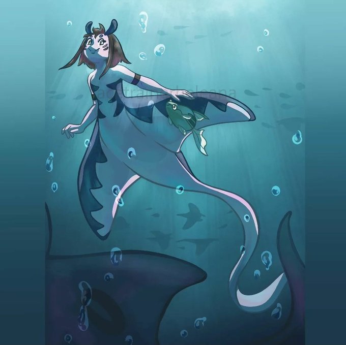
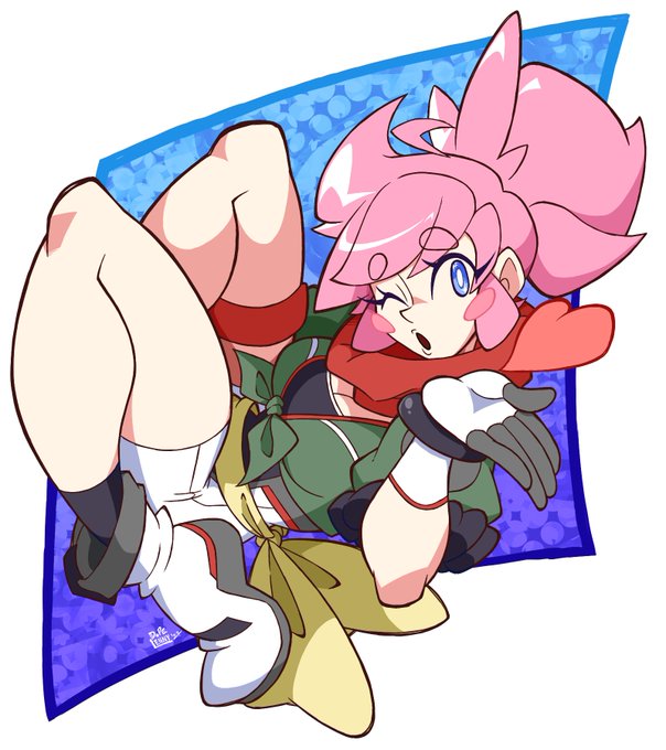
top 2020 & bottom 2022
insert funny tweet about comparing recent art and art from 2 years ago here
this isnt exactly 2020 but... this is me comparing my lining skills now 👍🫶
2019 2022 https://t.co/K6ewDXtjxQ
2020 -> 2022
I normally skip these trends but since I made Lucy in 2020 I figured I could do just this one comparing her first drawing and a more recent one! She baby. https://t.co/Gc9vsIRtPs
2020 vs 2022
I always like comparing my progress. https://t.co/m0Cg8uundE
✨ a b l a z e ✨ Just both of my sonas. I'm casually comparing their size difference
It feels mean comparing my 2022 art to my 2020 art skfh
2020 vs 2022 https://t.co/nznKTJHPEG
Comparing with my latest drawing ❤️ https://t.co/k788H9aJA2
Oh oh this interesting one haha
Not quite remember when but i did start during 2020 and this one of my first colored illustration comparing to now 🧑🏻🦯 https://t.co/4JtJF6apVn
I love comparing old and new art.
April 2020 -> August 2022 https://t.co/9nsTBb1DLx
I love comparing my mermay ilustrations every year, I'm glad I've improved this much, and I'll keep learning backgrounds and more so next year I can do even better 😊 https://t.co/t6GhAmLR57
and while i havent made a truly Big Piece recently for TTT, comparing these to the newer things ive done. just. ugh. the difference. im so damn proud of where i am fr.
'Improvement'
Comparing these two pieces - I feel like I just got more lazy |DD But def. like the sharp lines and colors more now. https://t.co/JNt3GuXPzE
i love comparing my new art to my old art because i start to question how did people enjoy this shit
2020 vs 2022
comparing my style with miku lol https://t.co/p4TplzHwFw
like comparing two of my fav pieces from 2020 here to two of my better pieces from this year just feels
weird? bc its not so much "omg i improved so much" but more just like
Im drawing different content in a diff style?? idk maybe im just biased bc its my own art but like.. idk
@Ciarra_13 Ahh I always love to see artists comparing their old work to their new! It’s a great display of how far we’ve come from then and the ways we’ve improved! 😁 Thanks for the share Ciarra! 💚✨
(Left 2015) - - -> (Right 2022)
I like comparing my old stuff with new cause like this I can see that I truly evolved https://t.co/pRsLhipVyW
@BunkoGenki I love comparing old art with recent art!
Lucario from 2020 and Super Saiyan 3 Sonic from 2022:
Comparing the Leniis two years apart.
I have been getting better... https://t.co/5rpHN4dcIl

