ContrasのTwitterイラスト検索結果。 10,815 件中 305ページ目


@APPLEF0X I think it depends on the size and contrast of the text, and I still think itll priorities eyes/face over text. Because I put my watermark in the lower corner but Twitter still crops to the face.


Repost because I changed the brightness and contrast so much qwq
Here are 2 Nobara Kugisaki stickers I will have when my Etsy opens <3
Should be soon, keep saying that but I ran into supply problems with sticker paper and such !
#jjkfanart #JujutsuKaisen #jujutsukaisenfanart


世界は、混ざる。
The world is mixed.
https://t.co/G9snPFWwtN
#ricohgr #ricohgr3 #grsnaps #youtube #bnw #daidomoriyama #28mm #streetphotography #highcontrast #blurry #tokyo #japan #shinjuku #新宿 #森山大道 #ストリートスナップ #光と影 #streetphotographyjapan #tokyocameraclub


Getting this pose right for the @Lancer_RPG SPECTER NPC was a really fun challenge! I wanted to make it very humanoid to contrast with the ASSASSIN, but of course I still needed it to convey stealthy predator energy. (Also I feel like I'm running out of good color schemes lol)

https://t.co/H51ktR6wRy
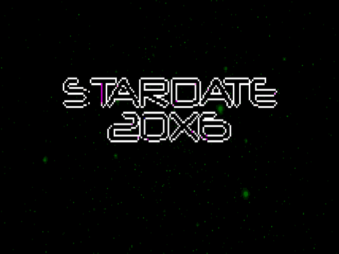
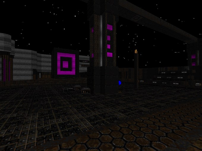
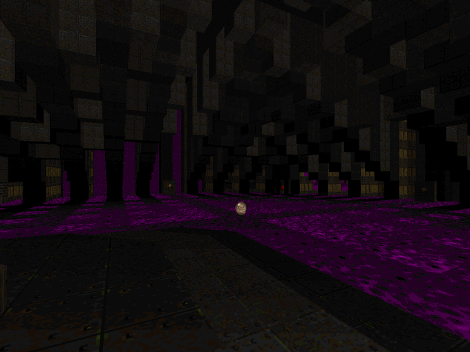
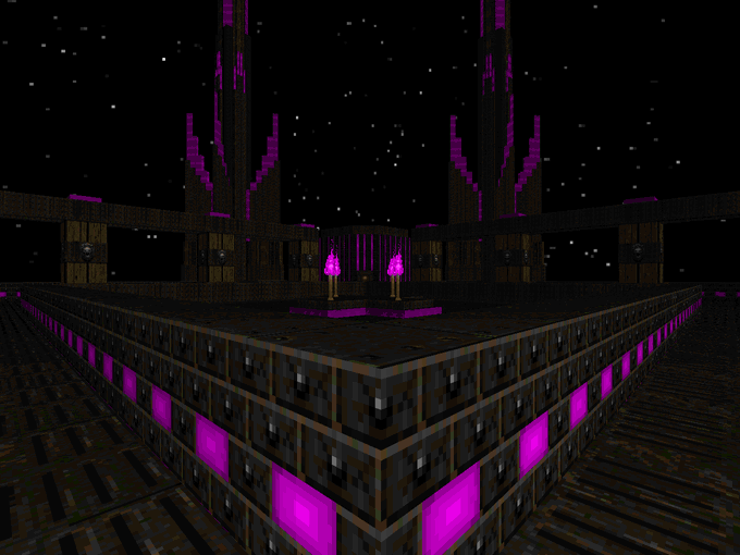
Stardate 20x6 / Doom II / 2013 / by Zachary Stephens aka "Ribbiks"
Gorgeous architecture with brilliant purple highlights contrasted against dingy metal and earth tones. Demanding and innovative combat scenarios alongside full-on space-hugging slaughter.

Finally made the form she had on one scene in my short story, turning down the character brightness to increase the flame contrast made it look 100% better, really happy with this one ^ - ^


ulquihime: are u stuck in 2012?! bc man, you are powerful for shipping for so long.. you love what they brought to eachother and how different they are, contrast and ying yang is ur type of ship


Compare and Contrast Part 1
other half belonging to: @MapleandPie
Designs by: @GoldMouseStudio

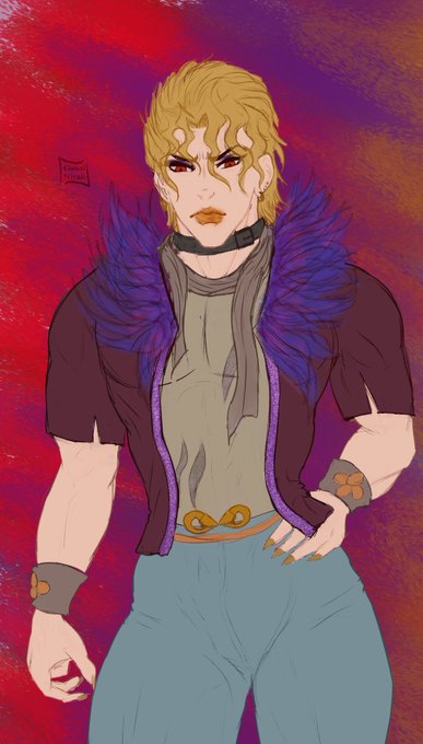

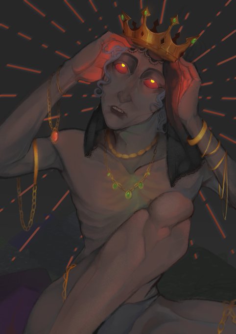
Contrast: Hotmess vampire - dilf hamon warrior.
Playing with the brushes and getting used to the CSP :3
I'm starting to like CSP, you know... Is quite "easy" to use.
#jjba #jonadio #sketches #drawing #DioBrando #JonathanJoestar


@Jaoaoaoaoao @eithi007 Hm, is that really true though? I think it being contrast lighting definitely makes the colours less soft that usual, but it’s clearly Fumikane’s water colours


Detail share train!
What details of your art do you like best?
1-The cloth texture of my Purple Boi.
2-Pad'Eka's metallic thingy in his head.
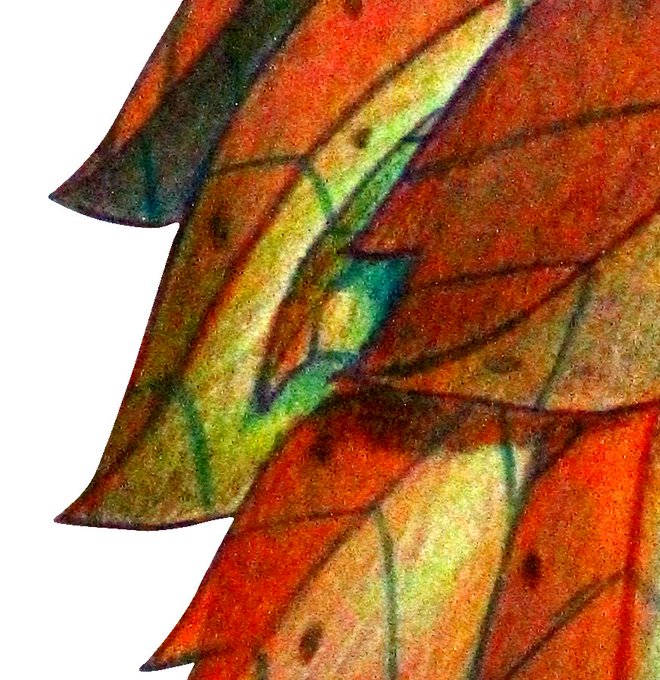
3-Autuliis's leaves color contrast.
4-My Purple Boi textures in his horns!
What about you? @RedVeril @Firi_San @coconutcow_art https://t.co/27ZxDoyIqg


@angie_gallery @potatodrawzz A method that is visually much more appealing is by extending the canvas and adding something that contrasts/has visual weigth, which is what I did in my latest post: https://t.co/Rt8cmYny1x
Or alternatively posting the same image twice unaltered or e.g. color & b/w.


Yeah I like this. The stark contrast with the white masks makes them pop out more. Deepsea shadow monsters. \o\


A quick little doodle of sospoot farmer, Amelia. I really wanted her to contrast with my farmers from ANB, SOS & 3OT, both in her appearance and her personality.

Finished 2 part commission for @Team_Bees_ !! These both turned out v pretty imo I like how contrasting yet complementary these two pieces are :]
(individual photos in replies!)
.
.
.
.
#Art #ArtistOnTwitter #ComissionArt #ComissionsOpen #Cottagecore #Punk #Alternative #Fairy

This version of @psychicpebble is way better than that old SleepyCabin version I did years ago. I had a lot of fun with his face. Comedically detailed head contrasting with a barren torso.


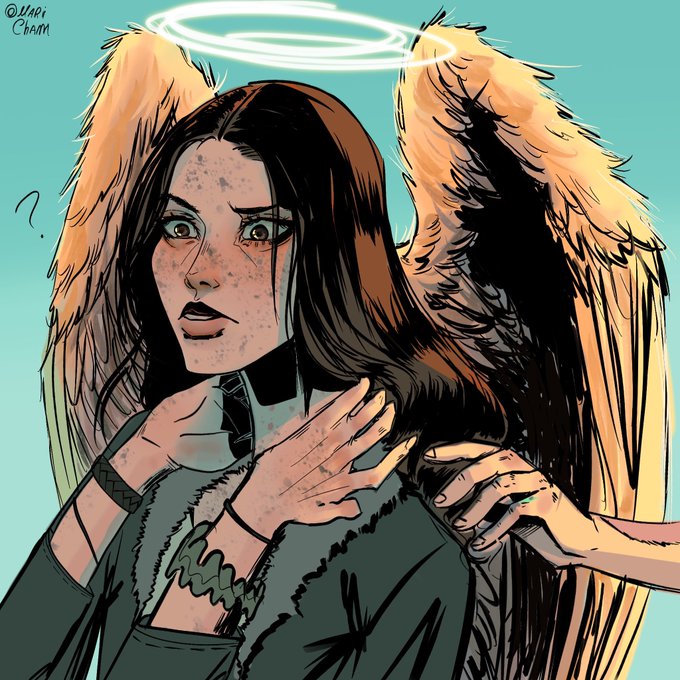

Eu fiquei um tempo pensando no que o Tristan diria para a Bea quando eles se reencontrassem Seria algo tipo:
“Você por aqui? Não tenho mais dúvidas de que aqui é o céu”
“ anjos não ficam muito longe do céu pelo visto”
“ agora temos tempo para aquela aposta né?”
#Desconjuracao


@OolasDraksy the final texture will accentuate certain areas too, i just ended up feeling like the paw markings don't really "fit in" with the rest, they kinda come out of nowhere
and yeah more dark blue areas is definitely more contrast, but it also defines a smoother gradient