compareのTwitterイラスト検索結果。 305ページ目

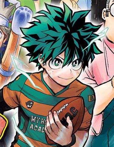

Really awesome ensemble jump cast illustration this week. Correct me if I'm wrong, but I think this is the first time we've seen Deku's glowing.. veins(?) from full cowl in an official colored Horikoshi illustration. Cool to see Hori's take compared to the anime's


❥ # STRANNY STRANGE - gray area on a nightlight .
⸻⸻ HELLO .. another reference, this time of my own design and that being stranny, the son of the mothman known as oridtch, whose a little less forgiving in humanity compared to his father.
had fun with em', hope you will too!


Snek! I had a much easier time drawing this boi compared to Ekans
Enjoy this danger noodle :3
#GottaDrawThemAll
024/905+? Arbok


Comic/Manga [11/50] — Chainsaw Man — Volume 9 — [A]
Quiet and contemplative compared to the previous volumes. Does a great job showing how far the characters have grown so far while also transitioning into the next arc in a powerful way.


one thing I wish Dominion did was to make their Atrociraptors designs stronger. I love that we have old school raptor designs like Blue, & now also the Pyraptor with feathers! But compared to those the Atrociraptor designs look weak/mid & way too similar to the raptor squad.

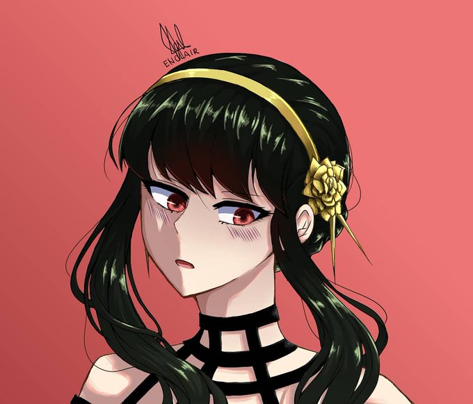


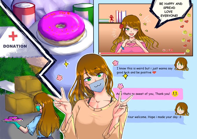
@ortamaw I used to not do it but here's my most recent one compared to my old ones lol, the backgrounds take days and I simple have no time to do it while in college.


march 2020 - april 2022
very first concept sketch of human jeydak compared to his final look. Sometimes it really feels like im not making progress until i look at some of my old art from a few years ago and compare it to recent work to see just how much ive been grinding https://t.co/9BQSJ3Ml49


put a good bit of detail into mae too so here is just her since she smol compared to da rest of da image


@_HedgeKnight Ty for the art share! I have these commissions that I worked on that hardly got noticed compared to other works I’ve posted! 😣
💌 https://t.co/b3EQNTU16S

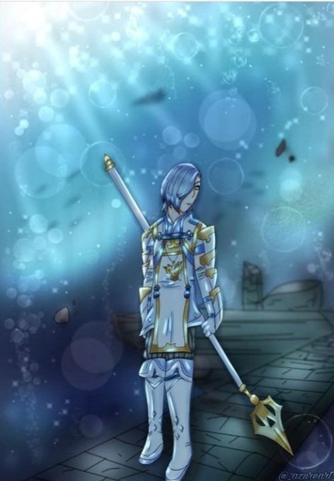
"QRT with your art improvement" except I QRT my last piece instead of repost cause I just posted it 2 days ago- Here's a 2019 piece with a background to compare to 2022! It's a screenshot of my IG post so the quality is worse oops. I really wanna redraw this Shigure piece someday https://t.co/HX3qwPYLer


Sometimes me and @primalgreene play a game where we have to try draw a fish from memory and compare. Last night we did a Halfmoon betta and a mudskipper lmao


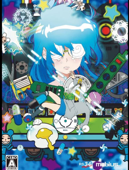
I have a couple of game creators that I always try to buy their new works, but they're not people who would turn out a decent sales figure every time compared to the ones in the AAA lables. I call it the "放っておけない List."

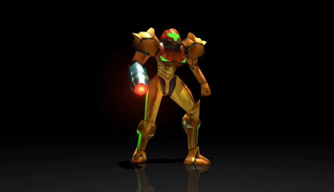
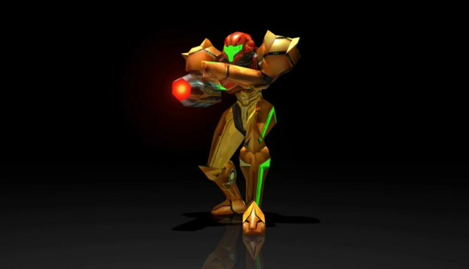
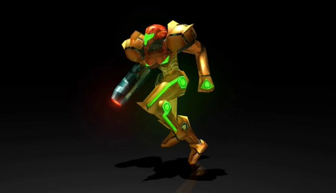
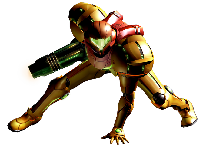
WAIT, THEY GAVE SAMUS' IN-GAME MODEL LITERAL BOOB ARMOUR IN HUNTERS??? EXCUSE ME???
Official art to compare


Sonic the Hedgehog (1991)
A sweet game to kickstart the series that I love, though compared to later entries it feels like it's missing some personality. The special stages are probably my favorites among the Mega Drive games tbh. Still worth playing, but a bit difficult to beat


pictured above compares her 2021 version to now, but this is how she evolved from 2017-2020. gabby is proof that i actually improve


My first real drawing (Stocking), compared to my latest SFW-ish drawing (Ollie).
The progress I've done as an artist. So proud of myself 😭😭❤️

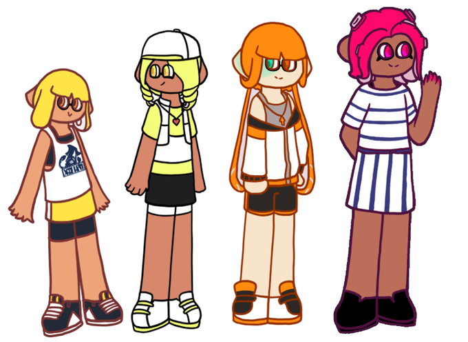

// so since all of my splatoon agents have reference sheets now i tried my best to see how their heights compared and holy shit


@Pokemon How could the others POSSIBLY compare to the power of oven mitts and award-winning smiles?
Hint: They can’t