ContrasのTwitterイラスト検索結果。 10,815 件中 308ページ目


Today I've added 3 contrast-boosting colorblindness modes
I'm not colorblind, but I... think it's working right? 🤔 (Trianopia mode shown here)
#roguelike #metroidvania #gaming #IndieGameDev #gamedev #indiegame

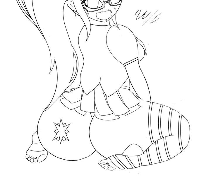


I spent more time on this Twilight design/pose. I’m still working on contrast of color and pose. So, I’ll be working on that more. And excuse the dead background once again 😅. I still had fun doing this twilight character.
#characterdesign #mlp #art #digitalart #conceptart


Fucked up the shadows and had to fix them :P basically forgot to make the shadows darker soo there’s barely any contrast


-Tao jokingly called the horn at the start if this clip an "elephant" and now I literally cannot unhear it
-I struggled with writing the end because MoRCB is only two rounds so I wanted it to end on a triumphant musical note, but that ended up contrasting too much (end of clip)

some fun trivia of the song while I play some instrumental clips:
-Main focus of the composition was to contrast long, sustained strings with short string spiccato for a tense yet heroic sound. These first 20 seconds is the first draft I showed the team.


Spring 2021 anime "Blue Reflection Ray" shared 2 beautiful contrasting PVs featuring the OP and ED! https://t.co/4OWlXvdMSK
#bluereflectionray #animenews #animecharacters #animegirls #magicalgirl #spring2021anime #newanime #watchlist


@RitzScythe I usually wing it but I guess I mostly use bright colors that contrast. For lighting I'll draw in where i want my light to head and then see where shadow and highlights will land. Then I'll just use a blending tool to make the shadows look cleaner.


man, Elias is SO done with Geoffrey's shit. It's a nice contrast to the Penders authored stories where Geoffrey could basically do no wrong


Might be a bit small as a whole picture to looks so I made cropped icons ❤️💙
I love their color contrast so much :> https://t.co/vE5rSZ9HoU


S I R C U S member's ID photo.
I make them contrast by Blue and Pink. That's so pretty. I fall in love everytime I see them * crying *
I've made them in heart badge. They're so cute TT If I found my own badge, I'll show y'all. Everyone must to see them!


[dont rt]
i didnt think very far when it came to tiz's outfit colors but maybe blueish jsut for the contrast... also i like blue


Hi Twitter sorry I keep forgetting about you ;•(
Here are two mastercopies I did for my watercolor class! This was the first time I’ve ever done a mastercopy in this medium. Look at that contrast tho lol
First artist: John Singer Sargent
Second artist: Natalie Andrewson


After messing with my logo so many times these are the final versions, when I have a black background I’ll use the right side so it contrasts better


For the two new characters, I wanted to
Make them contrast with eachother.
Such as complementary colors (green and red)


An older art of mine here, but Caroline is SUCH a fun contrast to Zach's other boi Willow, who is quite quiet and shy. She's affectionate to a fantastic fault, and a joyful performer. She brings loads of emotion and energy to every bit and story (and plenty of hugs as well.)


i still love how different the contrast is with and without the helmet haha
also yeah i changed Boss hair to a more realistic and easy to draw one, but he still has some white higlights
but yeh
look at him hahaha