compareのTwitterイラスト検索結果。 22,409 件中 310ページ目


Basic shape starting to come together on this. Trying my best to keep it fairly low poly so its not overly detailed compared to the rest of the avatar, also not super used to such organic shapes lol


I never used to understand why people would compare OP to Naruto and Bleach art wise, but after seeing alot of the colored pages he's drawn I can see why people have that take. I still think its Kubo, Kishimoto, and then Oda, but I can def respect the take alot more now


@CodedProphecy23 See this digimon here. This is Magnamon. He's a V-Mon that armor digivolves from the digi-egg of Miracles. He has high defense and has power compared to a Mega if not higher. If he's in a predicament he'll always overcome it. Essentially he's literally wearing plot armor.

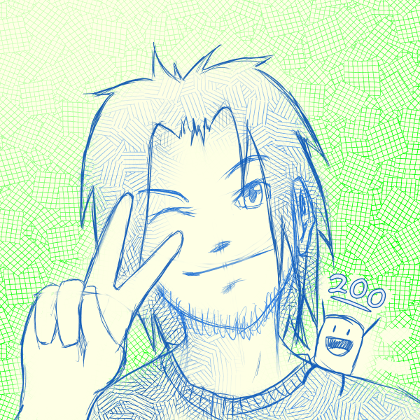

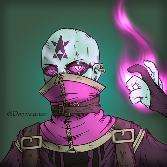

But in isolation, every year that goes by, I can look at my own art compared to even just a year ago, and say "Yeah, haha, my art sucked. But that was then, and I've improved."
(2016, 2017, 2018, 2019)


haunted by the white passing Sasha comment when he looks like this when compared to white people


i dont have any much good comparable art since my style fluctuates but ill compare the last time i did splat commissions to recent.
2018 vs 2022 https://t.co/x1auFYCJod


I found and old O L D Mecha design I made, so… Here it is compared with the design it eventually evolved into, and the Starsoarer; what I believe is my best design


these are really the best i have to compare, even if one isn’t finished 🥲
apr 2021 vs apr 2022 https://t.co/F0x0PS3mLQ


In less than a week of launch we completed:
✅400% Appreciation in $BabyApeCoin
✅More than 50% of our published collection is sold
✅Huge and very present community.
This shows that we are delivering QUALITY and compares to projects that have been on the market for years #NFT


evocatus is probably girl of the month for me.
shes a bit older and a bit more cold compared to her younger sisters

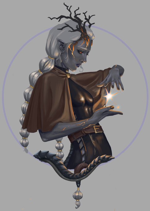
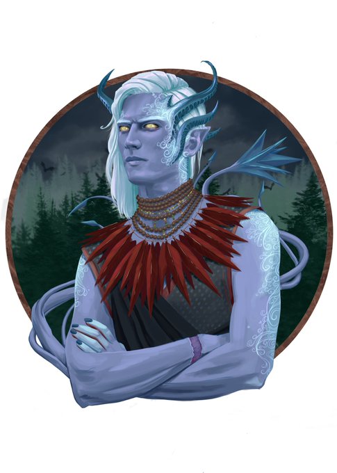
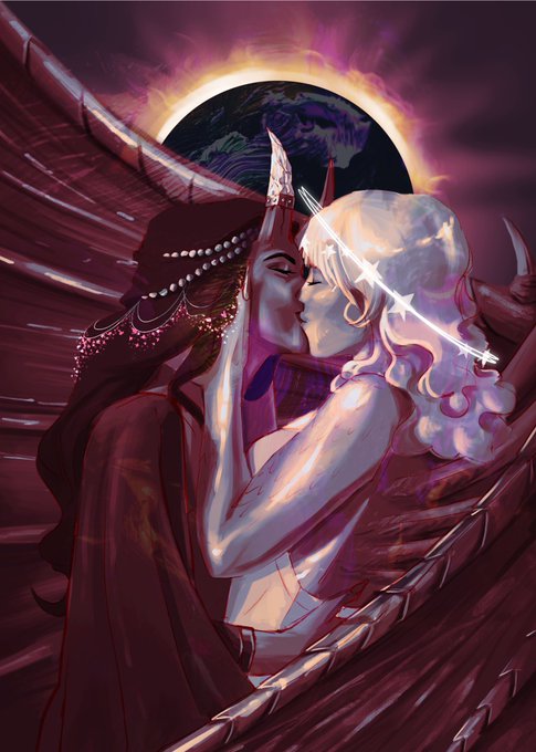
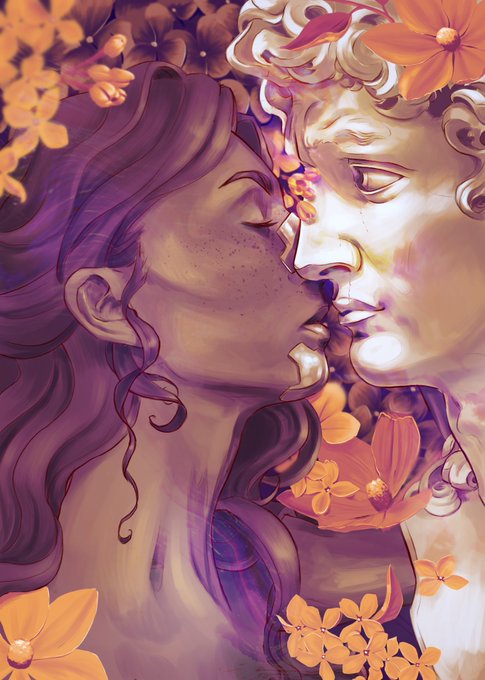
@artcher_artwork Thank you so much for the artshare! Twitter is my fav and biggest artplatform as well. FB feels so toxic compared to it.
But here’s my art! (First one just a WIP)


I WON'T TOLERATE DICKTOLAS SLANDER, C'mon It ain't that big, just look at it compared to other tiny things

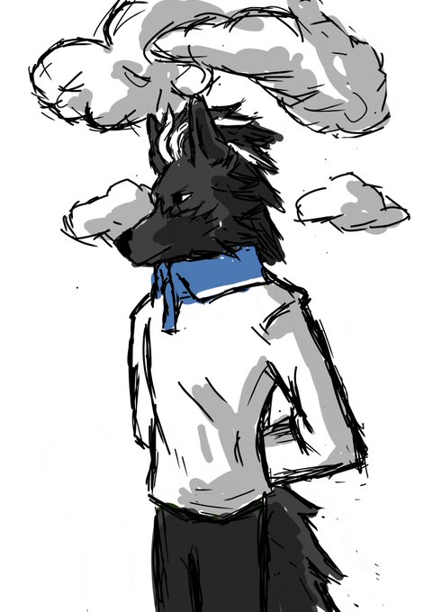
this is me trying not to compare myself to others
#furry #furryart #furryartist

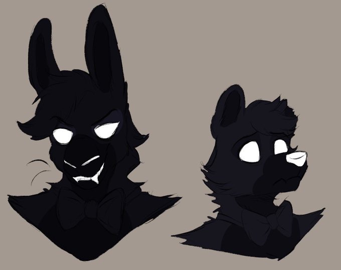
fuck it. shadow fronnie doodle to bless my tablet because i don't give them much attention compared to their counterparts.
potential redesign for their "regular appearance" to sort of reinforce the fact they're polar opposites to Bonnie and Freddy.
#fnaf #fronnie #fnaffanart


@WolfWings Yeah, but it feels too light against the other colors in contrast. Compared to this.
I gotta fix up the colors on this one too for my new pattern but eh, future Naos problem.
🎨: @/Hootaloo (I just colored it)


August 15, 2020 compared to April 19, 2022 https://t.co/W2ZdwK1zip


wanted to compare two more complicated drawings, but as a bonus here's another drawing i did of mary this year with her canon design


I really thought the city would be boring, compared to Poppy Valley.
Clearly I was wrong.
But I don’t think we’ll be using the spirit camera again anytime soon. Some things are…better left unseen.


Well let’s just compare horses!
2014>>>2022
First was for @souporhorse forever ago 🖤 https://t.co/xfUi5xKO8S