contrastsのTwitterイラスト検索結果。 780 件中 32ページ目
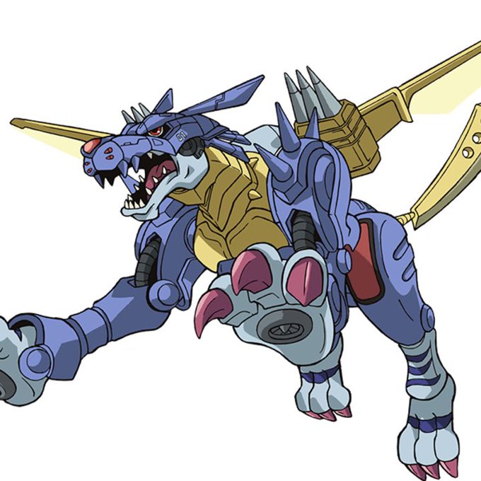
The colour scheme is dark blue, like MetalGarurumon and ZeedGarurumon rather than the original Garurumon which is an interesting choice. Red neon contrasts pretty well with the Greymon’s neon blue, the neon energy lines are also Merciful-esque.
Skage got a color and contrast update in the new chapter. Not only to freshen up the old concept but I noticed that I spend some good time on adjusting his contrasts in particular.
Watercolour is fun-Just suggestions for the non-focal elements and shades of blue suits perfect!
Colour contrasts just for focal area.
Photo reference credit - Painting references.
#watercolor #watercolour #vanidasmangathilart #art #landscape #vanidas #vanidasmangathil
@_BankArt These are some of my favourites. I just doodles this Solar (black&green) last night and I love how much it contrasts to my usual stuff 😍😍😍
@DeePeeArts I'm actually very inspired by baroque art talking about contrasts, I just love using strong lights and I think that's probably the most remarkable thing about my art. And also the lines!! I like to make my lines feel really strong and use really angular shapes in my lineart
working on updating the monorail/passenger train, the metallic & rough exterior contrasts immensely with the cleaner interior, given the brutal climate these trains travel through, i figured i'd try to capture that!
these 2 cards are so cute 😭 I prefer cuter Banris bc he seems more his age and it contrasts with his attitude
aside from his usual fashion crimes, his open shirt shtick sucks bc Omi is likely “sweetie you’ll get cold” @ him when Banri steps outside only to rip it open 5 s later
"In spite of poverty, you see people with dignity and a certain quality that contrasts with where they live and what they’re doing.”
Roy DeCarava
Photographer
Gustave Courbet once said: ‘Fine art is knowledge made visible.’
Courbet uses a palette knife and a loaded brush for the rugged cliffs and contrasts this with the smoother texture of the grass and the sky.🌊
See this artwork in the Blue Gallery.
#hellobrum #barberinstitute
for example: @_sugarbones works in a kawaii, hyper feminine style, but contrasts that with traditionally "unladylike" themes. she's also bold with her product experimentation and combines that with fanart to broaden appeal.
The Red Ribbon Army Arc of Dragon Ball represents Western culture and environments. It contrasts against the Eastern environments that Goku explored in prior arcs. The naïve Goku serves as the medium between Eastern simplicity and Western complexity. #DragonBallCultureDaily
And *of course* the war god and the demon hunter are... lovers. I remember stuffing that small story with all tropes and contrasts I could get my hands into: Height difference, fighting styles, technology vs. acient armors, colors, textures...
This is the hunter lady.
https://t.co/8Sa4ymHZk8
Doom 2 In Name Only / Doom II / Limit-Removing / 2014 / MAP01-MAP32, MAP34 / by various authors
D2INO is a land of contrasts born from the differing viewpoints of its contributors. It tends to lean toward a more representative take on the original story.
Playing with contrasts to help frame the image and guide the eye to certain points.
Maybe a bit too much emphasis on the deer.
Should up the contrast between Cuke and his background.
Still don't know if the focus should be on the Goddess(WIP) or on Cuke. 🤔
Height comparison. I like the idea of Wolf being larger, pointier, and more predatory/scary. The biker gang theme makes everyone feel a little more united, and the leather contrasts with the light Star Fox jackets.


