ContrastのTwitterイラスト検索結果。 10,507 件中 314ページ目


The One Rose cover design was handcrafted using no stock graphics. The entire design is a blend of textured and clean vector artwork. I wanted to create something eye catching with contrast, impact and intensity.


Day 29 of drawing something!
I can’t believe it! It’s been a full month since I started :00
I tried to stick with orange for the character with one contrast (the hair) how does it look?
Anyways, I hope you have/had a great day :>


The Goemon anime follows the same beats with the needed variations, but the difference is that Hattori-kun is at heart a comedy series with a focus on the everyday (more or less), in contrast to Goemon’s elaborate setting with an evil villain threatening Japan and the earth.


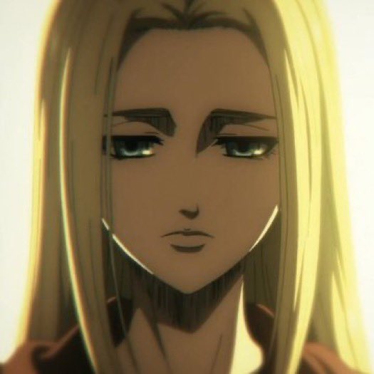
// aot season 4 episode 10
•
•
THIS EPISODE GAVE ME WHIPLASH OMG WHEN THE WHOLE CREW WAS BLUSHING AT EREN’S STATEMENT IM GOING TO CRY ok but seriously the contrast between the flashbacks and the present is just *chef kiss* very depressing but realistic I loved it #AoTSeason4NHK


Minion of Set saving humans from minion of Nibiru
#seth #egypt #ilustration #drawning #highcontrast #nibiru #anunaki

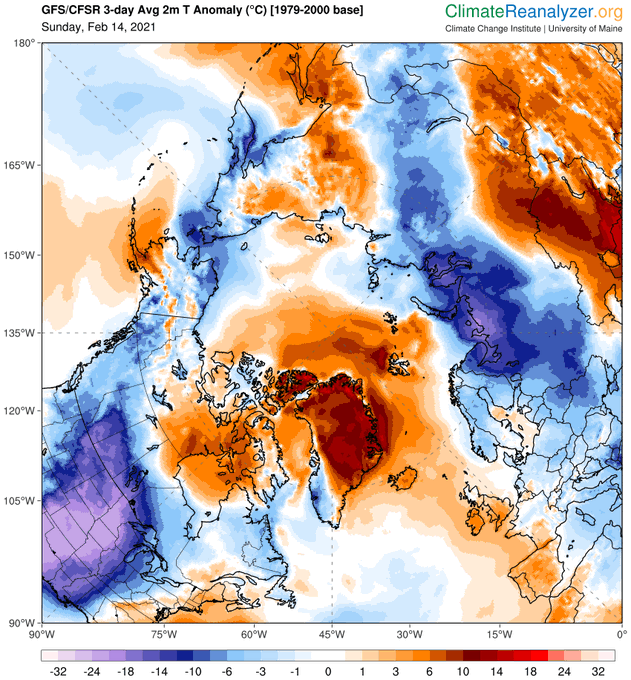
Stark contrast with most of Greenland, where temperatures are 10-14⁰C above average. Another anomalously cold area in NE-Russia. https://t.co/khw5lqVzFE


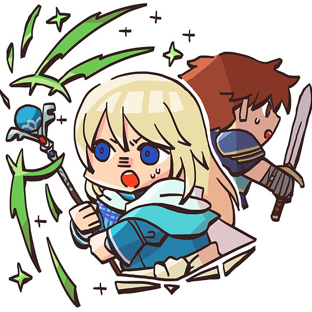


This was totally accidental since I just chose a red colour to contrast from the white bg and intended to change it back to white, but fitting for vday! We will probably never be blessed by a blushing captain but AoT Sundays > Vday anyways 😏 ready to be traumatized again


Just realized that Cera's second color palette looks like the e621 website color palette.
That was unintentional, trust me. I was just playing around with the hue and see that these colors contrast fairly with Cera's original colors.
Damn. lol
#digitalart #furry #characterart


my buddy has commissioned me twice so pls look at the jarring contrast between his #fursona VS #DNDcharacter

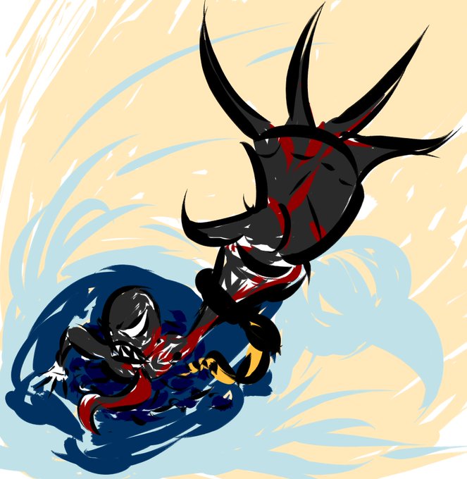
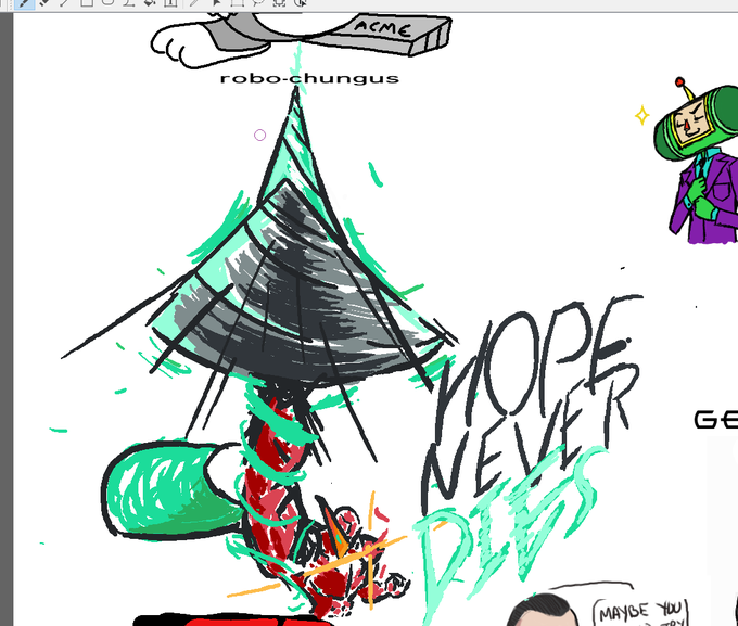
@SteP__Arts It's easy to create focal points through lines and colour contrast that drive the eye to a specific areas. Manga artists do it all the time. Though these are decent examples from her.
Showing some of my own too, see how lines can pull your eye? Or the contrast?


@zzsleeps I love contrasting features for couples

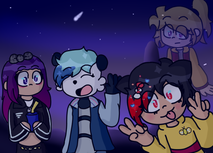
Este dibujo estaba a punto de caer en el olvido....pero lo recordé
Gran contraste de fondo y personajes
@CandyRu_ @abrichu_owo @JakomyNike


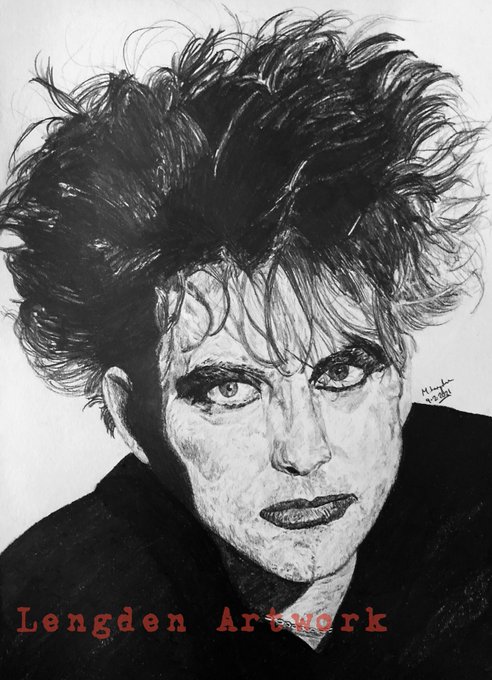
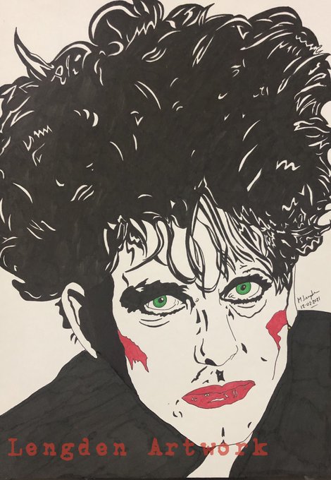
Couple of contrasting portraits I have completed this week of legend Robert Smith. First attempt at a Pop Art portrait. 👍🏻
https://t.co/sfWz60AYih
@thecure @thecure_ @fans4thecure @RobertSmith @crying2thecure @TheCureMexico


“Happy Birthday Carl” recent commission for a 75th birthday present #print. #Drawn in #procreate & contrast tweaked in #photoshop. DM for more details?
#portrait #family #present #digitalart #sketch #colour #composition #art #illustration #artistsupportpledge #arte #kunst


