CONTRASTのTwitterイラスト検索結果。 318ページ目


Coso del Jin medio rapidón y coloreado con una saturación y contraste medio kk que hice ahorita en clase de escritura. Escuchar hablar a este profesor es hermoso, y probablemente es el más dedicado de todos hasta ahora. 10/10 would recommend.
#BTS #JIN #btsfanart #digitalart

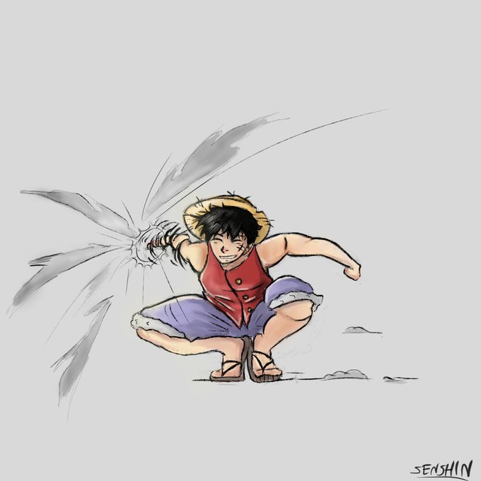
Dia 25, Luffy.
Quinto personagem que deram ser semelhante a mim. O contraste tá ficando muito mais forte no celular, era suposto de ficar com cores fracas }=

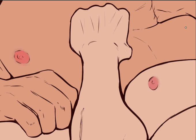
I discovered that the color of their skins have a lot... Contrast.


There's some gorgeous natural light today, great for capturing contrasting imagery like this painting by one of our @BBS6thForm 🎨📷 #spiritofbbs #lovebbsart #chiaroscuro #painting #blackandwhitephotography #MondayMotivation #homeschooling2021


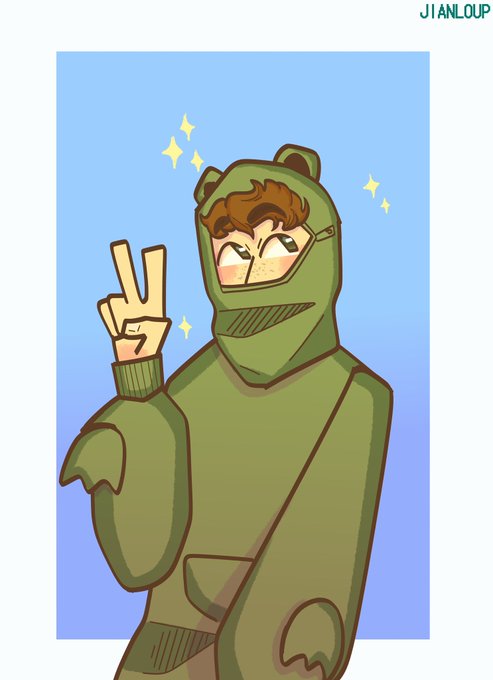
Eu miren el contraste de mi arte--
Es que Dios, se que es un desastre pero lo amo ah


A page from a much earlier iteration of #HushRonin. Circa 2017. Contrast with the second piece, circa 2019.
#art #artist #artwork #comics #comicbooks #makecomics #makingcomics #comicart.


I try doing high contrast with Himeko....turn out decent i guess
#ArtistOnTwitter #digitalart #崩坏3rd #HonkaiImpact3rd #miHoYo

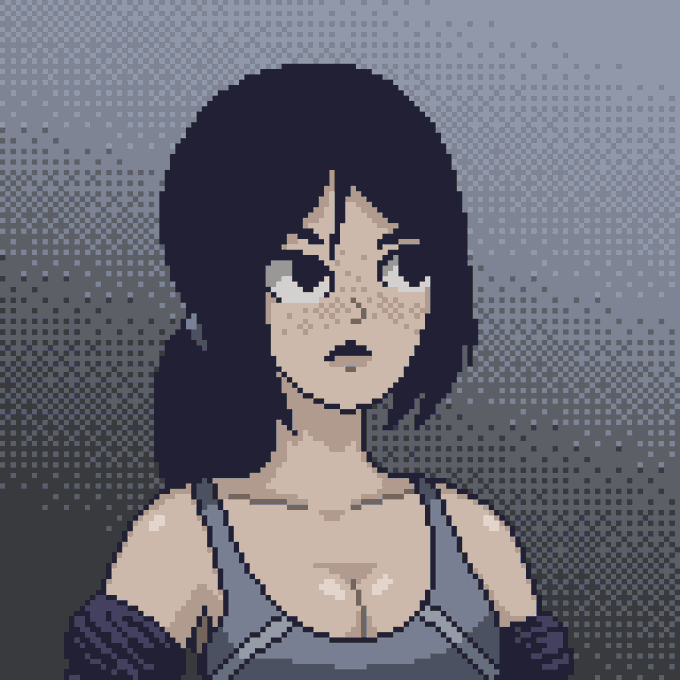

some old but gold pieces I did for followers back in Dec 2019. I thought these made a wonderful mood contrast.

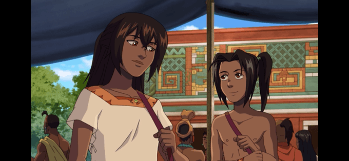
Y bueno el campeón de la humanidad. Es importante el contraste. Vemos q el niño es inseguro pero gentil, Nelli e Izel no llevan joyas ni adornos se nota q su extracto es muy humilde y siguen a un Señor generoso q les deja tener su sustento. #OnyxEquinox


Respecto a este tema de "cortar las cadenas del odio" me gusta mucho como lo trata One Piece con el contraste entre Otohime y Fisher Tiger. Y como al final, sean capaces o no de superar ellos su odio, lo importante para cortarlo es no transmitirlo a las generaciones futuras https://t.co/PLPZkXFWo5


Finished. I went for high contrast on this image, I think it went well.


#WorkInProgress #fanart de poncefleur
+ Crayonner
+ Line
- Finir Couleur (Contraste, Lumière ...)
- Retirer le superflu (Crayonner, Croquis ...)
- Modifier la forme de la tête (Mâchoire, cheveux, yeux)
- Ajouter la bouche
#digitalart #draw #SelfStudy


Le seul manga de Masakazu Ishiguro disponible en France actuellement est "A Journey Beyond Heaven" qui m'attire déjà pour le contraste entre ses personnages épurés et ses décors post-apocalyptiques qui rappellent forcément Akira. Je lis ça dès que possible !


@sw_holocron I drew this picture of Darth Vader 10 years ago - I thought the imagery of the butterflies and flowers would contrast against Vader and reflect a metaphor of peace and calm being his worst nightmare.


perceive kalama. i based him off of ayam cemani, the chicken breed with the fibromelanosis mutation that makes them so loaded on melanin that their skin, hair, eyes, muscles, organs, bones, you name it are completely black. this drawing is a little higher contrast tho LOOK AT HIM

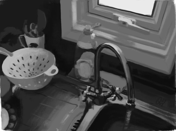
Challenged myself with a more complex scene for this value study. I like the way it “feels” and I believe it’s because of the contrast—the bright light coming through the window vs. the dark tiles. Time to go to bed! 🛌 #digitalart #digitalpainting #schoolism


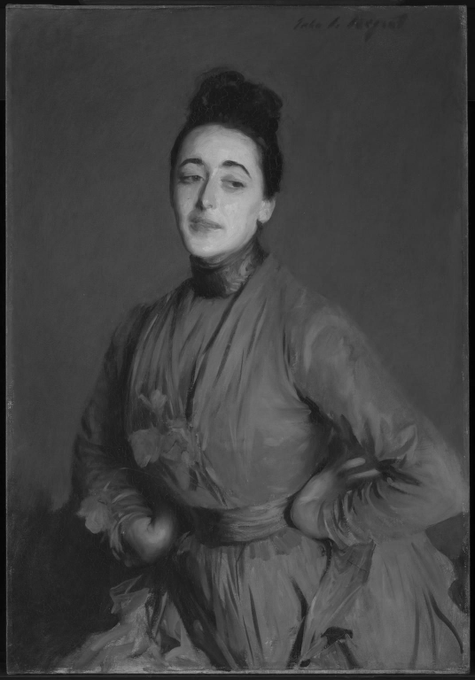

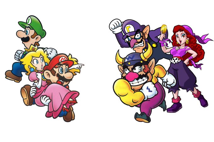
Wario, Waluigi and Captain Syrup could be the opposing trio for Mario, Luigi and Princess Peach. (Hell even their names contrast each other 👀)