compareのTwitterイラスト検索結果。 22,409 件中 318ページ目


@RinaSocietyNFT haah usually akan banyak gradient kalau pakai airbrush sebab dia ada gelap ke terang en. rina punya banyak glow jugak kan jadi sol recommend export mp4 la. tapi boleh cuba export dua2 pastu compare quality. ehh takpa tanya je banyak2🙆🏻
ni contoh: Atas gif, Bawah mp4

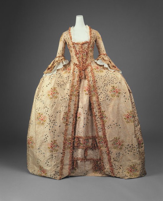


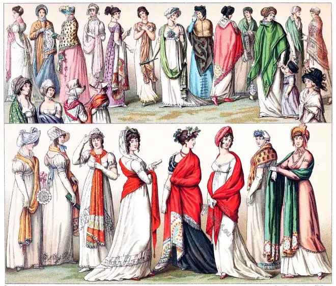
The shift of pre-death c!Ranboo always being in formal wear to reviveboo dressing so comfortably and loosely being compared to the shift in women’s dress from the 18th century to the early neoclassical era is something that can be so personal,

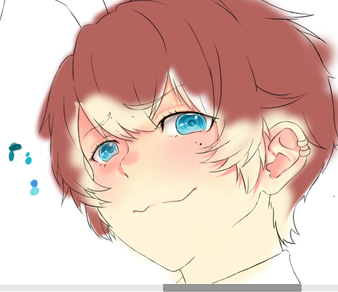
muito obrigada quem compareceu na live!! foi bem daorinha, depois de fazer os olhos eu virei uma máquina de pintura, apenas B)
desculpa não ter ficado com a cam, espero que ninguém tenha ficado muito chateado

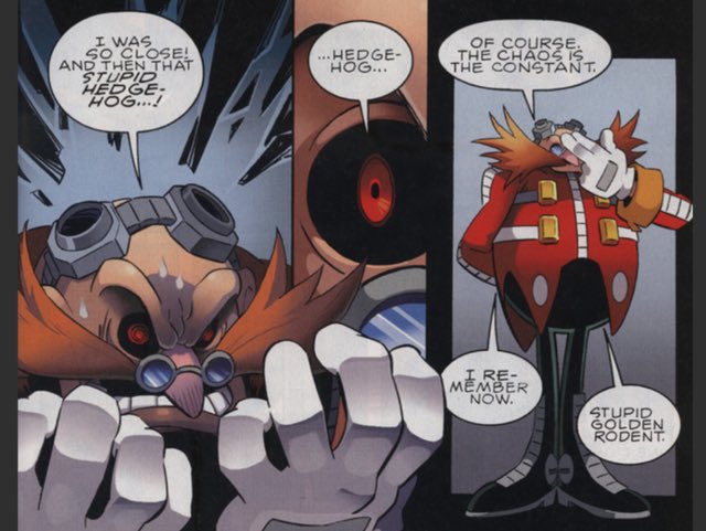
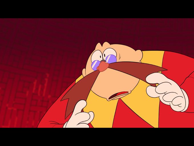
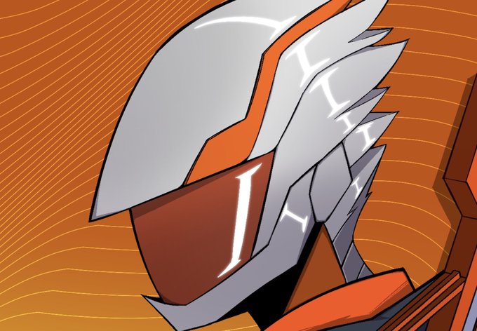
I be forgetting that I’m sonic Canon Eggman has cybernetic eyes.
Because compared to how it was in the Sonic vs Metal Ova his eyes were regular but in both the original Archie comic and other media his eyes are black.
I wonder if they’re gonna bring it back…


was drawing FCG today at school and he was compared to a skylander, a character from meet the robinsons, and a character from robots. personally i see all of them
#CriticalRoleArt #criticalrole


Caught up to the Edens Zero manga.
It's definitely in my top5 new gen. The Cast is enjoyable and mc is soo good compared to most of the new gen.
The art is awesome without a doubt.
Highly recommended, its peak fr😭.


Love what @pxlhns did with these, always fun to compare the before and after.
I wanna see your favorite #SuperPixels upgrades! Drop em below 👇


THE LEGEND, THE MYTH, THE GREATEST MALDSTER TO EVER GRACE THE THREE REALMS, @noctualittleowl! SUCH A DIVINE DEITY CREATED THE FINEST POTATO THE WORLD HAS EVER SEEN! EVEN GOD HIMSELF WOULD CRY IN SHAME COMPARED TO NOC'S BRILLIANCE! 💜🧎


The Dragon Protector 🐉
---
Mixed media piece made for a university course. Playing on the idea of a diptych piece of the outside of a cave compared to the inside.
#childrensillustration #environmentart #fantasyart #painting

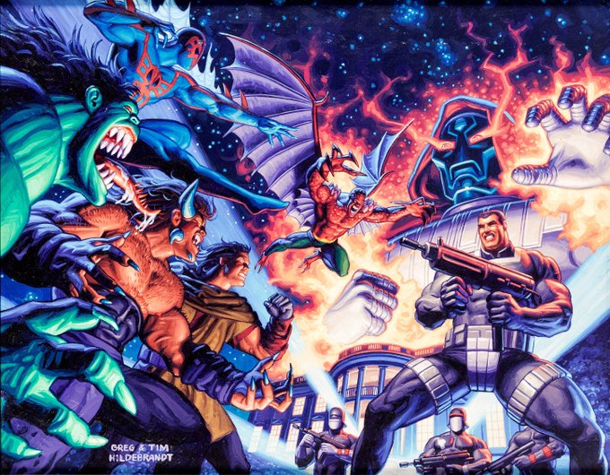
Painted cover to 2099 Special: The World of Doom #1 by Greg & Tim Hidebrandt
The 2099 comics line I enjoyed then and now, and compared to how all over the place the mainline Marvel comics were at the time, I find that the 2099 stuff still holds up.


yes i am still thinking bout how i use to draw levi’s side profile (1.5 years ago) compared to now— like?? WHAT


bonus because someone compared the cloak pattern to a donut before i colored her https://t.co/jEEWl5afwa


I think when magneto gets to the MCU . Even though they could have done this at fox. I would love to see the compare and contrast of these two guys . #magneto #doctordoom . I always felt like no one at the avengers /spiderman could add to this duo.


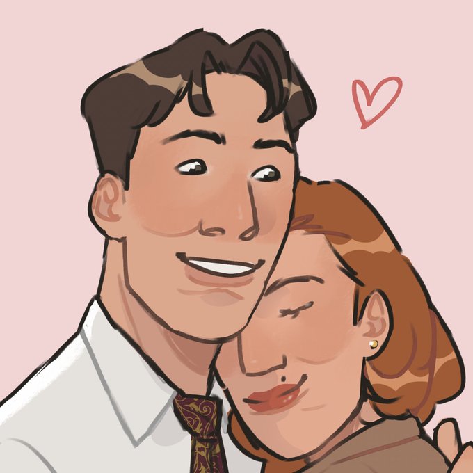


Hey, guys! Been working more on her and I'd like to know: Do these colors look good on her? Compared to the original scraptrap, of course :D

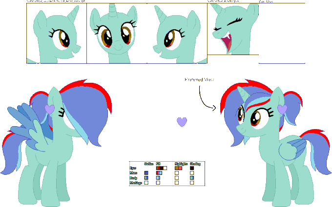
@MOCHI_nation well, here is a smol horsie, that everyone compares to toothpaste

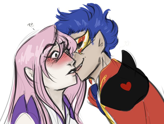

being a weirdo vs. actually trying to make amends
idk, i remembered i had a similar art from months ago(august to be exact) and just thought i'd compare


Title:Love After World Domination
Rating:10/10🎉
Review: I would say is something fresh compared to previous romance animes in the past few seasons. Has good action+cute romance. Plus the Gelato 5 Sentai Transformation Sequence is cool.
Highly recommended + blue_seal of approval


Now with them together and a comparison.
I really had fun doing this even if its not really that good looking lmao.
realism on more cartoony style of characters is just a weird niche I have for but looking at my artstyle compared to the real ones makes me appreciate my style.


Good lord, this is the 50th page and it came together so quickly compared to a lot of the other pages, haha.
I had a lot of fun with it, too.