COLORのTwitterイラスト検索結果。 33ページ目


hasdhlasdhas i hope i dont confuse myself with the lineart again when i color qvq


Kyle Osment - Yuusha Ga Shinda!
I drew the original sketch but the lineart, color and shading was the work of @alliumlab.
Thank You!! you did an amazing work !!


月と夕日(水面普通に青いver.)
ホワイトワトソン水彩紙SM
ターナー透明水彩
ホルベイン透明水彩
高反射率法
#透明水彩 #WatercolorArt


Colored Doodle
Ursula's claws are a bit of an experiment for her, although she dabbled in their use in her younger days, she only recently started using them as her primary weapon.
"I like my fights up close and personal!"
To call them close range weapons is a little...


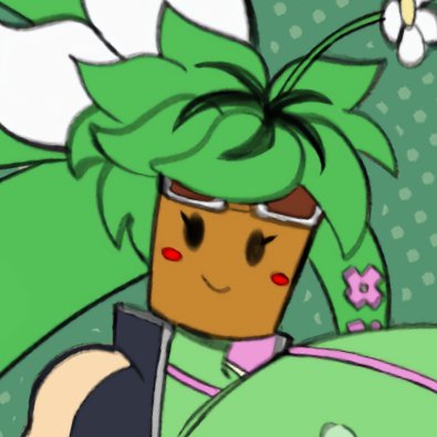

Tried coloring Kanna (again)
You know where to find full ver. 😉
#BlasterMasterZero #ブラスターマスターゼロ
#BlasterMasterZero2 #monstergirl


#今月描いた絵を晒そう
もう9月も終わりか…今月はあんまり普通の作品描けてないんだな…なんかいろいろ忙しい…
#WatercolorArt #透明水彩


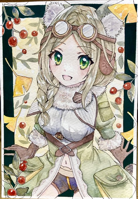


The final poster and unused sketches. It helps to flesh out your concepts in value and color to fully understand the composition. In the end I went with the final because I wanted a more detailed piece for my portfolio, but the others would have been cool too!


"Oh you're down there it's true ! Enjoy the night loser !~"
finally attacking with some big coloring again. Different workflow this time !
feel free to dona on kofl or on patr for supp !
#Sizetwitter #giantess #巨大娘

月と夕日
ウォーターフォード水彩紙F6
ターナー透明水彩
ホルベイン透明水彩
高反射率法
#透明水彩 #watercolorart


i decided to color this sketch~ trying out a more simple and but faster coloring than usual.
also bratty kibbochi is starting to grow on me.