ColorのTwitterイラスト検索結果。 1,022,021 件中 33ページ目


君との時間…余韻
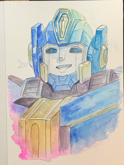
写真じゃ伝わりにくいのが高反射率法のツライとこだけど…これが一番自然な光を感じる。結局これが僕にとっての正解。もう分かってるんだけど寄り道しちゃうよね〜今は捨てて行く段階なんだよね。
ホワイトワトソン水彩紙F4
ターナー透明水彩
ホルベイン透明水彩
#watercolorart


@RyderBB123_ https://t.co/lgcmC6aCBQ
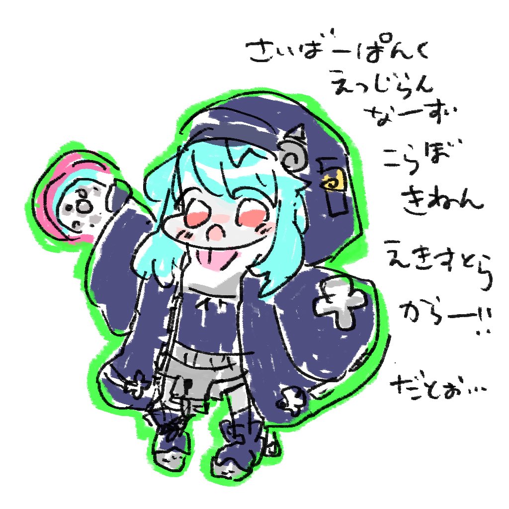
she was on an older color wheel so im avoiding any vtubers ive drawn before

Not sure she'll ever see it since this is being flagged as "sensitive media" for her so i'll send it to her but pink goes to Fraiki!!
okay for the next color i wanna do purple! so go ahead and suggest purple vtubers please 💜
#fartki https://t.co/59O7Hr0PjB


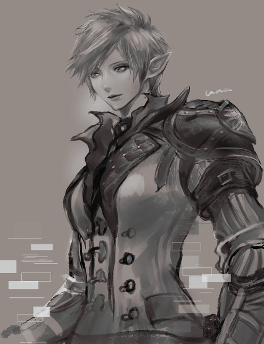
practicing choosing colors following values instead of hues
as long as the value is consistent, you can use colors that aren’t similar together for more visual vibrancy

君との時間
(低反射率、ハイコントラストver.)
ホワイトワトソン水彩紙F4
ターナー透明水彩
ホルベイン透明水彩
#透明水彩 #watercolorart


I post this coloring for show im alive. Enjoy it 🔴
[Art by @dezzy_draws]
I made a version without the yellow filter so you can better appreciate the colors and shading.🎨


君との時間
ホワイトワトソン水彩紙F6
ターナー透明水彩
ホルベイン透明水彩
高反射率法
#透明水彩 #watercolorart


These inspired me to draw my own container cargoship lol
Might color this later probably 😬
#spaceship #illust #イラスト #scifi https://t.co/G0cOAC3knx


New Book 【F05.06】RakugakiShitagariya
【PRECURE toys, capsule toys, candy toys, drawing book 1】
B5/20P/1000JYP
*Analogic colored paper .Postcards.Please confirm the name card card at the venue on the day.
#レイフレ33
#レインボーフレーバー33


