readableのTwitterイラスト検索結果。 912 件中 33ページ目

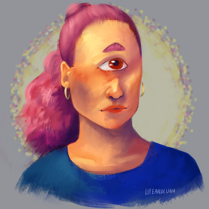

A soft angel for @NokiryArt ~ I was really pushing the colored light/shadow in this one, seeing how far I could stylize these colors and still keep them readable.

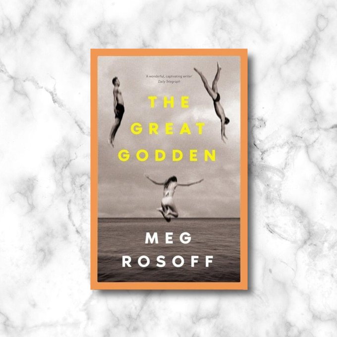
#TheGreatGodden (YA) by Meg Rosoff, @KidsBloomsbury
Out Now!
"Sophisticated, seductive and smoothly readable, this is a summer story par excellence, and a coming-of-age tale for all times." @JoanneOwen, Expert Reviewer
https://t.co/QrKAVZoq2S
#bookrecommendations #teenreads


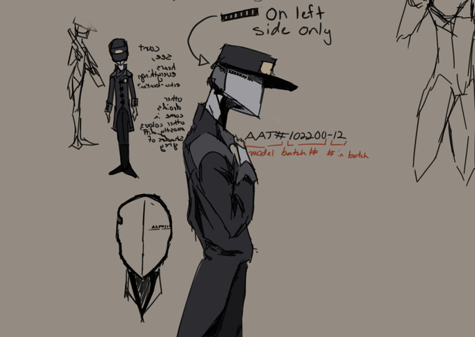
@Protodude The sprites clip on the edges and appear on the other side pac-man style, so I did a quick reconstruction by to make the sprites more readable. Moved some stuff around, but this should help the inevitable animator who'll make a run cycle.


these two get a combined post because individually they're........ fine. together they are unreadable and insufferable and the worst thing to happen to homestuck


EmiMaxwell do not look, but like, anyway, I'm trying to decide if I like the shading or not so I'm just writing stupid shit on the side with my unreadable handwriting


Last Shantae edit I swear
Moved her nose and mouth up a bit, adjusted the right hand to be a bit more readable, and shrunk the hips a little bit to make them seem less disproportionate


I realized this looking back on my finished pieces as of late, and preferring the unfinished sketches in the end. Something about my tendency to render and reshape what already looks clear and readable ruins the piece halfway through


Lil half hour sketch for Cheesy for a commission in the vinerealms style based on a design by @leoninyourmom !! I wasn't gonna post this anywhere but I'm really happy about how much faster I've gotten lately. It isn't polished by any stretch but it's at least readable!


the entrance 🌿#WIP this is probably a rare time where the sketch is not practically unreadable 😂


Page 3 is done for @TajohSpecies
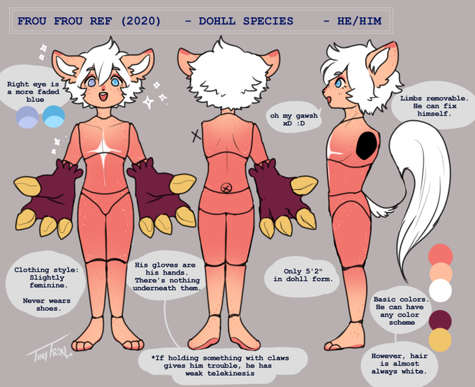
Phew this took months to finish this. Some more lore to the species and its honestly a lot of fun. I really hope it is readable. ;w;
Here's better quality: https://t.co/fB4fjYMPSw
No retweets please!

Some doodles for a character design so far, the text on the far left is unreadable because it's backwards lmaoo
#sketch


Big thanks to my artist @Toraraka_Toka for making my stupid jokes readable. Here are some comparisons of what Trouble Takers would look like without him:
#CelebrateCANVASDay
#ArtistVSStoryboard
#webtoon
#comics


e.e I hope this is readable now. Sooty has a very bad day, running into his ex, who doesn't seem to be too happy that he's been cheery lately.


joining in on the #NobodyArtistClub I draw mostly cute girls and furries, I have one finished Comic that's available to purchase, is readable weekly online and on webtoon! and have another big one in production!


Purchase a copy of Hester Lynch Thrale Piozzi from your local bookshop📚 This is an eminently readable compact biography of a particularly colourful late eighteenth-century personality. A welcome addition to the Writers of Wales series. #ChooseBookshops #lovereading


the body paint is kind of annoying in how it makes the underlying base more unreadable


increasingly unreadable wips started today (wasn't able to start the speedpainty thing, i'll do that tomorrow)