ContrasのTwitterイラスト検索結果。 10,815 件中 321ページ目


Very pleased with the overall look, the contrast in colors, and the details on the characters face. Enjoy! #art #digital #painting #365days #365paintings #procreate #character #characterart #sketch #illustration #woman #hair #hot #gold #tattoo #tattoos #light #geometric

First manga VS Favourite manga
Quite the contrast https://t.co/4YliPgxchL


@CHEEZYDACLOWN Generally I went along the same path. I was always frustrated by the love of ssj4, being that it has no functional differences from any other form of super saiyan. So I thought having it be primal would be great. It also created contrast with the usually reserved Rada.

Mine goes paired with my partner's one who's the god of death. (i dont wanna type it all but theyre soft n comforting in contrast to my harsh and dark lol)

The contrast of colors I picked is so horrible, I need to tone down SQH’s skin haha


Original art by Ito, the ingame model and a reimagining by oddjorge on artstation.
Now I'm not saying that reimagining is bad, it's very well done- but personally, I think making the design that explicit and clear also makes it lose something. In contrast, here's some Bacon


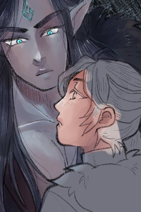
Just changed my profile pic because I miss my OTP and I just love the contrast between their human form and their BOW form in the banner 🥰🥰🥰
Pfp by @syrinqa
Banner by @PetrichorCrown


absolutely obsessed with this panel and their contrasting aesthetics


I want to update Zoras design but also I like how its highly contrastic to Vesnas design. Its fiery but also contrasting with black and red scheme. I also want to update her design that was inspired by bearded vulture not to change it but to polish it


@GiganTheAlien It was at first brighter but that made his skin look like plastic, less contrasting highlights work imo

@nikkieviore @moosukii Thank you so much for the opportunity 🥺🥺
I love this style omg the contrast is gorg

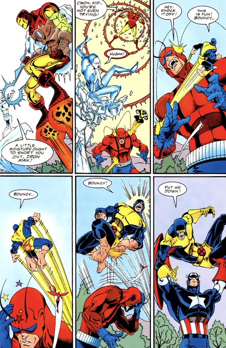


“PUT ME DOWN!” “BOUNCY!”
Let’s compare and contrast the tone of comics over the decades, shall we


Artist 🔮 plainity @plainityy
i love magical girls, miku, the 2000s and cold colours/dark settings!!! ive been working on my colours a lot and i love to do contrasting images like anime girl + dark night... my trademark is the moon and visible brush strokes!


@artofprefeito Here's a mad one, old oil painting (2014) vs new oil painting (2021) and the first tattoo I did (2019) vs a newer one (2020) . With painting i've gained a better understanding of depth and contrast. With tattoos i've developed a stronger skillset, clean linework and clean colours

I’ve been drawing for years and tbh my fav still remain M&F cp. The contrast nature between a male anatomy and a female anatomy just really satisfied. The height, hands, eyes, hair, etc. the lineworks of a male and a female are on an opposite spectrum


Our new series is an experiment.We are inspired by G.Richter his monochrome works. In contrast to conventional painting, which is only flat on a two-dimensional surface, painting in 3 dimensional space still develops depths, shadows and light. #ArtistOnTwitter #bülow #artwork