neckのTwitterイラスト検索結果。 321ページ目


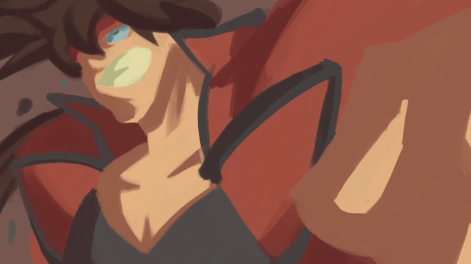


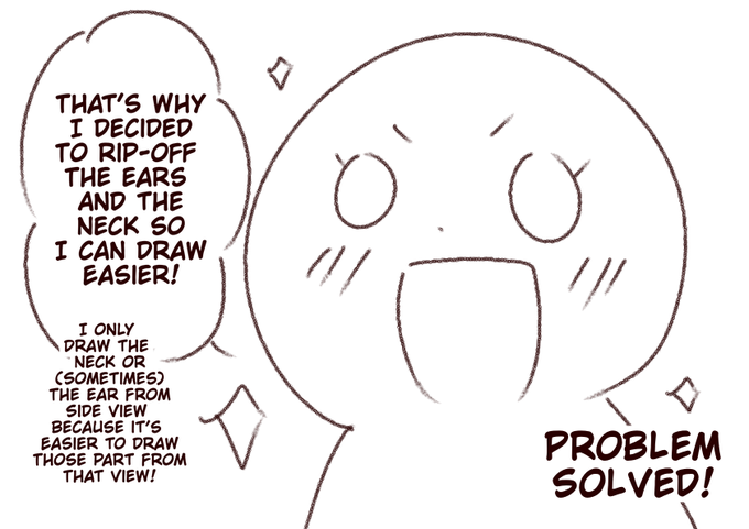
The reason why I never draw the ears and the neck from front view :


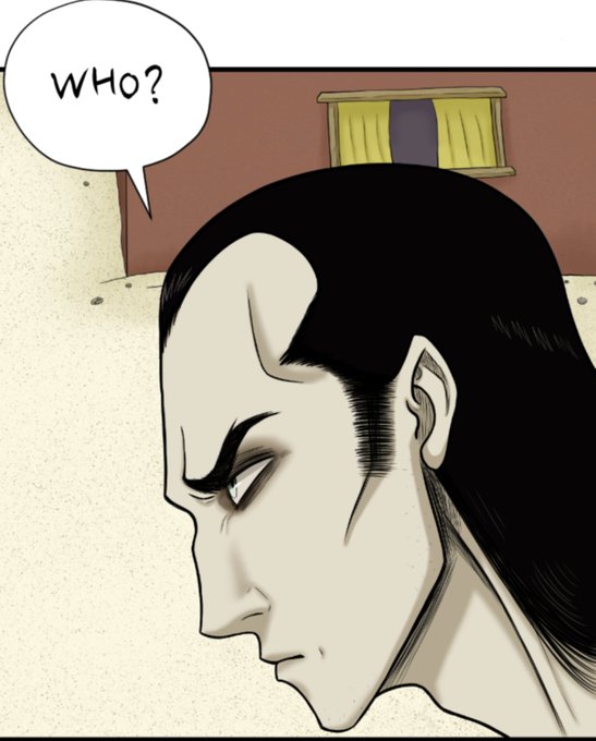
@VermillionWorks Even though my comic is in color, I like to do some hatching, like you can see here on the neck, inside the ears, around the eyes. It just creates a look I'm fond of. I have seen a few other creators do it too. It can add a neat effect.


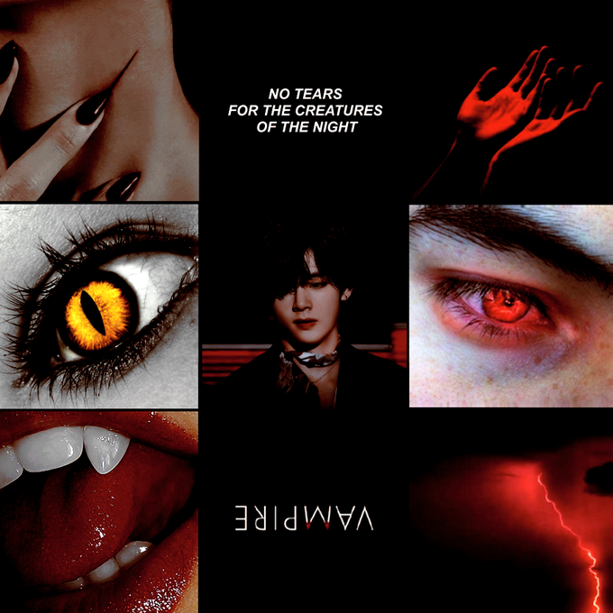
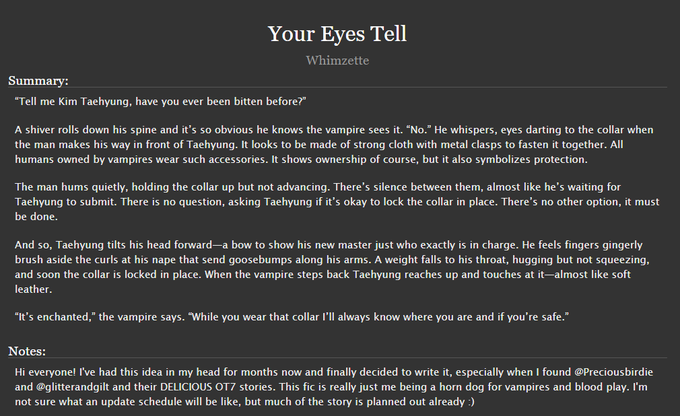
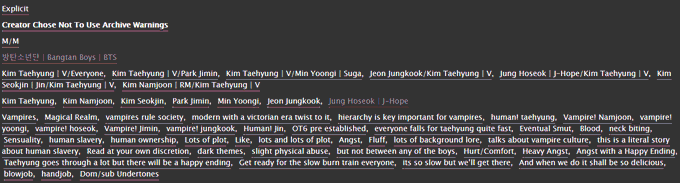
│Your Eyes Tell │
• 119k
• Modern Vampire AU with a Victorian twist
• OT7 w/ Taehyung-centric
• Angst, fluff, smut, magic,, neck biting, human rebellion
• 23/?
https://t.co/UF75Fqb6Za


// blood , guns
he’s kinda… yknow:.. looks around scratches neck… he kinda ahaha.. smiles


'Death Punch' (Failure Event2) 'Broken Neck'
(Test Animation)
#gamedev #indiedev #animation


Officially done with batch 1 commission. Batch 2 commissions ongoing 2/4.
[🐰] Pls do not trace or steal my arts or I'll take your neck-
#royalehighcommissions #aakirin #Commission #art


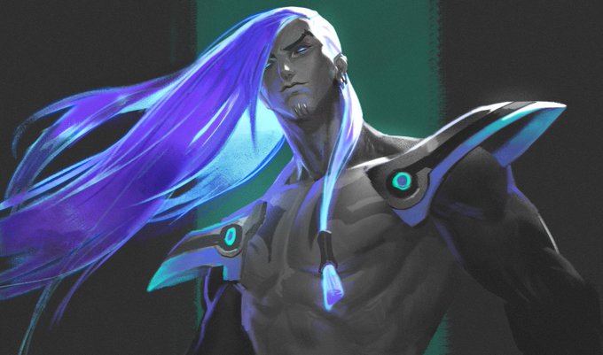
Twitter's internal manual crop made his close-up blurry. Here's a better one.
Also fun fact - without the plants and the coat, his neck is a little too long. The coat visually raises his shoulders so he looks fine with it.



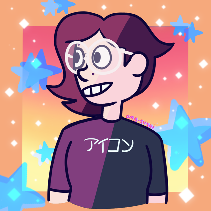
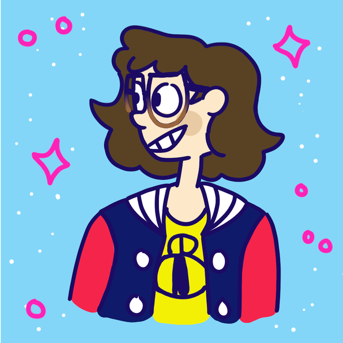
Btw you can see the influence of that version 1 design in this icon that I was using on my socials for a while
Looking at my youtube icon again, idk why the ear is so damn high. And I liked my avatar to have these really broad shoulders, but the neck looks so whack in that pic