contrasのTwitterイラスト検索結果。 10,762 件中 325ページ目


The touch up can be easy/hard depending on if you know where might be lacking and how to improve them
I highly recommend the the color correctors such as the hue/saturation/tone/brightness/contrast sliders
Filter layers can be used to change the overall mood of the piece as well


I just scrolled down my profile and I thought the contrast here was hilarious lmao


2/ I try to respect the values I choose at the start because they are important to the global compo. I want the viewer to focus on the girl, then on the cloud. So I chose bring good contrast with her dark hair, and came the idea of this glowing flower bringing light to her face.

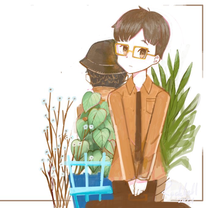


I went to the trouble of coloring this spinosaurus on a multiply layer, but I think it took away the good contrast of the monochrome one
#spinosaurus #paleoart #procreateart #digitalpainting


➤ “Naturaleza muerta con lámpara”, Fernand Léger, 1914, @museoreinasofia
➤ Léger lleva su estilo cubista casi hasta la abstracción, en una serie de pinturas tituladas genéricamente Contraste de formas, basada en la disparidad visual entre discretos volúmenes geométricos
🧶 /FIN

@RandolphPinckn3 @GymLeaderEd Thank you so much for the tip!
Definitely a hidden gem and I have featured it before 🙌
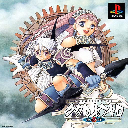
Probably one of the biggest cases of people missing out on it because of the misleading cover art.
Just check out the JP cover art for contrast


Finalement jvais mettre la version plus contrastée elle est plus jolie!

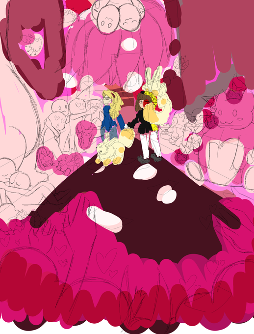
Hey could I get some feedback concerning the color pallete of the background and crowd? I want it to be monochromatic red/pink, but I'm not sure if the contrast is strong enough compared to the main characters (in the middle)
Feel free to offer some color suggestions!


This spring, learn to draw voluptuous stroke-endings, unusual contrast, and exceptionally lavish forms #SpencerianLettering w/@TypeLettering April 10 & 11. This workshop is filling fast. https://t.co/X9uCi9pnvT


🐺DISEÑOS DISPONIBLES PARA TATUAR🦄 He decidido hacer una especie de serie de esta temática de espinas y contraste de colores para tatuar, están híper tirados de precio ya que me encantaría hacerlos para mi portfolio! Así que si me ayudáis con l discusión sería una pasada 🙏💖🔥


[OC][ART] Contrast that players show me when they ask for character art, i absolutely adore this via /r/DnD https://t.co/Ybu4WD7PSg #DnD #rpg


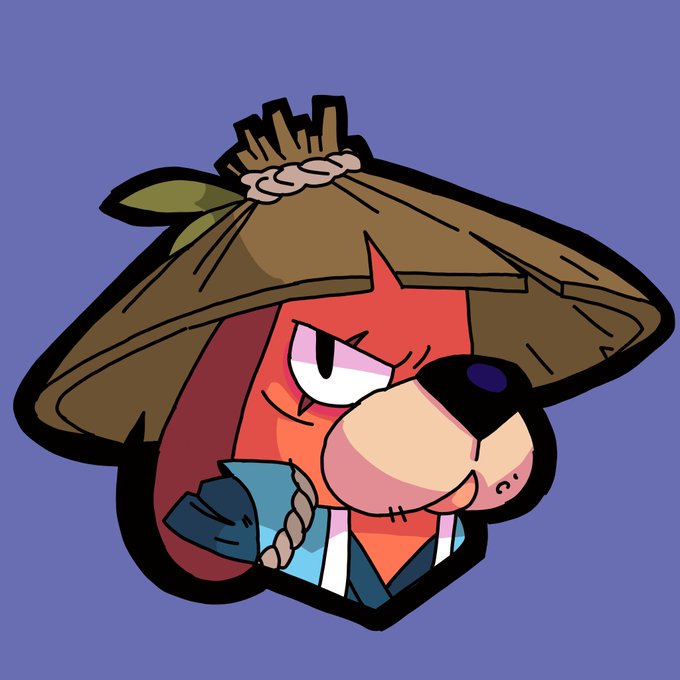
Ronin Ruffs rework/ redesign, cause i thought the original skin design was overkill and looked like a someone trying to be badass but failing horribly , and i also made him into a more traditional looking ronin/samurai as a nice contrast to his base models futuristic design


Feb 22, 2015. By: Alisuki
[10 Yeahs!] [0 replies] (EU)
https://t.co/UdY6MxhRih
"Alice:Jack q mona es tu verdadera cara ›ω‹Jack:Jaja!no enserio dame la contraseña(es q en la cara hay una marca contra.^^)¬˛¬"


a concept i forgot about -- valhalla units to contrast the hel cohorts, whose bodies look like they're made from stained glass. aka i'd like to see laegjarn again
[#FireEmblemHeroes]


1. technical design - 3/5
not enough color contrast when its so small on the site. the orange is too light for this design to work at such a small scale, the colors just blend together. there needs to be better shape language in general-


@beakfriends Have you played Mystery Room? Because I was surprised how much I liked that one. Really loved the contrast too, of Alfendi Layton (slovenly, possibly lying about his upbringing, weird personality issues) and Layton (gentlemanly, kind of emotionally checked out)


Coso del Jin medio rapidón y coloreado con una saturación y contraste medio kk que hice ahorita en clase de escritura. Escuchar hablar a este profesor es hermoso, y probablemente es el más dedicado de todos hasta ahora. 10/10 would recommend.
#BTS #JIN #btsfanart #digitalart