comparisonのTwitterイラスト検索結果。 22,141 件中 326ページ目




@maartengm I have the .pdf of the book on my desktop but still have to read through it, here is a render with explicit sampling of point lights, far less noisy. Might do a comparison with mitsuba later


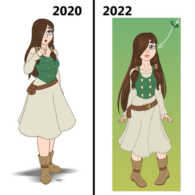
Here's a comparison between the one I drew in 2020 and the 2022 version. https://t.co/QzOyFcvivs


there are a lot of different styles used in the cards and this is comparing that one specific style with this one specific style because they're both kind of similarly backlit situations, but part of it is just that it's much less muted in comparison maybe

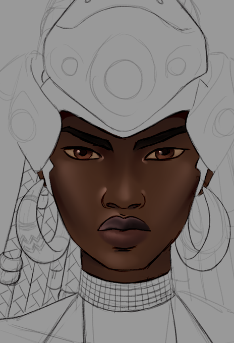

Comparison between the more refined coloring (still in progress) and the palette test 💜


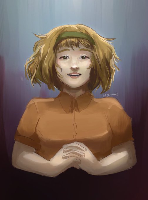

For comparison and I absolutely love that panel 😭#blueycapsules #blueycapsulesfanart

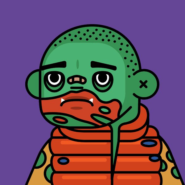


Today's comparison is my new #neo16bit art this week!
#worldofillusion #sega #disney
Follow me for lots of vg fanarts!


Comparison of old and new art of my favourite duo, Asher Furlan and Ruth. ^^ Asher's hair and moustache look so much better now. XD



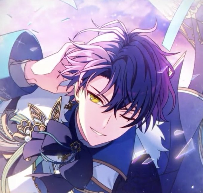

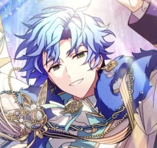


Here's a direct comparison. I wanted to make it a lot more appealing and bright than the last one's muted colors.









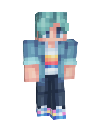
so silly i had a friend send me this, someone thought the skin i made for her looked like scott smajor because i Also made scott smajor's skin LOL here is her skin & smajors for comparison. they do look very similar


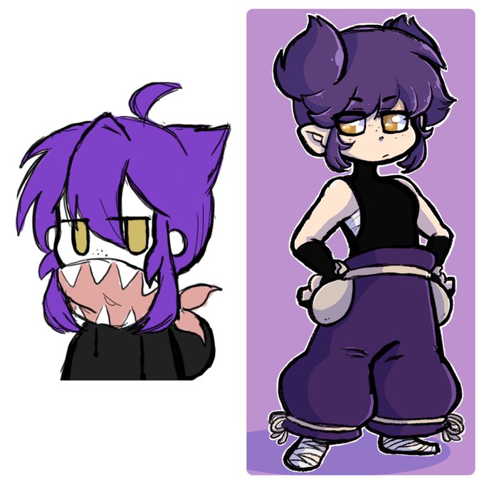
Comparison between drawings a year apart. The wip on the left is very recent, and the second was from last year. I’m glad I made progress, but I want to get even better over the summer. Also I don’t know how to draw pointy ears.