LightLのTwitterイラスト検索結果。 327ページ目

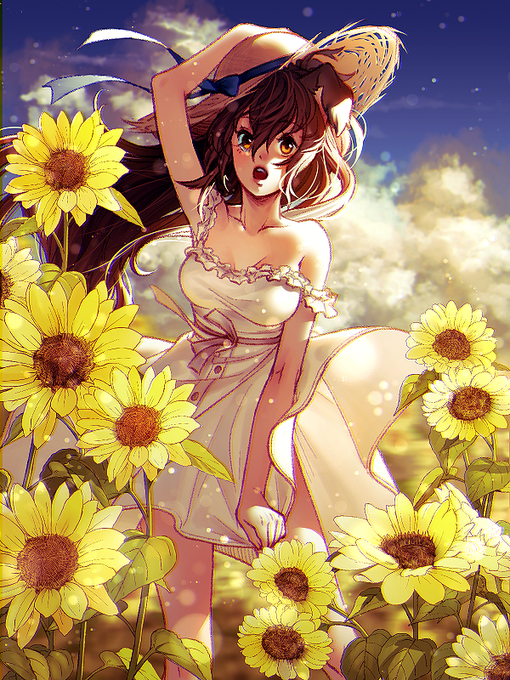
Would anyone be interested in slightly discounted half body commissions with a detailed background? I want some background practice but my head empty and brain smooth - price will start around 300 USD
Feel free to reply here or DM me if so!


Slightly refreshed Captain Shuu's face just to see how much (or how little) my face-drawing style has shifted in 4 years :3


A warrior, world weary and longing for respite, rests against an aging willow tree.
Beside him Death stands tall, her gentle caress on his brow as feather-light as her midnight robes. Ever so slightly, he leans into her touch — he welcomes the peace she offers. https://t.co/kjfWeNp7Db

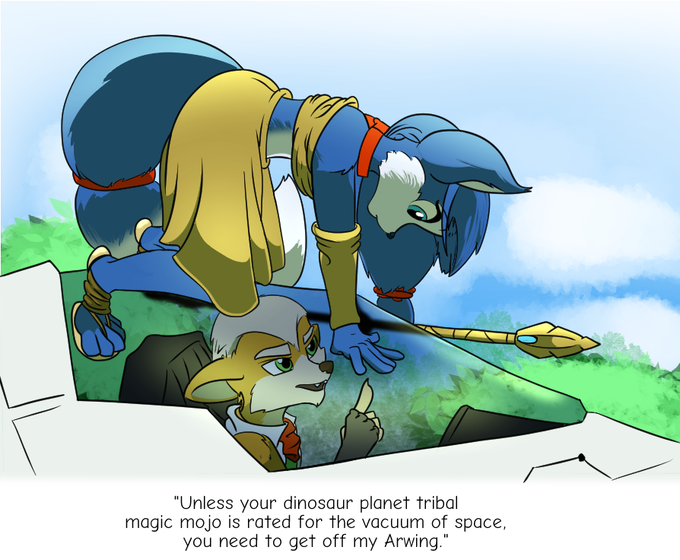
"Open Up Please?"
Just a small project for fun this Sunday evening- A theoretical interaction with a slightly redesigned Krystal.
Might have to draw her again later- Especially since I accidentally lost the source file. DX


84) Office Affairs (2019) - Yuni
And another (slightly less) Smut Yuri that I got on a whim. I'm happy that Yuri-Manga are getting more and more releases here in Germany, but I'd really wish for releases with a bit more variety in the storylines...
Besides that tho a good read!


2021 Version:
Slightly over 1 year ago.
Time Taken: 19 Hours


Playing around with a slightly different rendering style. Ft. DrMadFellow & RiezaK, both are Twitch Streamers.
#art #ArtistOnTwitter #illustrations #fanart #OC #hollowknightfanart #hollowknightart


Comm for: https://t.co/WxRnYwibu2
Matt's got a slightly new look and an updated ref! Make sure to give him...wait...her? Uh...him the proper respect!
Timelapse video link: https://t.co/XXNXYHHwwe

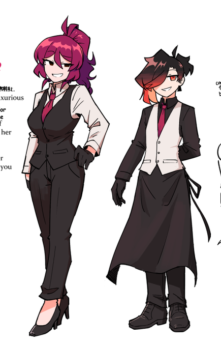
for anyone curious, heres a little height comparison
without her heels, ayuko is just still slightly taller than atlas


Just Sira and the star light, drawing something that makes me feel slightly better...


https://t.co/N7GTsOvFws
slightly slanted (upturned)
#NFT #NFTArts #NFTCommunity #opensea


Thank u for the tag beautiful!!💖🪶
Went slightly based off of my lore for this one uwu I think it turned out cool!!
I'm tagging @CatboxDani, @jinxsin_ & @rikathorn if you three wouldn't mind 💖🪶 https://t.co/ZBLbLBI5vD


Male Miri flexing his exorcist magic… btw, doesn’t he look very almost the same as me? Only difference is that his hair is slightly longer, and he usually has a ponytail!
#ENVtuber #Vtuber #VtuberUprising


@eCoLoGy1990 @worldofwomennft My WoWG + 50% of the WoW derivatives I made. I'm slightly addicted to drawing WoWs