CONTRASTのTwitterイラスト検索結果。 329ページ目


Wonder Woman Rebirth spoiled us with such great artwork right from the start. Great rotating art team of Liam Sharp/Laura Martin and Nicola Scott/Romulo Fajardo, Jr. Contrasting styles that work so well with their side of the story.


two days in a row and how his reaction contrasts it shows the harsh reality of their relationship. He springs up like a puppy, gets dressed and happily rushes out. In the panel where we see his reaction to seeing SH, he’s all happy, flushed and excited. Now, SH immediately gets

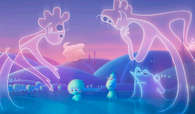
Soul (2020)
Otra película de Pixar que explora el tema de la vida y lo que viene después. Los Jerrys son lo que más he gustado por el contraste estético y el tipo de humor🙌


✨Happy New Queers ✨😌 meet Dee (on the left) and Jaci (or, more often used, Jackie or Jack, on the right) 🥰
✨Dee is a trans woman
✨Jaci is nonbinary
✨They’re married 😤😭🥰
I had a lot of fun with the + the contrast between them! #art #trans #nonbinary #characterart


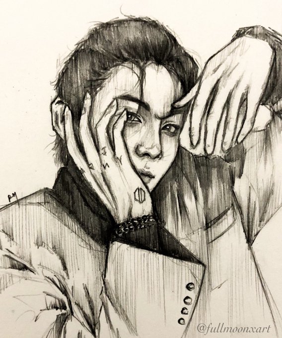
@fullmoonxart Yes you did! Like look how many more details you started to put in, and the way you got more bold do work with shadows and contrasts!?! And your line work!?! Your art was already amazingly beautiful to begin with, but you managed to make it even more stunning! 💜💜


no but this poster goes so hard like the contrast in colors, the swirling designs, the homoerotic enemies to lovers vibes of it all...yep yeah


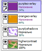
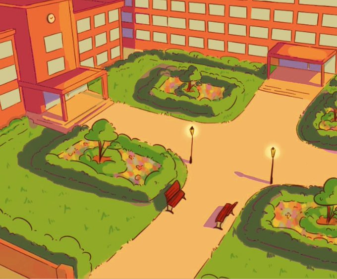
@cybervalkyria my go-to would be one orange and one purple layer on overlay mode
you coud also make the picture a bit more contrasty, and add purple/blueish shadows
good thing about this is you can play around with the order of the layers and adjust their opacity
hope this helps! (。・∀・)ノ


@ChocoRune1 Hiiii! I'm an anime artist trying to grow an audience on twitter hoping to leave instagram one day, currently obsessed with Genshin Impact, love to draw cute girls and boys with vivid high contrast colors ✨💕


Wanted to draw Crystal and Nemesis together doing a rainbow party on Neme's husband, Opeitos! Also, Neme's now darker because its a great contrast with her colors 💙


"The sheer contrast of her chic paper doll style with the psychological horror present in [MAIDS] is unnerving, lingering... @nurse_nurse has nailed glam and, when she feels like it, terror."
These are the best artists of the year https://t.co/BCNWVS2KO7 @fantagraphics


First drawing of 2020 vs last drawing 2020
I find the accidental contrast humorous.


In contrast to yesterday's here's our little friend is front and centre -Coil. Oils. Wildborn series.
My artbook launches on 2/2/21. The preview is here: https://t.co/PiVHZkmR6E #wildborn #dragon #dragons #dragonart #dragonpainting #dragonartwork #dragonartist #fantasyart


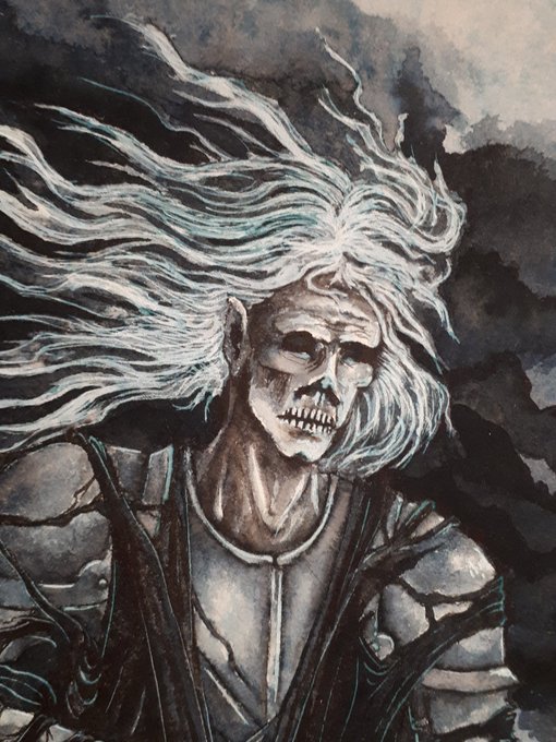
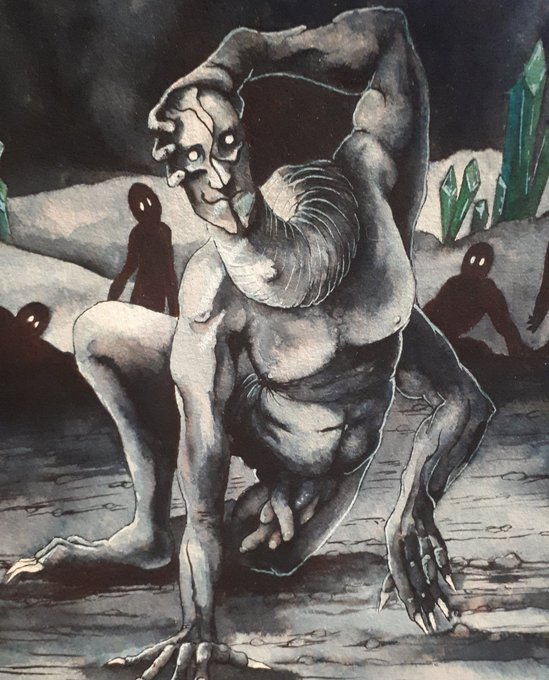

2 more ink paintings done during stream!
The 3-armed guy is "Dave", and was finished saturday. I'm so in love with how it turned out.
The other one is a Ringwraith from LotR, in my own style 💛❤🖤 With 2 different black inks for contrast 😊
Finished today.


@itsakiiwi's dtiys,,, its the sbi. the contrast kinda fucked up but who cares. wilbur sun
#kiiwiDTYIYS2020 #sbifanart


Watercolor #painting of the dramatic #storm sky, titled "Sky No. 6'" (30 x 40,8 cm, 2017). I just love those contrasting colors!
You can find the original watercolor and signed art prints of it here:
https://t.co/BO4WBzUoE0
https://t.co/cSVqObweKm


New profile picture, a new version of the headshot. Striking and easy on the eyes, a simple red/blue contrast.


#2020年自分が選ぶ今年の4枚
I doodled a lot, but I also drew pretty pictures this year. Group picture is unexpectedly fun to do. 😋
The contrast was really bad, so I want to get better grip next time.