SaturationのTwitterイラスト検索結果。 2,119 件中 34ページ目


the saturation slider is an indiscriminate beast with no regard for the inherent brightness differences between colors, eg fully-saturated yellows and blues are different brightnesses. if you put a filled black Color layer over your image it'll show you the "true" greyscale.
eg:


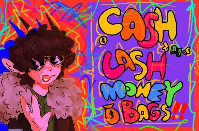
//high colour saturation
Me when I'm widowed and left with all my deceased husband's riches at 17 years of age
#tubbofanart #dreamsmpfanart #dreamsmp


if you crank the saturation up the skin looks great, the artist just works in really desaturated colours.


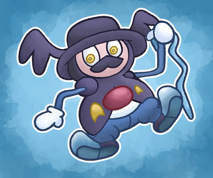
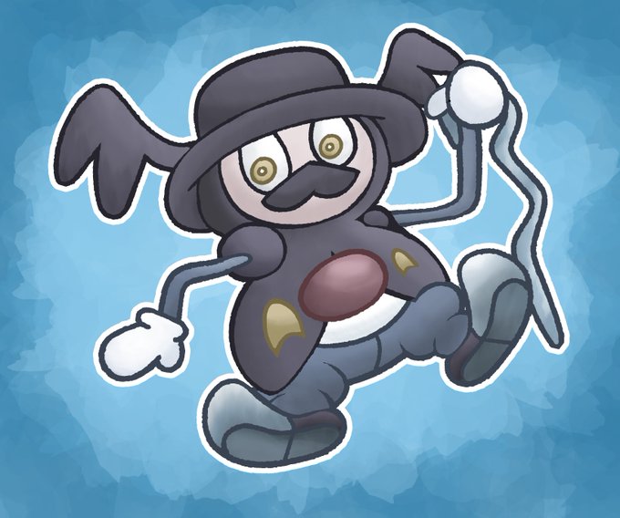
Been REALLY busy this last week, but I managed to squeeze out one more draw for Ice Type month!
Probably the easiest shiny I've had to edit, just had to lower the saturation.
This January Ima take a break from Pokemon sketches to focus on some bigger projects. Stay tuned!


It took me way too long to realize the importance of hue shifted shadows... I mean look at this! The shading on the left is from just making things darker, while on the right the base color and saturation is changed as well. Makes a world of a difference!


timelapse of bunny maid (really went f it and amped the saturation in the end lol)

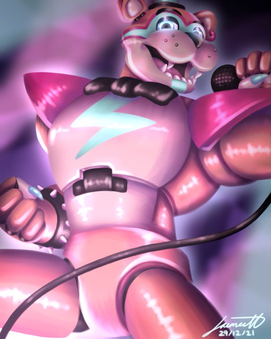
Here, you guys get to see it first. I might play around with the saturation etc and sell it as a print? 😌 I LOVE HIM
#securitybreach #fnaf #glamrockfreddy


@HexerVooDoom Oh, I remember when I used the saturation slider and he became something akin to troll-night elf hybrid. I kind of like the idea of him being a druid-hunter in a WoW AU. Maybe I will go for something like this.


Fun fact:
Every render of Golden Freddy in FNaF 1 is actually just freddy. Scott edited the render in post to make it look golden
[He used Hue / Saturation tool on +25 to turn freddy into golden freddy, to bring back the old colors you just have to go on -25]

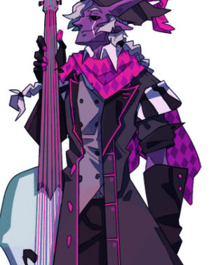
Also discovered through playing with hue and saturation in 2017 and stumbling upon this

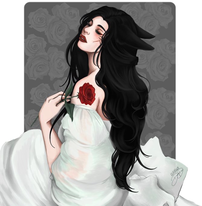
So I decided to drop the hue and saturation affect and added more to the background instead think this one came out better 💖✨


One quick small update without messing with the hue bf saturation~ since the background was a bit bland.


It looks a bit washed so I upped the saturation a bit https://t.co/Q1zFDgJhOH

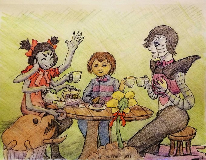
Now that I've had a few hours sleep, I've taken the chance to fiddle with the colors some more for higher contrast / saturation than my earlier photo, plus move Frisk's mouth enough to tone down the knife cat meme


Bonus: Lily and Tear colored so you can see their forms a bit better lol
I might also up their saturation when I do sprites for them since these two have designs that are still fluctuating a bit because wow do I hate drawing hoods and hood shapes


@xxhhunter I've solved that with having either value, saturation, or color contrast (warms vs colds, complimentary colors, dark vs light)....when all else fails, a white outline works fine too lol


