ContrastのTwitterイラスト検索結果。 10,507 件中 336ページ目


Put them all on one page and added a contrasting background ^.^ I love my head shots by @CheapB0n3s 🥰🥰🥰


Old painting from a month ago that I kinda wanna redo but I'm busy with other stuff. A little too much contrast oops, still learning 😳 #art #creaturedesign #digitalart

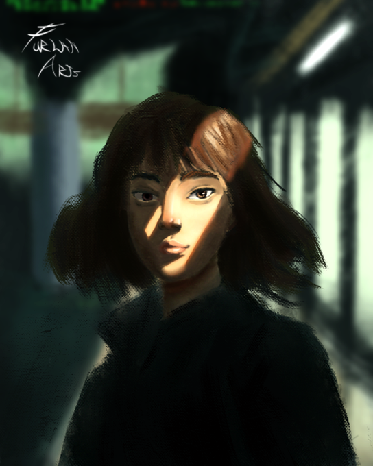
Was really fun to work in this painting, love that contrast
#painting #digitalart


Hear ye, hear ye! @ArtByBeaver is back with super helpful #PHAProTips. Get comfortable working in the shadows with these color contrast techniques that will take your work to another level. Just don't forget to come out for your Vitamin D once in a while.


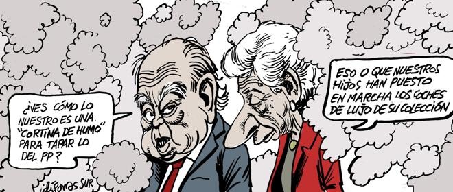


Sorprendentes protagonistas los hoy elegidos por Ferreres para su tira @diariARA; un contraste con las versiones de esa "ingenua" pareja de @A_idigoras, @MikiyDuarte y @PUEBLAdibujante


Hello everyone!
Today´s illustration is a #thumbnail. I am improving my value contrast and #background design since I mostly only focus on #characterdesign.
#conceptart #illustration #postapocalyptic #grayscale #digitalart #ink #fantasy #magic #mysterious #art #manga #comic

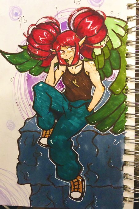
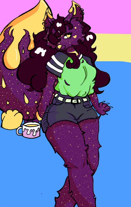


@CeliliaArtworks Honestly this was probably my best and worst year for art. Got more into digital art, improved my style, started painting more (and even got into painting cards lmao).
Ive also had little to no energy for art in contrast, so thats been fun.


@neutralKou Nothing special, so I don't know how to explain it. I tend to use contrast strongly.


XiCheng terminado💙💜
Bueno,rehice el resultado y lo amé muchísimo más!
Que opinan?
Ésta ship que no es canon me gusta igual y realmente amo sus personalidades cómo contrastan entre sí!
#xichengfest2020 #JiangCheng


冥麿 個展
-廖蝕-
2020年12月18日〜24日(無休) 12時〜17時
→乙画廊二度目となる孤高のアーティスト 冥麿 のアメリカ凱旋直後の展観〜Black and vermilion contrast〜一度見たら脳裏に印象深い魂の線描は珠玉。是非、お見逃しなく!
#_meimaro #冥麿 #oto_gallery #2020年12月18日から24日 #乙画廊


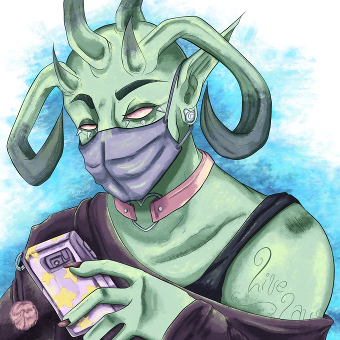


Empty eyes - it started off as something I did in my sketchbook almost, a year ago now?
Not sure if it came from somewhere other than pure annoyance with drawing pupils/no room with small doodles
Then I lied to art teachers saying it was for "contrast" - nah, just lazy...sorry https://t.co/Q7aq7zWpk1


#NoStraightRoads #NoStraightRoadsfanart #NSReve
#evecember day 9
Contrast headaches


"How ravishing she is, he thought. Everything about her is ravishing. And menacing. Those colors of hers; that contrast of black and white. Beauty and menace. Her raven-black, natural curls. [...]" 🌹 Yennefer of Vengerberg 🌹 #TheWitcher
(https://t.co/kouTsk6z2D)

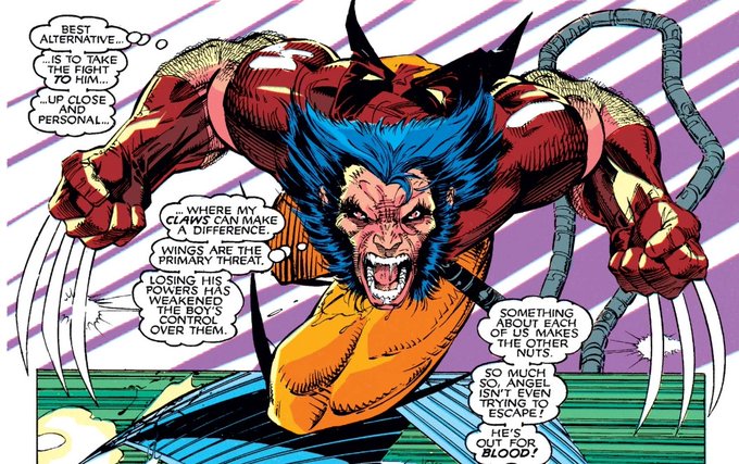
This contrast is perhaps exemplified by Logan referring to Warren as “boy,” effectively infantilizing him and highlighting the distinction in maturity between the two, an apt distinction as Logan has fought this battle for much longer than Archangel has. 7/10


[comms, furry] custom design of a fae-cat disaster to match a moodboard provided by the client. I really loved working with this colour-scheme, and that tiny pop of pink contrast!


Watercolor sketch based on a photo by @interchilltheatre. I love how they bring graphic elements into their photography. Creates a sharp and soft contrast. I went outside of my comfort zone and made up a landscape for the background. Reminiscent of classic SciFi pulp covers.…


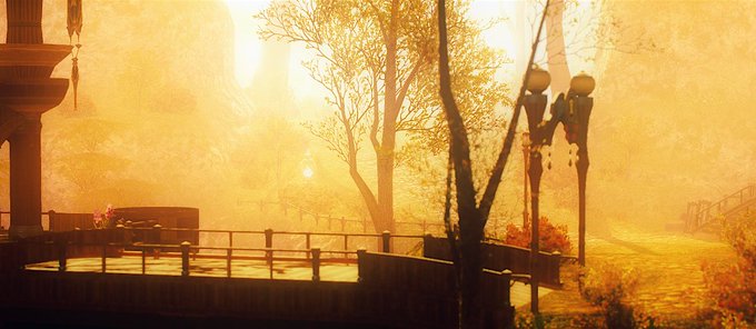


Old set of pictures I took around Gridania.
Was playing around with contrast. Foresty areas are the best places for that since there is a good mixte of sun and shadow. Thanks trees! 💚
#FF14 #FFXIV #FF14風景 #ffxivsnaps #GPOSERS


@ThisIzTodd Your Sonic fanarts are also great, the composing is crazy 😎 with so many details and light contrast.

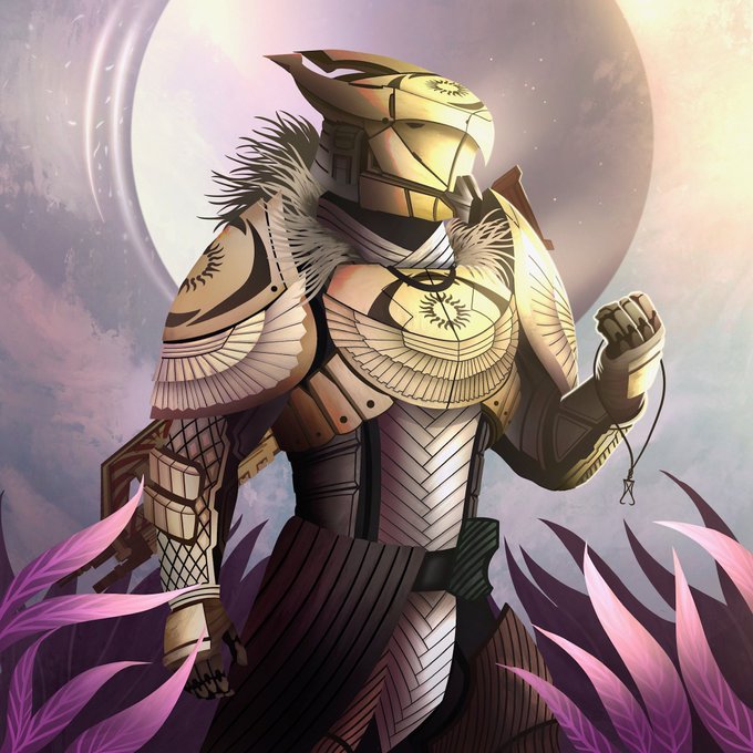

Trials Titan Commission, featuring past and future mercury, the challenge was to showcase the contrast of light and dark from the guardian to Mercury.
#Destiny2 #destinythegame