ContrasのTwitterイラスト検索結果。 10,815 件中 338ページ目

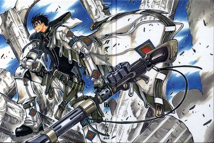
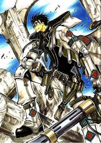
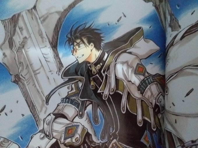
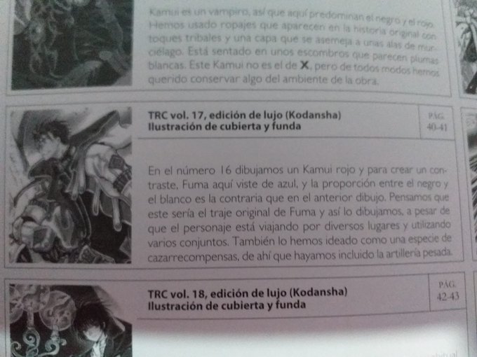
-In the n.16 we draw Kamui in red so to create contrast we drew #桃生封真 in pale blue
This could be his original suit,as a character that travels a lot.
We created him as a kind of bounty hunter,so here he carries heavy artillery.
#clamp on this
#ツバサRESERVoirCHRoNiCLE #x1999


With some tiles to test for contrast / scale

last wip!!
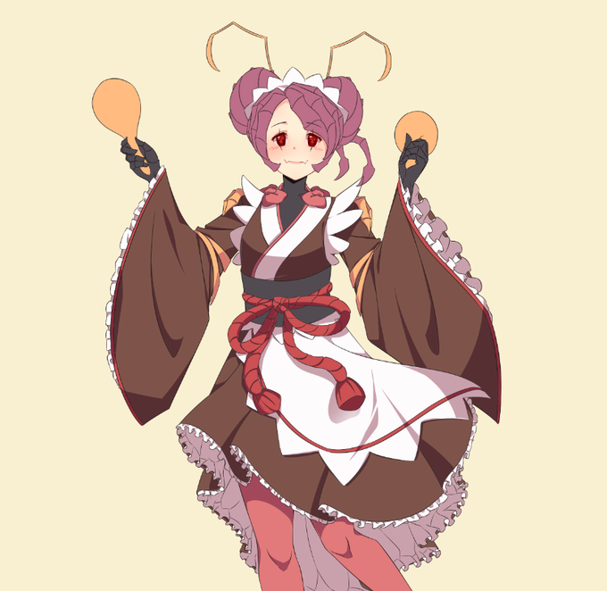
so far the colors are a mess bc i just color picked colors from different artworks 😭😭
and also i dw to use the official character sheet's colors bc they're too high contrast and saturated 🥲


Doing even a little bit of studies really helps to loosen up and level up! I am also experimenting with light to make things feel a bit more alive and always working on the contrast (which is a big issue for me)! I am really happy with this one though!


In contrast to terrestrial locomotion that shows substantial variation in gait, different #dog breeds use consistent stereotypic swimming gait. 🐶
Fish et al 2020 @AnatRecord The “dog paddle”: Stereotypic swimming gait pattern in different dog breeds
https://t.co/VjRrrMUr63 https://t.co/KQVHDgUvrP


@Yutari2 @GlaucoSilvaArt Golly! Here's hoping! Either a Red colour scheme to go with my name and fur colour, or else blue for some contrast =D


El contraste y los fondos son aspectos que me cuesta dominar, hice esto para practicar aprovechando que ya no debo pintar con el ratón, aun queda mucho por aprender amigos 🌸

Les presento el ship que necesitábamos, los viejos bonitos 😉
Con contraseña, es fácil chavos 🐜
Nadanwaykov o Armanwaykov como lo quieran llamar.
https://t.co/DTM3CN1Ale


In order to find my identity and define my own laws in my art style, I like to do fan art of characters that I like, this allows me to feel what and how I would synthesize.
this gives me contrast and pretty much by a process of elimination, I get closer to find myself 🌱
#goku

clarity colors version because fear the original is too dark and too low contrast


4.12.2020
this strange contrast of mood and pairings in posts, hmm..
|
#okegom
#samemi #samekichi #idate #idakichi


For William's design I just went off an older ref but streamlined it to make it easier to keep on model. I felt like keeping his head more square would contrast well with Zach's roundness and Lucas's triangle shapes.


(re upload cause the contrast was off, here's the alt version)


@momatoes ENGEL's supplements are honestly a masterclass in cover design. Maximalist type is balanced against a limited color scheme with strong contrast, while rough, hand-drawn illustrations are highlighted by clean lines & generous negative space. Everything compliments everything else.


@MusketsGoBoom Thanks for the art share! I want to improve on my contrast and colouring this year and draw more stuff for friends! 😤💪💕

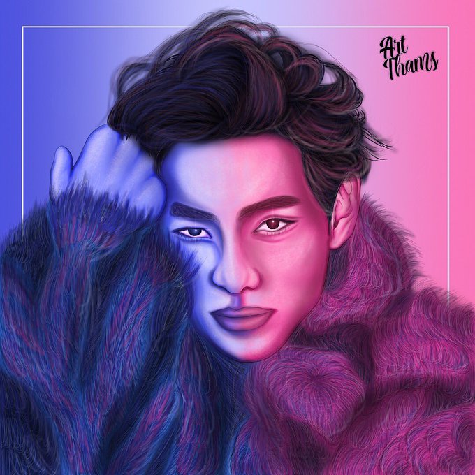
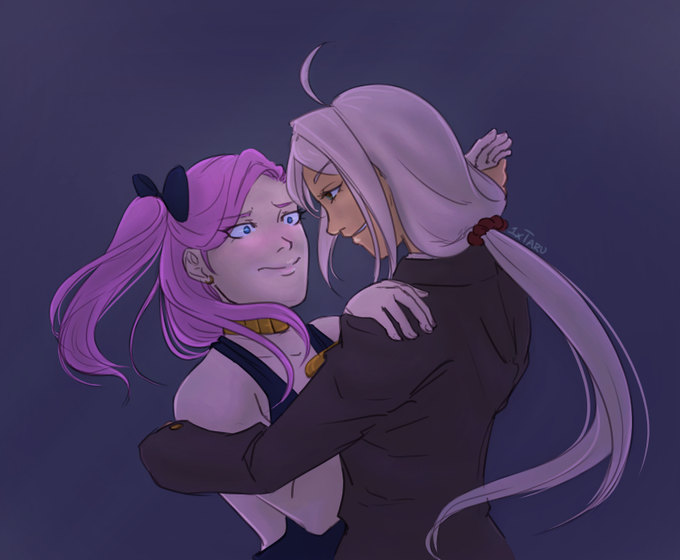
🎆 blue&rose 🎆
desenho do tae atrasado, mas postado! 🙃
minha primeira tentativa de desenhar pêlos e um contraste de cores 💜
e aí, gostaram?
#TAEHYUNG #BTSV #태형 #BTS #BTSedits #HAPPYVDAY #HappyTaehyungDay #TooGoodToVTrue #WinterPrinceTaehyung #OurSweetTaehyung