compareのTwitterイラスト検索結果。 22,411 件中 338ページ目


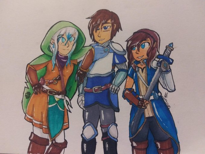


its so weird seeing the new designs compared to the OG look. Let me tell you that much. I mean look at when we started.... Like dear lord they were just babies
Now with an updated look, They match when I thought about them more so. https://t.co/42bg09tXkn




My yearly #redraw!
Once a year I draw Undyne from #undertale to see if I have got better at #drawing
Compared to last year... I believe I did! What do you think? :D
Past years are in the thread ⬇️


I know that I have a long way to go, but I'm glad that I can paint Vic way better compared to my first attempt...
#MrLoveMobile #mrlovequeenschoice #fanart

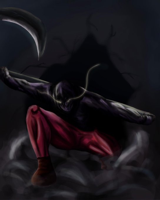

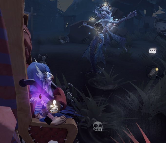
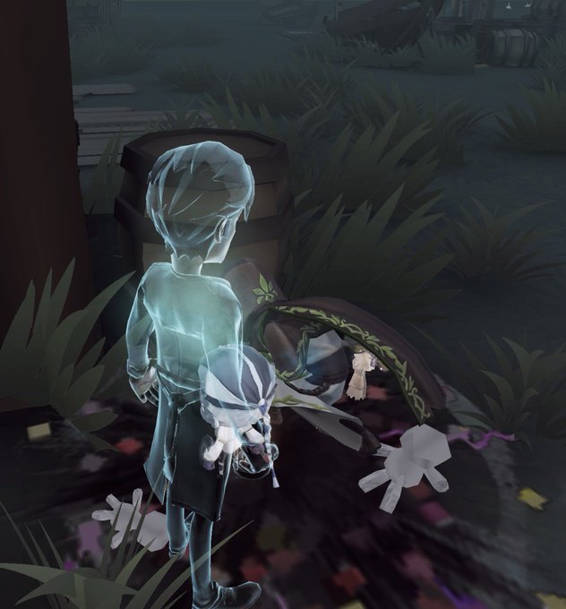
This Seer yesterday got really sad he kept getting Lakeside and compared it to the Naiad apocalypse. Our hunter just so happened to be a B badge Naiad who took that as a personal challenge. He mourned me


[20/03-Happpy Birthday Eriri🎂🎂🎂]
I really like how this drawing turned out, I love how much of an improvement this drawing is compared to the one I made in 2021. 😊
#お誕生日おめでとうございます #冴えカノ


REVIEW (86: Eighty-Six Cour 2)
After three long months of waiting the second cour of 86 has finally finished! The second cour really blew me away compared to the first(and that is saying something as I really loved the first cour!).


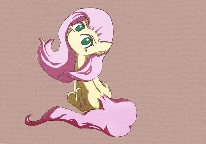
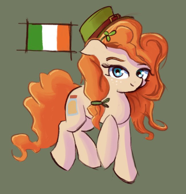

Some of my recent art finally uncompressed, that colour dulling compression was annoying the hell out of me I’m glad I figured it out at last, compare the original post to these yourself to see why. It’s like Twitter put a grey filter over every image I posted.


Dont dare to compare & talk about such man's prowess. Even Karan Johar said : How a person with almost no social media projection, no ads, no tv shows & so shy can be such a big superstar?
No hero in whole Indian cinema is equal to Prabhas


I finally found out why certain images came out with dull colours, Twitter automatically compresses .png files but not .jpg or .jpeg ones. Though the quality is usually lower with .jpg over the lossless .png on Twitter the opposite is apparently true. Wish I knew this. Compare.


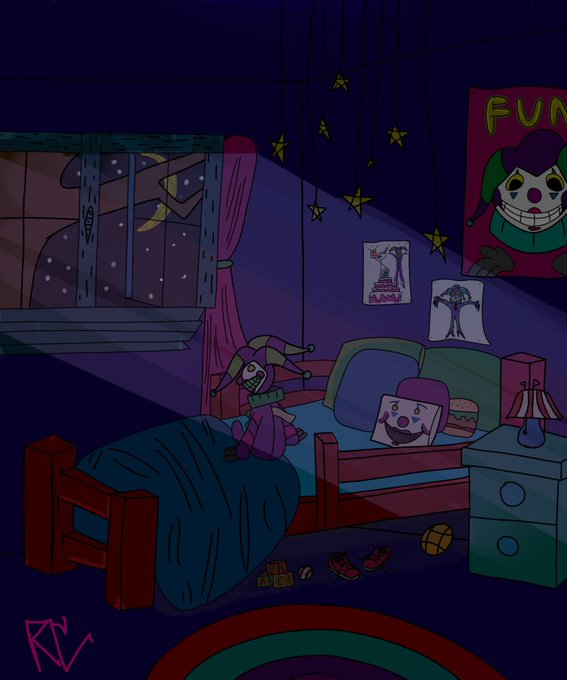
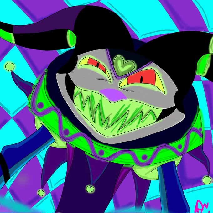
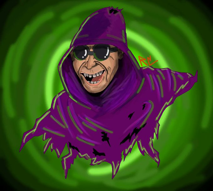
CHOO CHOO ART TRAIN!!!
These are just some of my favorite pieces tbh, my art isn't like amazing or anything but I do like it and I've seen a lot of improvement and growth compared to when I first started so yeah! Its also just fun to do! https://t.co/feFgI9o0iv

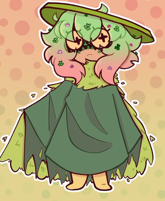

Its funny how fucking short leafie looks now when she used to be 5'8 canonically.
She looks so tiny compared to her old design
Her canon height now is 5'5 but maybe I should lower it a bit


Wanted to compare my current wip and one from a lil over a year ago..


fairly different art compared to what I normally do but I wanted to draw this seeing how I'm a Hazbin hotel fan and I wanna draw dis stuff. its nice to swap up the stuff I draw.
also I know saint Patricks day was a few days ago but I'm slow so I did it today.
#HazbinHotel

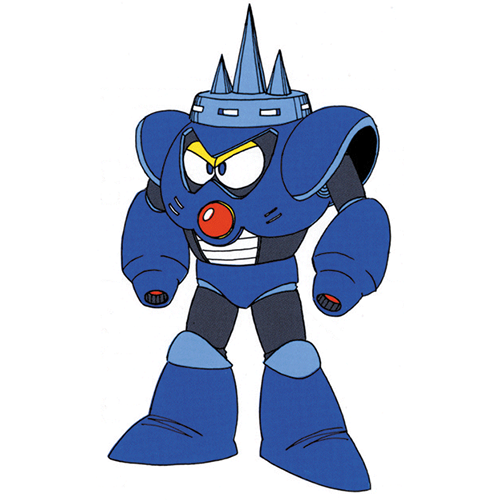
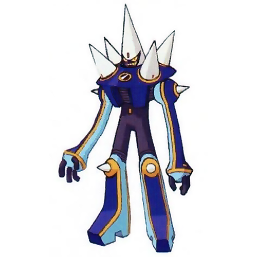
needleman -> needleman.exe: glow up or blow up?
in the interest of "fairness" I try to compare with like-style art. it's a big shame most of the transmission navis don't have high quality production art!


@Traveler00011 Your off-brand stetson is dripless and will never compare. You might aswell have pim’s cowboy costume on.