ContrasのTwitterイラスト検索結果。 339ページ目


I need feedback, more doilies or less? I feel like I want to simplify the design a bit but I also like the contrast!


This is the current progress, details are still missing in the contrast but i'm working on it.


also ive been TRYING to improve my sprite readability! her skin doesnt contrast well with her hair, i think... but i dont want to use lines


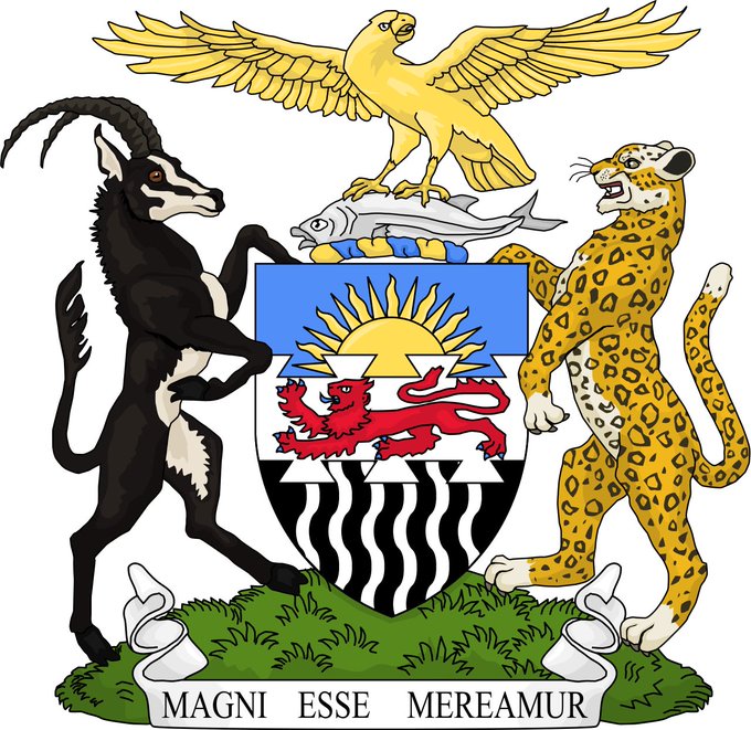
Consider, in contrast the magnificence of the bird on the Coat of Arms of the old Federation.
Now there is a serious bird.
A bird that catches fish and is haughty to boot!
A bird you don’t mess with!
A bird that means business, it didn’t come to play!
We need new birds 🦅


Los dejo aquí porque las historias de instagram me la pelan (?)
Y porque le hice modificaciones al final y ya no quería volver a publicarlo.
La segunda es la versión final en la que le agregué una sombra para dar contraste :'u
Pinche Caín


i don't know why no one talks about this but look at the contrast between the box art for the ace attorney games. why did they abandon this. why did ace attorney box art design go from "cinematic movie poster artwork" to "four people in rectangles"


It’s in such stark contrast to his latest look which is just kinda eh... I miss bear daddy Thor. Bring him Back ! https://t.co/oZ4819lBKI


The Machinist's "Gunners goggles" are brown-tinted lenses that not only protect their vision against damage, but they also protect them from muzzle flashes and blast debris. The tint also increases visual contrast.


If you check my story on IG you probably know that I have a new OC. You already saw my new fursona, Amari (the left one) but I want you to meet Ryley! They're a couple and I love them both - I wanted to go for a casual and pastel goth type so they would contrast with each other!


Thought I’d share a time lapse of the painting process. I’ll usually have my reference next door - colour selection can be tricky as drop selection tends to make my art look flat. I customise to get better depth, contrast, and tones for my paintings.

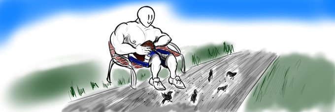
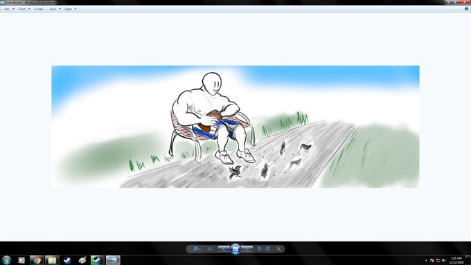
So the new banner I just added is supposed to be more saturated but twitter for some reason turns the contrast down making it really dark and I don't know what to do about it. Pictures are what it looks like on twitter and on windows photo viewer. Should be looking like the right


not to post too many WIPs but I'm actually excited about this?? (I'll probabyly do some color fiddling tomorrow there's like no contrast here lmao)


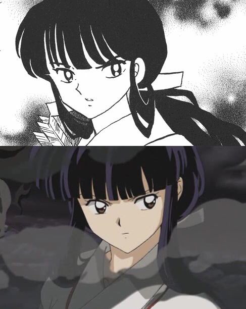


my piece for @dimitri_zine !!! highlighting "reunion" & the people most important to him contrasting with his self isolation ✨
thank you so much for letting me take part!!


contrasting, new hairstyle
#furry #furryart #furryartwork #furryfandom #furryartist


Oh dear, someone reminded me about the XJapan art I used to draw. I'll just put it here and laugh as it's too much a contrast to what I do/like now 🤣🤣🤣