imoのTwitterイラスト検索結果。 12,995 件中 339ページ目


wil! a very underrated, underappreciated archer in fe7. he usually turned out just as good, if not better, than rebecca imo.

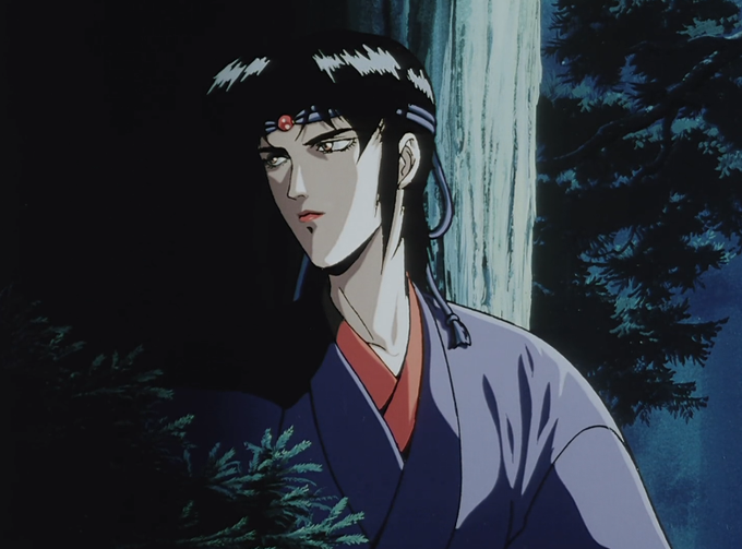
Ninja Scroll's color pallet is also so impressive, a Kawajiri classic aesthetic, but its unlike other works that were out at the time imo. The last film I can remember with a similar palette to a degree had to be Royal Space Force: The Wings of Honnêamise (1987)


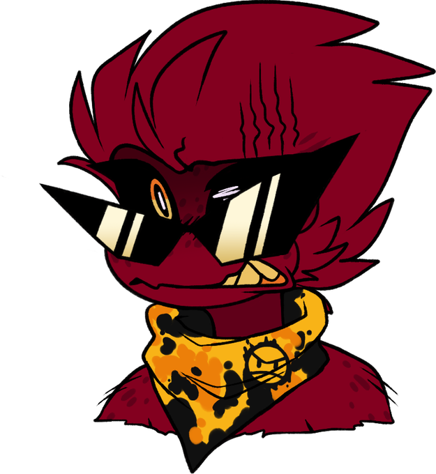
Minus B3 Pico
prolly the swaggiest Pico imo
he's a porcupine not a hedgehog don't make that mistake unless u want die


Today i wanted to share one of my all time favorite artists I've collected on @hicetnunc2000. @choqopi's art is something else, i just feel peace and warmth coming from her work, imo one of the best artists in the whole NFT space.
"Morning Glee"
https://t.co/4VYHFG3A6d


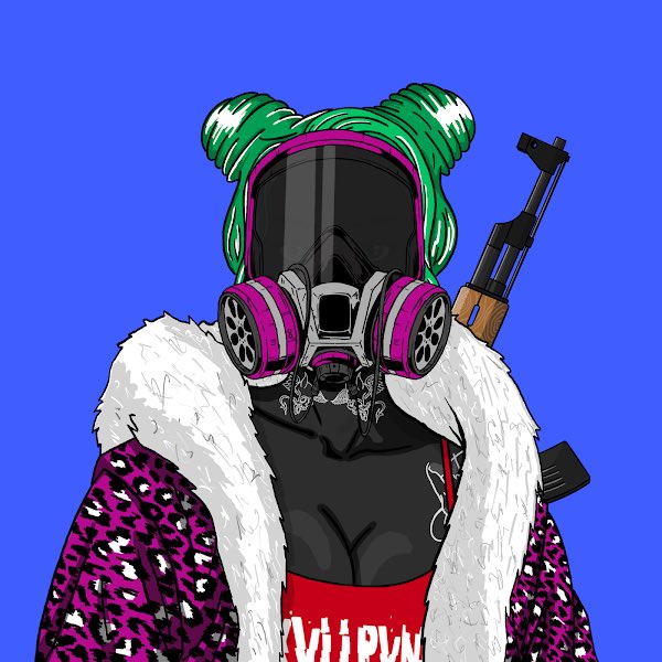

I have these 2 @skvllpvnkz
Feels underrated imo https://t.co/81d3jzfW9I


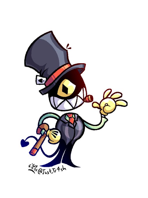
God fucking-
44. Ron G.’s name is a pun on “RNG” since he’s a gambler. Clear as day but I don’t think I ever actually mentioned it. Best name I’ve come up with too IMO

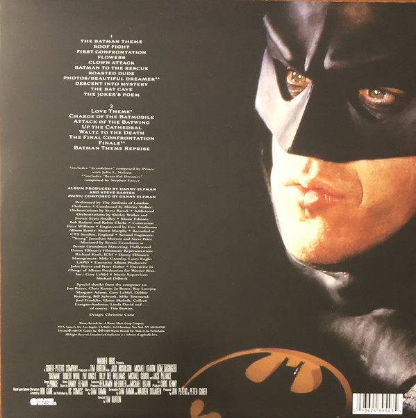
Back Cover to the Batman 1989 Score Vinyl, with a closeup shot of Batman in the Batmobile used. This photo works well as (Back) Cover Art imo.



One day I will draw something. Until then, I guess I've drawn something. Fit kit, big meow, still deserving of cuddles imo


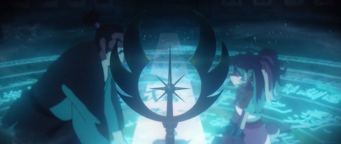
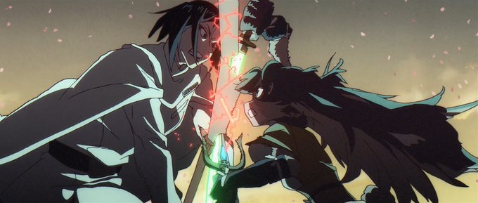
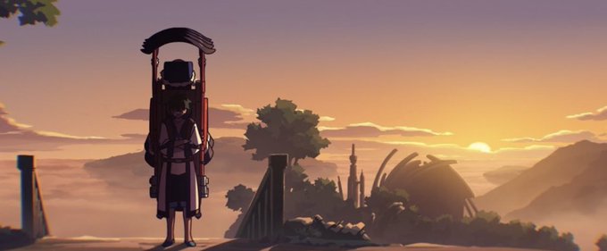
Ppl saying Lop and Ocho is the "least" Star Wars Vision episode are full of shit. The episode deals with the main topic of Star Wars: Family. It also has a lightsaber fight and bit of the force. At most you only were missing of a space ship battle, but that's like whatever, imo.


Also look at how Agrabah still looks like the actual Agrabah from the movie. It's not easy to conciliate gameplay/design constraints with - looking at the big picture - the real thing you're supposed to walk around. Underrated layer of complexity when designing a level imo.


IMO Episode of Bardock and most other DB material released around that time is the absolute LOWEST point in terms of art quality. The shading colors are disgusting, the anatomy is the epitome of “DB anatomy”, and the highlights are absurd


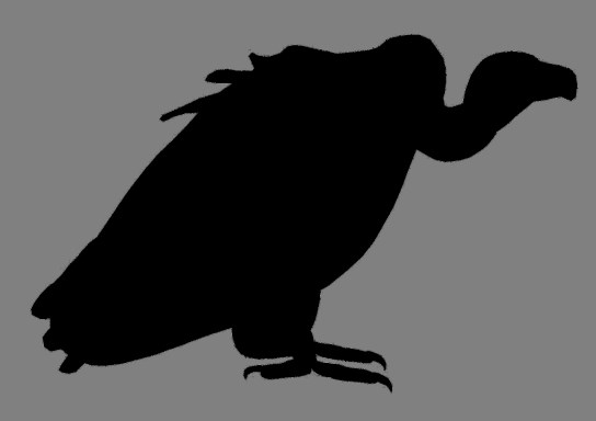
I like how Ishida utilizes negative space here in this scene to make Tokio's side profile look like that of a vulture. This was also during a moment of dejection, so it fits really well hammering down what kind of change he's been going through imo.