saturatedのTwitterイラスト検索結果。 4,892 件中 35ページ目


I used to use such eye-searing saturated colors when drawing LOL good times
2011 --> 2021


@blackscour Almost the same thing happens to me, but on my tablet it looks more saturated and on my cell phone... well... ;;


blue is less saturated than green and gary and more serious in the manga


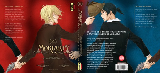
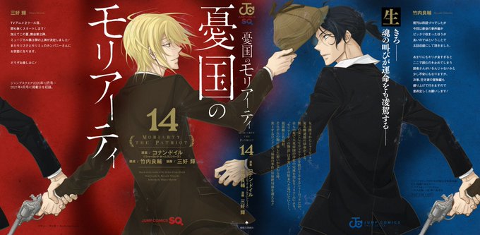
Ok fight me on this but....... I lowkey prefer the french version of William's side of volume 14's cover. It's so much more empty that it actually emphasize William much more. Also on those pics it looks the same, but irl the colors of the french edition are much more saturated.


PLEASE TWITTER SOMEDAY LET ONE OF MY POSTS GET MORE THEN 20 LIKES anyways heres human ralsei it was alot more saturated on my pen tablets screen TvT #deltarune #deltaruneart


Trying something desaturated featuring my #GenshinOC UwU


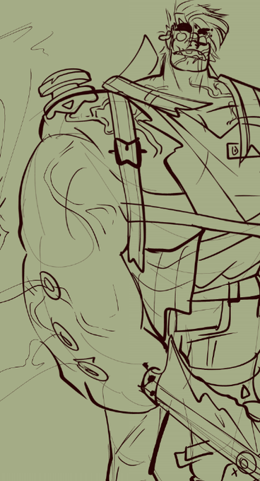
Concept for a slightly older Doctor Mundo, grossly dirty hair that he either badly cuts or pulls at when too long, more scarring and even more fucked up teeth
His "uniform" are basically rags at this point and he's so overly saturated by the chemicals.. he's happy tho!
#drmundo

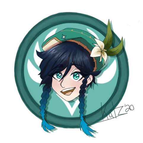
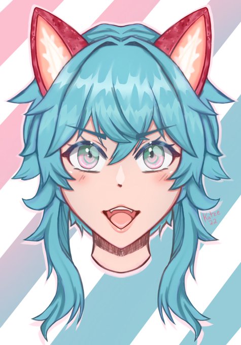
honestly it's hard for me to see major difference here other than the fact that I changed hair shading styles and use more saturated colors now LOL but what do you guys think?! https://t.co/mIgltTuncR


them!! i did their colors by memory so the colors might be more saturated👹👊🏃

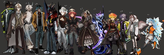


updated height chart- also I love desaturated colors sm 😼😼+ wips


@viyomiarts Tried doing another type of artstyle, Didn't really turn out that good so I'm asking for tips oh great idol of saturated colors 🫶


One of the last physical media pieces I worked on, and tried redoing the coloring digitally. One day I might return to it, but I love what I was doing (despite the colors being FAR too saturated
#thelastunicorn #fanart #unfinishedart


@sbs216 @Skeppy @GeorgeNotFound I see this alot too where he's really desaturated

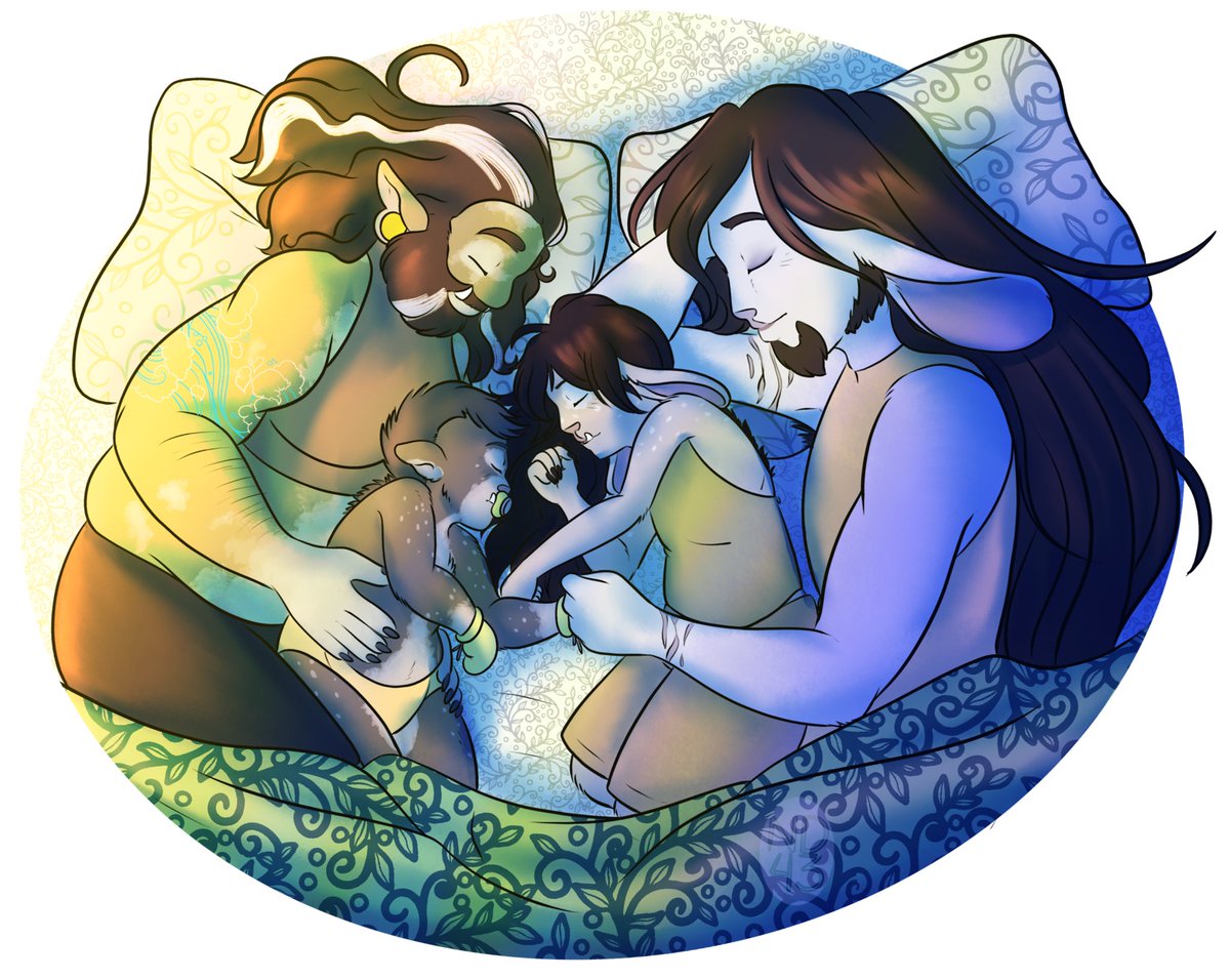
I’ve just been really digging super saturated sunrise/sunset lighting lately lol


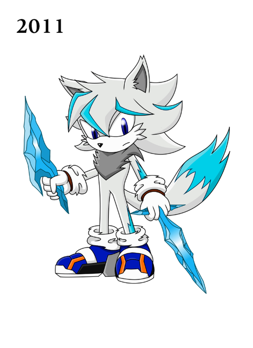
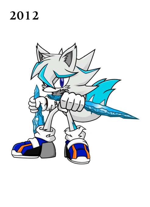

2010-2013. Looking back, I realize how over saturated the colors were, but I think 2012 was my best one of the 4. By 2014, I decided to distance myself from the Sonic Fandom and took my art in a different direction, but somehow couldn't scrap my OCs altogether.


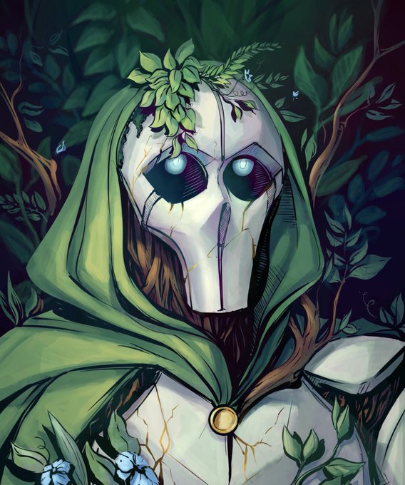


@_sesart_ Favorite colors are yellow and green, and the desaturated teal in these is what i return to the most!


see i think the problem with edits of this shot is that they make it way too saturated, even tho the original scene wasnt? i feel like if youre gonna add more color then do it slightly


