ContrasのTwitterイラスト検索結果。 10,762 件中 347ページ目


❄️✨ #Day2 #artistsontwitter
This is the lineart for one of my favorite illustrations and earliest attempts at perspective!
I don't measure out exact relationships as much as I should, but in this piece it definitely helped bring the tracks into reality and contrast nature🚞


@itzyshiu Favourite food? Hmm... I love a good tirimasu, especially when the cocoa powder on top and coffee soaked sponge look black so you have that black and white contrast.
That and have a massively sweet tooth X3


And progress! This was a real joy to color. I’m a big fan of all the pinks and the contrasting blue.
The lineart games gotten better too! Very pleased

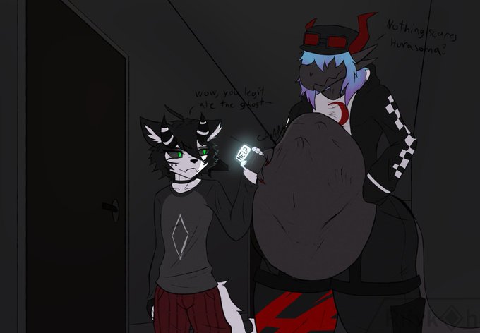


I guess twitter is just where I post #DestinyArt , quite a contrast from my considerably more successful Instagram page, but I'll take it. A nice little haven from the darkness of my usual neon skull boiz #destiny2 #destinythegame #motw @Bungie @DestinyTheGame


slightly edited repost of the Cassius drawing , hope the colors feel better on mobile now...i still struggle to pick colors on csp idk why they feel always darker and duller- maybe it's cause of the contrast with the UI? since i was used to SAI with a lighter UI??


@Handsome_Frank Think I enjoyed creating these the most this year. Trying to focus on limiting myself on detail but think about the contrast of light and dark and negative space.


@JANUSZCZAK And his paintings of his children a surprising contrast, full of tenderness & love.


Another archer unit completed. These are #GamezoneMiniatures and have been painted using #ContrastPaints #Medieval #WOTR #HYW #wargaming #28mm #wargames #wargamer #Bowmen #Bow #archers #longbow

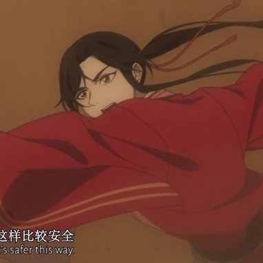

Uno impresionado porque fue agarrado y el otro solo aprovechó la situación, me encanta el contraste entre los dos


Another one of the lads; Deuce is Gozu's boyfriend and partner in crime; his wild vampire-punk persona contrasts with Gozu's stony calmness


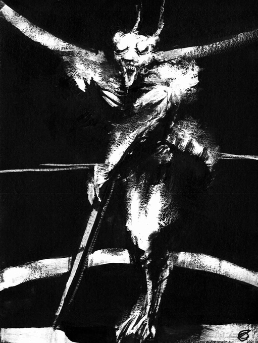
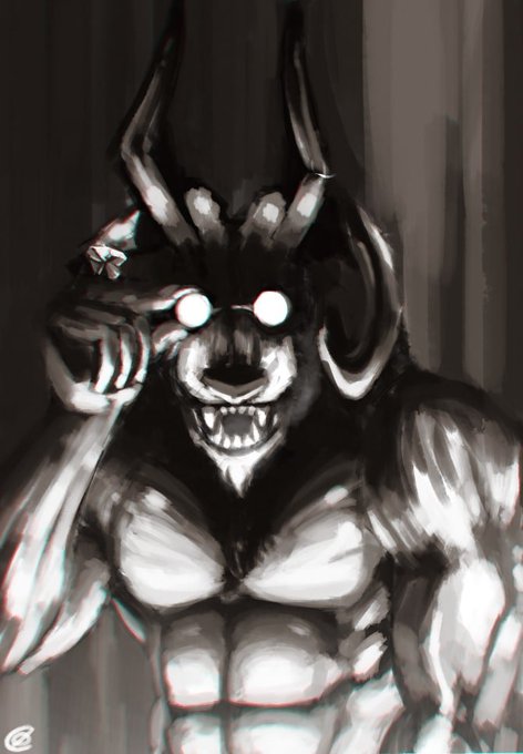
I also add some high contrast stuff that some people like too.


The Saxon Shield pigeon! This and the Lahore are my favorite colors of pigeon. The contrast of the red and white ones specifically are just gorgeous!

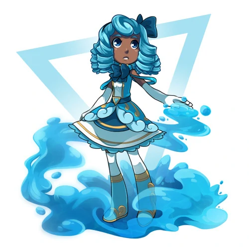
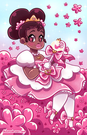
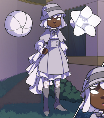
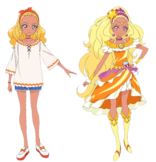
When making darker-skinned characters, this is usually a problem I see with designs. The skin undertone and the VALUES are either too similar or not contrasting enough. It is harder to find that balance, but when you do, you get PLP (some of the cast of SD/STPC) and it's great.
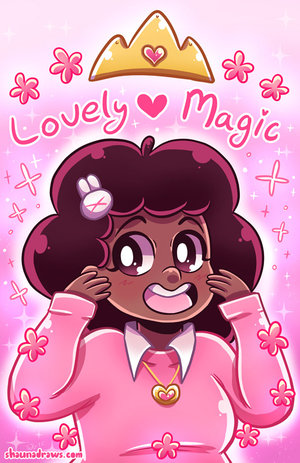
Lia having darker skin contrasts with the background colors while showing her features. The creator is smart enough to limit these colors for specific details so Lia doesn't blend into the background. Her color palette is relatively simple being represented with pinks and whites.


Actually not enough contrast in that one, was super muddy at icon size, so some adjustments. 👍


Commission #3. An emote styled hype Mel. I've grown to love coloring Mel's hair and experimenting with the contrast. Tried giving it an almost metallic look with the shading.
#projektmelodyfanart