ContrastのTwitterイラスト検索結果。 10,506 件中 348ページ目


@El_Banchito Samitto picked a good color with default S, but I also really like the contrast of EX D


In contrast to yesterday's drawing, here's a Cory appreciation post.


Howdy ! ✨
My name's Angie, a graphic designer & vector artist.
I love bright colors, geometry, design that has a soul and beautiful landscapes ❤️✍🏻
#LovelyLandscapes #water #contrast #vectors #colors


Colour tips:
Don’t use only neon colours. When using neon colours contrast it with darker colours
Don’t use too many base colours, limit yourself to at most 12 base colours. Base colours not colours for shading
Don’t use too many similar colours for hair and everything else


@ChelsieArts Make the highlights 100% white and that gives you some contrast for the shading

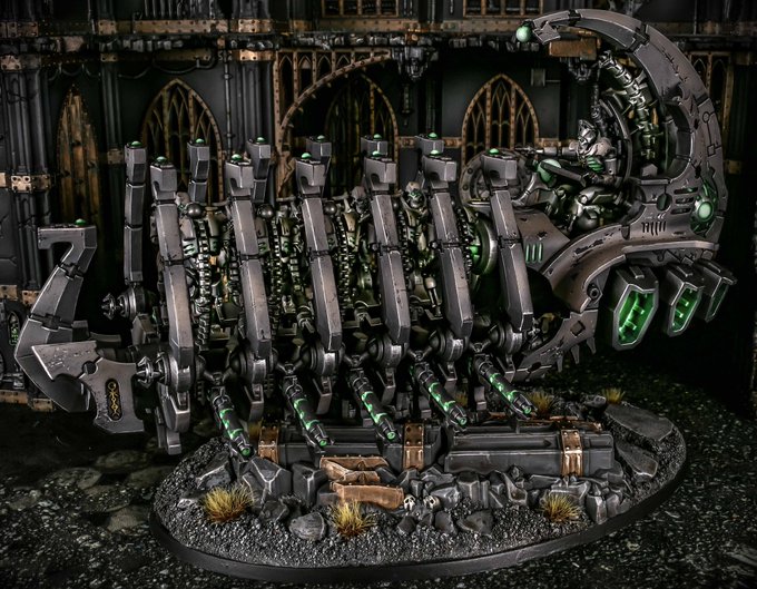
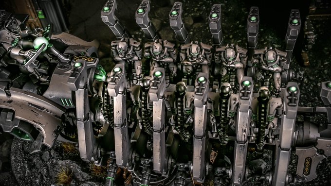


// Compare and contrast you beautiful losers.
Left, new background (and I gave the knife a bit more of a used look).
Right, what I have right now.


El poder y respeto que este hombre emana plus el contraste de sostenerle la mano a un cadaver cual padre responsable mientras caminan a la masacre


Gonna try to do a "bright" color scheme so it can contrast with the dark background I plan to give it, make her glow some


I had this idea of giving quackerjack an ex who was a all black wearing punk as a contrast to his more colorful self and realized I had no other ideas beyond that so uh...this exist i guess

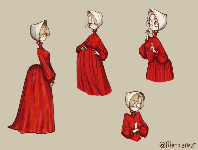
𝘔𝘦 𝘪𝘯𝘴𝘱𝘪𝘳𝘦 𝘦𝘯 𝘭𝘢 𝘯𝘰𝘷𝘦𝘭𝘢 𝘥𝘦 𝘔𝘢𝘳𝘨𝘢𝘳𝘦𝘵 𝘈𝘵𝘸𝘰𝘰𝘥.
𝘌𝘭 𝘤𝘶𝘦𝘯𝘵𝘰 𝘥𝘦 𝘭𝘢 𝘤𝘳𝘪𝘢𝘥𝘢.
Me encanta el contraste del rojo y blanco!!! y mi debilidad por las chicas de rubio cenizo en ropa de estos colores es intensa 🐐✨

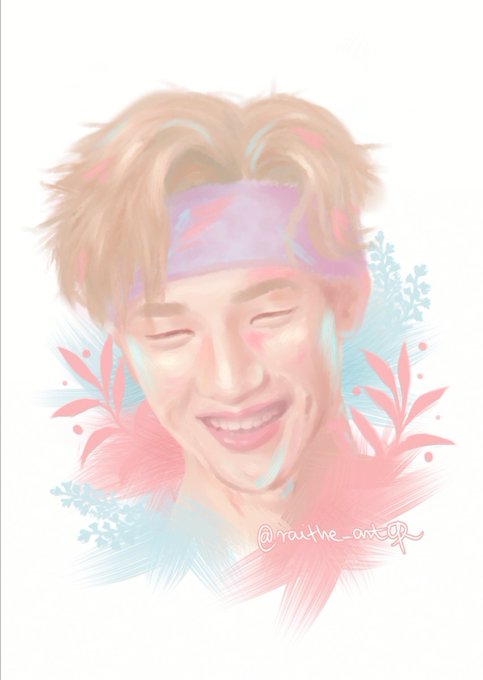

I missed pastel Channie for so long 🥺 it lacks contrast but aaaaa I WANT TO PINCH HIS CHEEKS

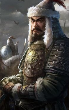


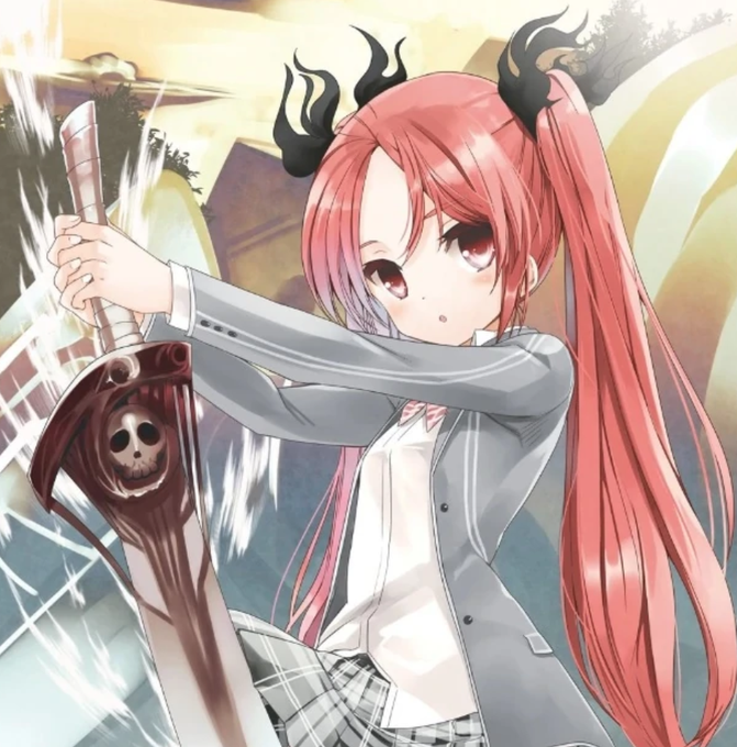
#ReRenata Cthugha looks like a huge fireball, and it's best known for being summoned to combat https://t.co/gAuiYL1Ytl turns planets into complete deserts; a contrast to its main rival,and Charybdis.
Chris, on the other hand, is ineffectual against the forces he speaks of.

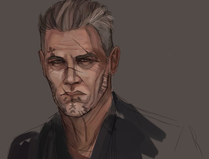
dare i say im getting somewhere with this, lol. anyway a wip of my character erhart! kinda digging the low contrast


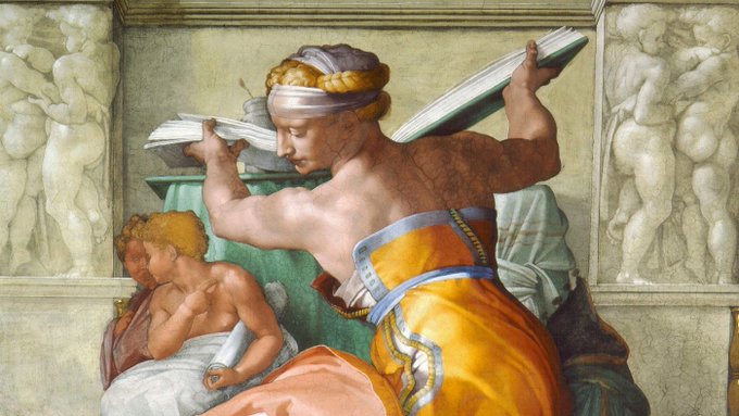
🎨
31 October 1512: Unveiling of #Michelangelo's fresco on the ceiling of the Sistine Chapel.
Symbol of a serenely triumphant #Renaissance, the Masterpiece would later offer a striking contrast with the “Last Judgment”, produced by an artist traumatised by the Sack of #Rome.


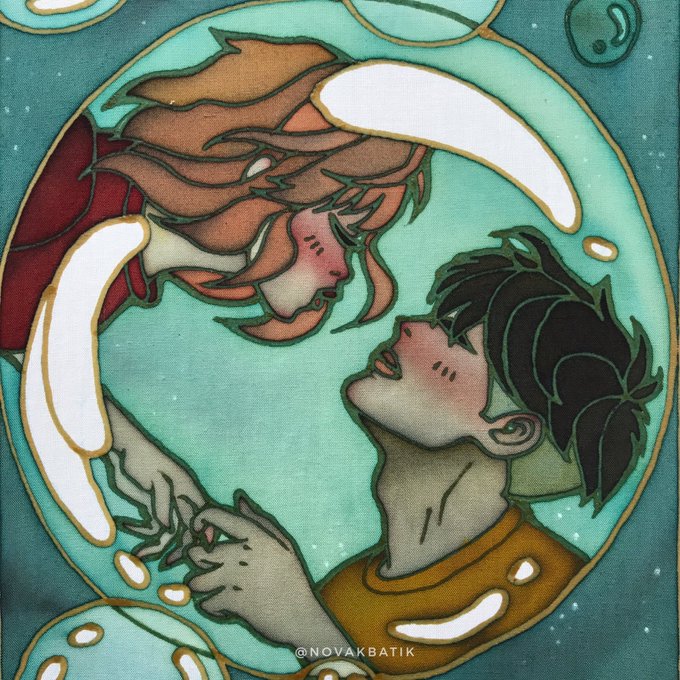

I love how contrasting their personalities are. Sosuke is very gentle especially when he’s with Ponyo and Ponyo is full of energy. Ahh I just love them! 🥺 #ghiblitober

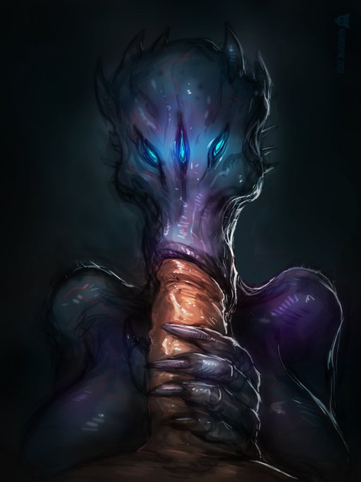
The good old purplish-blue vs pink skin contrast still works best. I like to think her eyes have some hypnotizing powers so the guy can't move.