CONTRASTのTwitterイラスト検索結果。 10,552 件中 36ページ目


i didn't pay attention to leaks so imagine my surprise when i learned milky way is a frontliner
this contrast is killing me


The Idolm@ster Movie: Kagayaki no Mukougawa e! (2014)
Pone en perspectiva todo el crecimiento de las chicas como un grupo al ponerlas en contraste con las Idols novatas. Destacando sobretodo el paralelismo que se hace entre Haruka y Kana, teniendo ambas la misma razón para ser-


@brik_arty Cloud cats from April 2022 and Awakened goddess from January 2023. Well, at least I still use positive colors 🤣
And playing with contrast meaning. Interesting 😊
@agosta_eth @ParadiseByArina @Nyachanochka


Thinking about Manchester Black’s two very contrasting experiences with Superman’s Heat vision scalpel.


Reblooming: 2023 edition!
I experimented with high contrast and low contrast, and softening edges, and I'm really happy with how it turned out!
You can see me trying new things over the years, always revisiting this one to see how and where I can work on improving! :D


Watercolor #painting of the dramatic #storm sky, titled "Sky No. 6'" (30 x 40,8 cm, 2017). I just love those contrasting colors!
You can find the original watercolor and signed art prints of it here:
https://t.co/BO4WBzUoE0
https://t.co/cSVqObweKm


Not really a fan of this illustration I did but I like the contrast in color value


@nekoemimi Your style is SO gorgeous! I love the soft pastel colours and how they contrast the bold black lines.


Spiritual messengers, symbols of devotion, and a cheerful sight to contrast the bleakness of winter, Cardinals play an important role to many, and they're heccin' cute. Lady cardinals may not as flashy as the fellas but equally beautiful with their neutral hues and red accents.

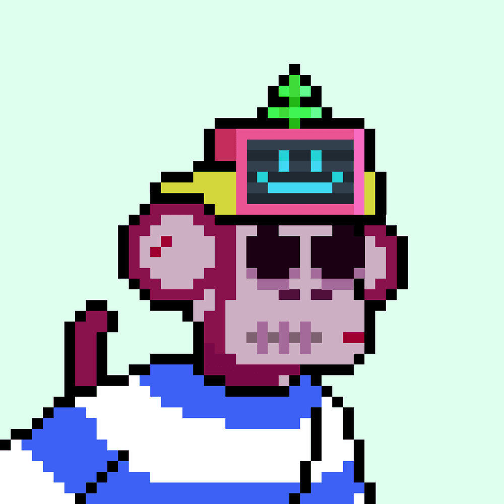
@YuukieNFT picked up this insane heretic Chimp. An evil aura contrasted with its vibey accessories makes for one unpredictable chimp!!


gm
pushing "Aura" a little further with more texture, depth, and background contrast.


Pink Shades #1372: Eyewear, 58/9999
Pink shades + purple background + red tie + Flesh Type.
All colors are perfectly matching in his suit.
A ⭐️⭐️⭐️⭐️⭐️ banger
For me, the contrast between the funniest trait on the most charismatic guy makes this PFP an exception.

Pink Shades #1372: Eyewear, 58/9999
Pink shades + purple background + red tie + Flesh Type.
All colors are perfectly matching in his suit.
A ⭐️⭐️⭐️⭐️⭐️ banger
For me, the contrast between the funniest trait on the most charismatic guy makes this PFP an exception.


And of course, @FrankMillerInk
Frank Miller has an artist language all his own. It may not appeal to everyone but to me, its brilliant. The wrinkles in both the clothing and skin, the use of shadow and stark contrast, and how it's not afraid to be what it is. 💯 Inspiring


These were probably my childhood favorite ones. Quite the contrast. 🤔😅 https://t.co/OsFf1a8N38


#RavenCastleTW
Rol abierto-(Dibujo reutilizado jiji)
Una noche decidiste subir por una de las torres y te encontraste a un hombre sentado mirándote desde la ventana.
¿Intentarás hablarle?


Decided to make the background this greenish color, in contrast to the purple and white! Painted most of the face and hair, still lots of painting to be done.