InconsistencyのTwitterイラスト検索結果。 1,290 件中 36ページ目


My inconsistency in making artworks is annoying but I learn everyday.
Star Guardian Soraka Fanart
League of Legends
#Leagueoflegendsfanart #FANART #soraka #artshare #artph


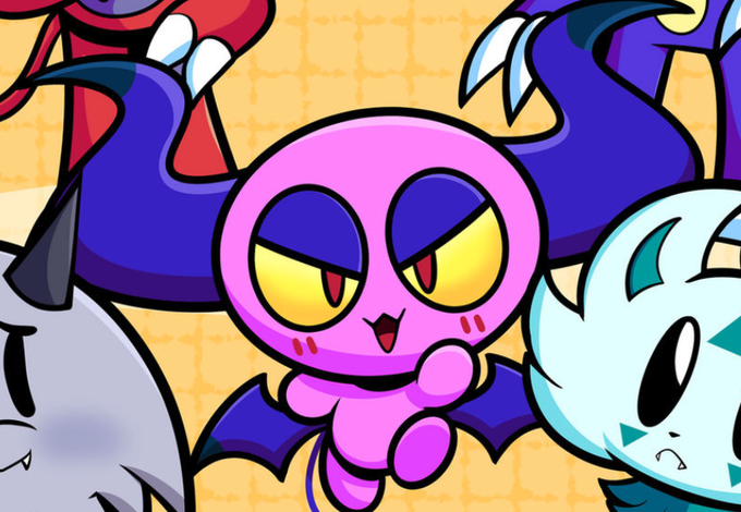


I just noticed an inconsistency in Chippy's design, specifically, it's eyelid color ;; It seems I have a tendency to switch between purple and a darker teal. What do you think looks better for it?


lookie art i was too lazy to finish ! kenma haikyuu :] !!!
yup yup im flexing my art style inconsistency !!!!!


#dndartists the only thing I’m consistent in is my inconsistency happy #dndartist day!


@suho_mei Hi!! I’m 0ptical, and I have REALLY bad style inconsistency 🥺✨✨✨
Thanks for the art share!


Here's a WIP of the new page.
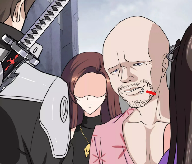
Guess what! I’ve been drawing Buttons’ scuff marks on the wrong side of his face for the last 2 pages! I’ll go back and fix that before I post this page. Visual inconsistency? In a webcomic?? NEVER!!


I some see inconsistency in the naming from the official P.A. Works English Twitter page. Only the word "Auatrope" is used in the very first (and most important) post, but subquently they used "Aquatrope". So "Aquatrope" should be the correct spelling. #白い砂のアクアトープ


@peachybaobei_ OmO hello there and im kinda late 🤡...Shaun here yes, i do art sometimes here are some of my “recent” works
As you can see i have a good relationship with ✨inconsistency✨

neat thing that i didn't expect while making a stitch of this scene from nnb s3
assumed it was just a pan over a still image, but it's not (seen by the inconsistency in this pic)
the scene is adjusted to account for depth of field as the camera pans up
very cool silver link


@grave_weaver Thank you!❤️ I'm Yereren, digital artist and I love warm colors and inconsistency


@iWolfei hi i’m mozza! and i do funky art :] (i’m still learning digital so don’t mind the inconsistency-)


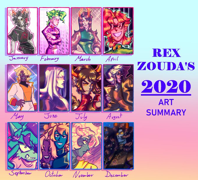
Ah yes, 2018- the year of inconsistency, LOL. I experimented a LOT, and I did a lot of mini projects as well.
Some of these still don't look half-bad! You can start to see the way my style has morphed over time when comparing the 2019 and 2020 versions though!

Eoekskkwnsn, this looks so ugly because of the inconsistency