ContrastのTwitterイラスト検索結果。 10,506 件中 353ページ目


Here's my own coloring rendition of a ghost girl piece drawn by my friend, @hooksnfangs, Initially I did it with a green background for contrast as well as to reference Danny Phantom but the blue looks a lot better. #ArtistOnTwitter #FANART #ghosts


Doodle
---
Still figuring out Garlic Boy's colors but I wanted him to contrast Yuri


“Hejira” (https://t.co/ACEFYxddok) by Gastón Fuoco for @sudtipos is a collection of 4 very different display fonts that nontheless share a common set of visual features.
① Serif, Thin & Spiky
② Sans, Broad-Nip Style
③ Flashy Op-Art Serif
④ Hi-Contrast Fat Face
#366fonts (291)


In contrast to big boy Trunks we have the littlest Pepper. little fun facy shes in her 40s.


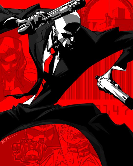
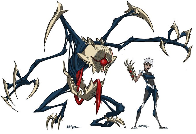
been studying a lot of jeff matsuda stuff and i really love the shapes he uses, very contrasty
a true master of the saturday morning cartoon energy


Fallout deathclaw mom
Been doodling a lot of monster girls lately and I loved the conceptual contrast this one had the most.


KEY KNIGHT !
Ok maybe i still have some settings to do with the color contrast on my tablet hhggg
It's a little annoying because I really enjoyed drawing this one (sorry for not keeping one art style haha :,DD )
#knightober #GobertKnightober #artchallenge

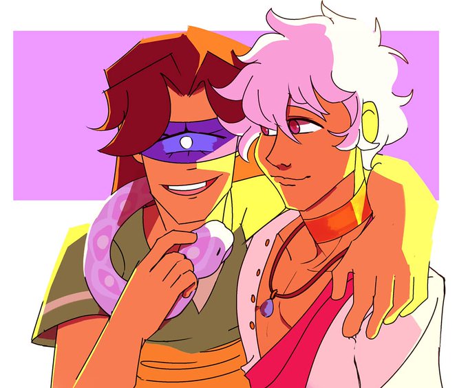
#thearctober / #arctober day 15: Asra and Faust
I want to do something simple but you know me. I want to color something warm for my warm kids.
I really want Fatima's colors to contrast Asra's. Cool with Warm.


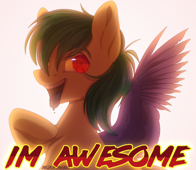

I redraw my favorite art. This is a very simple art, I was too laaazy to draw full shade, in contrast to art 2019
2015\2019\2020
He became kinder UwU


Kuwagamon!
Adorei essa paleta de cores e seus contrastes altos.
É muito proveitoso fazer estudos para aprimorar técnicas que a gnt gosta.


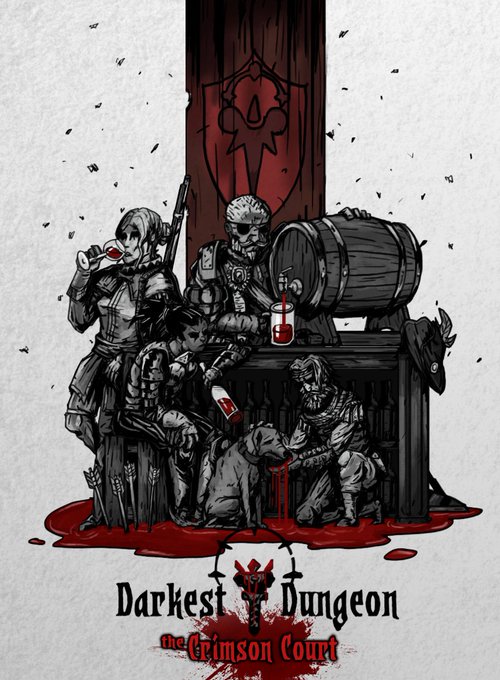
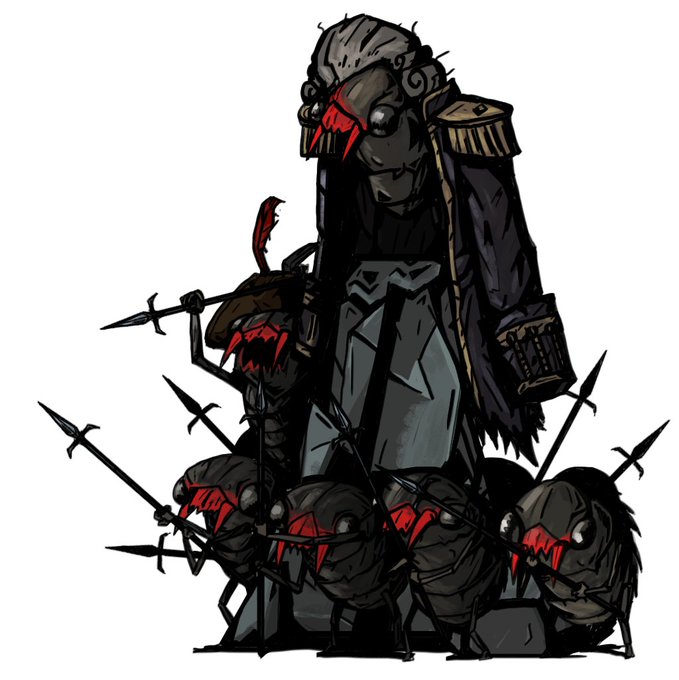

@JasminDarnell I'm terk, mostly doing high contrast/comic stylized art. Currently doing a lot of art commission stuff for Darkest Dungeon modding community and with a mod of my own design and drawing coming out soon-ish


So I tried changing all of the purple to red, for fun, but also because I'm considering introducing a partner character for her, who'd primarily be using blue-ish and cold colors, which would create a nice contrast between their designs.
Not sure if I'm keeping it, tho https://t.co/3Gtg5JILDO

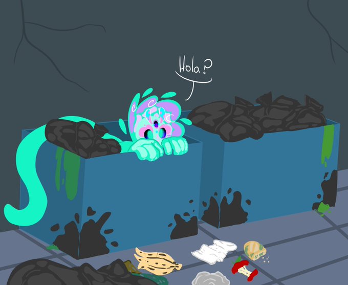
#TalesOfChaos
rol abierto
un día como cualquier otro decidiste ir a tirar tu basura (o buscar algo en la basura), pero te encontraste con un visitante en el contenedor ¿que harás?
(si no puedes dibujar no hay problema, puede ser escrito)

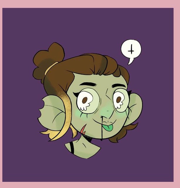


Inktober day 13 : Armor
Well, here gooes the big guns now.
#inktober #inktober2020 #ink #inktoberday14 #inktober2020armor #Inktoberarmor #inktoberday14armor #traditionalart #artist #artistontwitter #black #white #illustration #artchallenge #drawing #OC #contrast


CONTRAST:
You know about negative space- but it applies WITHIN objects like clouds too. Balance between areas of detail and areas of low detail 4/5


I work on some value study like this, really help me to undertsand contrast.


Day 10: Windmills and grasslands 🌼
My main goal for this scene was to create a strong contrast between the land and sky, and a peaceful atmosphere. I also wanted to paint elements that may seem big, but that aren't.
#inktober2020 #buildaworldin31days


Why is it so saturated when I see on my phone (╥﹏╥)💦
I adjust a less saturation & contrast but I hope the first one still look OK on y'all view xD