CONTRASTのTwitterイラスト検索結果。 354ページ目


From start to finish
After posting I realised it would be much better if I got more contrast with the background.


Still painting full color everyd ay and I tried to go big contrast, painterly today. Witch Bolt for day 10 #dungeonsanddragons #DnD #digitalart


[ZERO SUIT SAMUS 💎]
J'suis contente des contrastes que j'ai fait avec les cheveux et tout, j'essaye de pousser mes expérimentations de colo en parallèle de smash ! Tryhard vie 🥺


Watercolor #painting of the dramatic #storm sky, titled "Sky No. 6'" (30 x 40,8 cm, 2017). I just love those contrasting colors!
You can find the original watercolor and signed art prints of it here:
https://t.co/BO4WBAbZvy
https://t.co/cSVqObeDlM


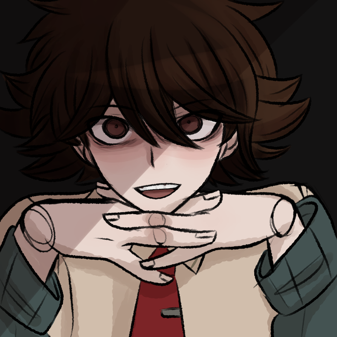
I think my favorite thing about watching other people's reactions to Kaizue is the contrast that people have. Kaizue has both a neutral friendly but slightly intimidating aspect to his personality, but some people only see the good side while others only see the sus side. 🖤🖤🖤

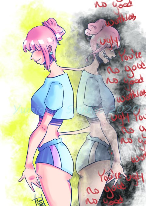
#Goretober Day 9 - #Monster, sometimes we are our own monsters. I hope you all enjoy this piece!
https://t.co/QtUy9sQOtb
#digitalart #supportmeonkofi #spooktober #monster #inktober #commissionsopen #contrast #artistoninstagram #artistontwitter


This was for an art project I had to do, we had to pick an emotion and color palette, the emotion being "anguish." For color I went for a monochrome, so basically black and white, but the blood I made a solid red cause I thought it'd contrast nicely.
#digitalartwork #emotional


if peril cried her tears would instantly evaporate,, also i headcanon that firescales have blackened/dark parts on them making her look like she is made of lava... in contrast to sky who has extremely pale pink scales. i just think shes neat! the white around her eye is salt


I really like the contrast between these two.
Acrona & @SulfarNightfall
#worldofwarcraft #warcraft #nightelf #nightelves #demonhunter #highborne #drawing #warcraftart #artwork #DigitalArtist


Day 9 - Contrast (Iru)
#100oj #100orange #100orangejuice #SUGURI #Iru #Green #digitalpainting #digitaldrawing #digitalart #fanart #animestyle #animegirl


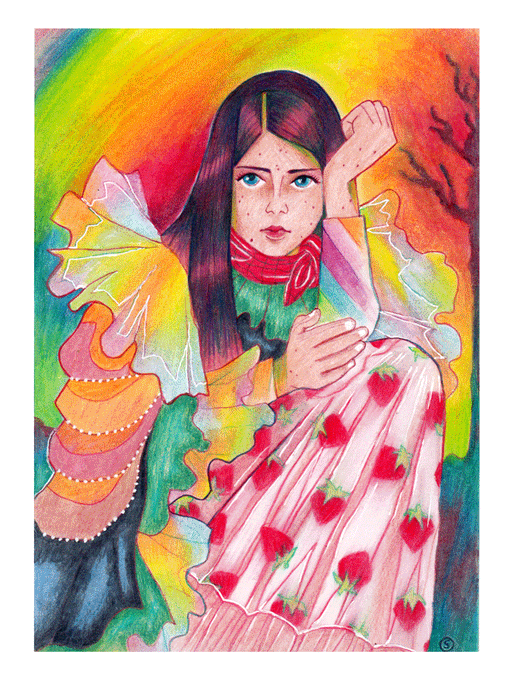
Shop preview n°2: an original illustration of Abigail in a strawberry dress! 🥰 Some details are in white gel pens to make it pop more. I love how bright the colors are in contrast to her mood and story! She's a survivor!! 🔥


Can't show the best -contrasting- ones thanks to a recent contract but here a bit of my chameleonic drawing personality~
_
#sameartist


#dailysketch 1193. Eu ainda acho que prefiro a versão com menos contraste. #Genshin_Impact


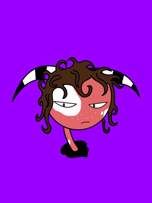
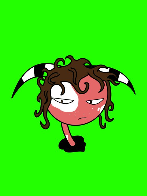
Drew somewhat of my impsona for a pfp, the discord server recommended I use contrast like purple than the original red. I also tried the complementary colour to red as well: Green.
#HelluvaBoss #HelluvaBossOC #HBOC #Impsona #oc #originalcharacter https://t.co/5KmRH8gtEJ


#sameartist is this tag still alive? none of these r very interesting but I like how they contrast lol

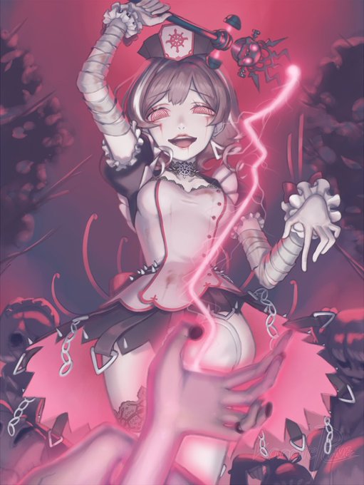
[10/9/2020]
~Electrical Pink Necromancy~
Offer blood to the wand and zap the dead awake!
#OC #Spooktober #ColorContrast


A lot of care goes into each Catopia Cat.
Here's a look behind the scenes at the visual language used in our game.
These notes cover Stroke, Contrast, and Roundness... what do you think?
#Indiedevhour #indiedev #cats

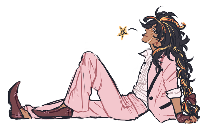
OCtober prompt 2- tuxedo! i was going for a miami vice kinda thing, but i realized after i was already SET on the tux colour that their hair dye contrasts it just. horribly. that's fine though. this is just. fine


Here's Athena, goddess of wisdom, warfare and handicraft. In contrast to Ares, she represents strategic and well thought-through warfare and is often portrayed victorious. Her symbols are owl, snake, olive tree, helmet and spear 🐍 #drawtober #drawtober2020