ContrasのTwitterイラスト検索結果。 10,816 件中 358ページ目

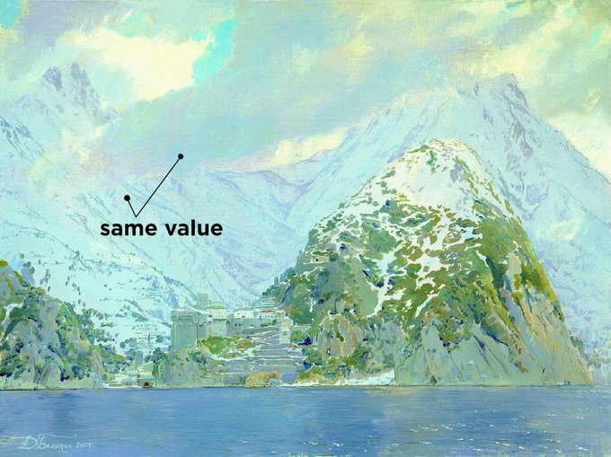

Thread on values! Have you ever had to rely on tweaking levels in Photoshop in order to get your painting to have enough contrast? Here’s how to confidently control values from the very beginning!


Shading is my favorite part, it's what I find most fun and where the art really comes to life.
I experiment a lot with my shades and contrast. The correct colors can change the entire mood and quality of the art, so experiment as much as you can!
saturation tools are useful


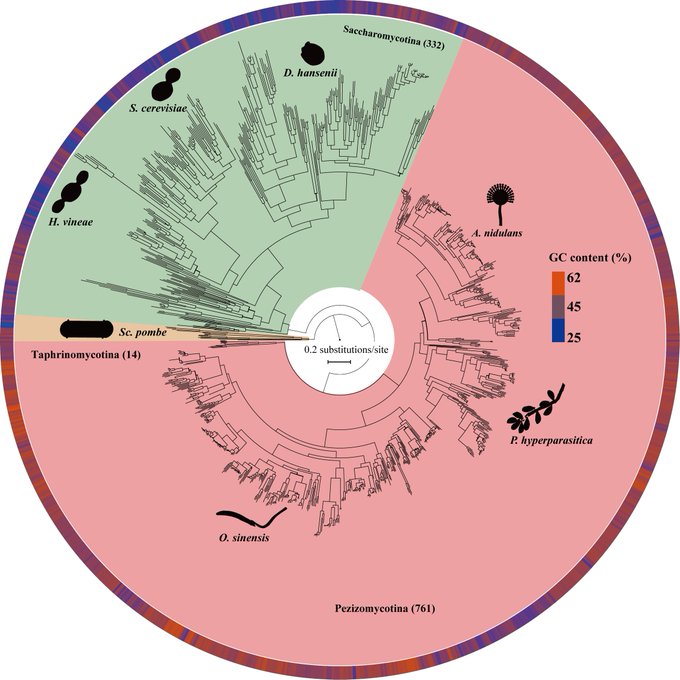
Excited to share our new work just published in @ScienceAdvances. This work utilized 1,107 genomes to provide a robust evolutionary framework and to reveal contrasting modes of genome evolution for the largest fungal phylum, #Ascomycota https://t.co/FRkknx8YiY


@D8bitGaming Ohmygoodness idek *×* do you think a dark purple would show up good?? To contrast with the lovely light purple and red or would that be too dark??
Do you have specific colors you use just for inking??
I know red, white, black, silver and gold are pretty typical dice number ink


just so it doesnt fo to waste here's my piece w the bakground i had for it! the idea was to make chaeyoung look as angelic and pure as possible to contrast w the monster drawing! :D https://t.co/JfWc28VJl9


@El_Banchito Samitto picked a good color with default S, but I also really like the contrast of EX D


In contrast to yesterday's drawing, here's a Cory appreciation post.


Howdy ! ✨
My name's Angie, a graphic designer & vector artist.
I love bright colors, geometry, design that has a soul and beautiful landscapes ❤️✍🏻
#LovelyLandscapes #water #contrast #vectors #colors


Colour tips:
Don’t use only neon colours. When using neon colours contrast it with darker colours
Don’t use too many base colours, limit yourself to at most 12 base colours. Base colours not colours for shading
Don’t use too many similar colours for hair and everything else


@ChelsieArts Make the highlights 100% white and that gives you some contrast for the shading


// Compare and contrast you beautiful losers.
Left, new background (and I gave the knife a bit more of a used look).
Right, what I have right now.


El poder y respeto que este hombre emana plus el contraste de sostenerle la mano a un cadaver cual padre responsable mientras caminan a la masacre


terakhir tinggal kasih detail aja. nah buat cahaya cahaya itu aku bikin garis warna putih diblur dan layer luminousity yang opacitynya di turunin. sisa detailnya ya ngikut doang deh. setelah selesai semua contrass nya kunaikin dikit, jadi kayak gitu. THE END