ContrastのTwitterイラスト検索結果。 10,505 件中 359ページ目


@savisavichan I’m Laila (aka Star) and my art style is STILL getting developed. I will get one some day...I love drawing beautiful girls and my ocs. I love bright contrasting colors that make your eyes hurt but still look 👌👌 I also just love experimenting with different styles and textures


I'm always orang just made it blue for contrast with the hair. Hi it's jenga boys https://t.co/yU1hBDkoaW

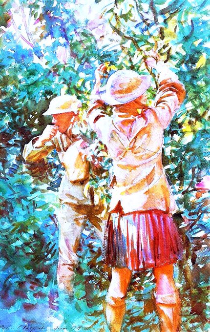

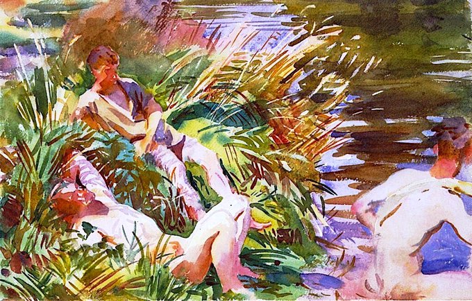
As a war artist his approach was unprecedented. His depiction of an Arcadian setting with nude young men is in stark contrast to the fact they would soon be likely to be hideously maimed or killed. Thou Shalt Not Steal (1918), Tommies Bathing (1918) & Tommies Bathing (1918)

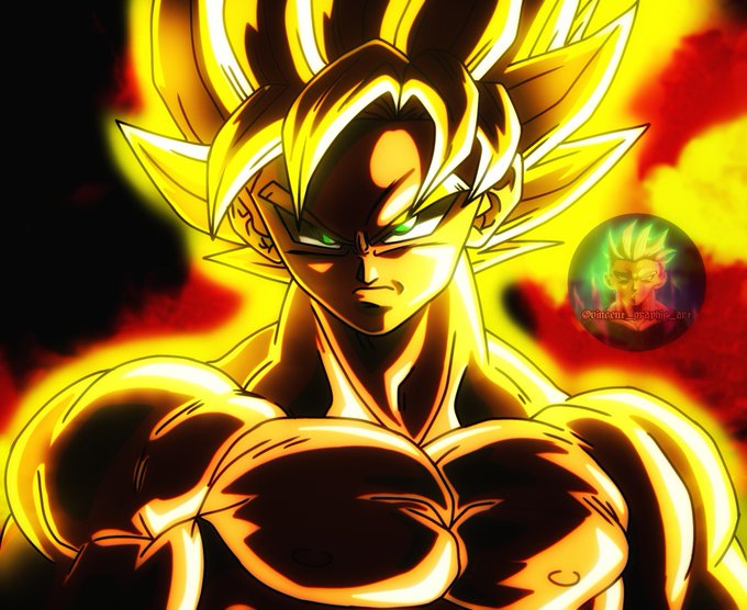
Alternative version of the drawing I posted yesterday. This has far more stronger colors and contrasts. You can actually feel the silent anger of goku. What you think about this piece?
Support @Vincentgraphart
#dragonball #Goku #DragonBall #digitalart #digitaldrawing


Curioso contraste el del #humor 🇪🇸 en que la madrastra de Blancanieves es la habitual protagonista de las referencias al cuento, con el 🇬🇧 en que suele serlo la ingenua princesa junto con los enanitos🤔 https://t.co/NhCwybdh68
➕➡️➡️https://t.co/Z0L3nSHx6s


Finishing my Inuyasha rewatch and the Fruits Basket S2 finale around the same time made me realize something
They share some character names
Rin and Kagura 😂😂
The personalities are contrasting though lol


#CoronaHTT challenge!
My first challenge hosted by @RichardHTT_ ^^ process in the comments!
I love this character, especially the contrast between her smile and her tears.
Find me @ https://t.co/wcpQTVzcMK


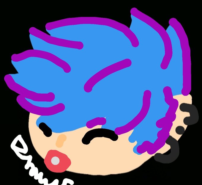

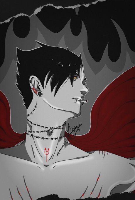
Hola, validen mi autoretrato chupado por el diablo dándole RT y Fav 🥺
Si encontraste la referencia a Kenma t beso


Pokémon fire red
Aquella vez que encontraste un snorlax durmiento en medio del paso ....
.
.
.
#drawing #draw #drawthisinyourstyle #illustration #Pokemon #pokemonmasters #Nintendo #fanart


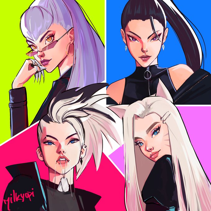


Hii, I'm Opi a small self-taught artist from Argentina, love painting with bright contrasting colors. Slowly trying to get better so i can do splash art in my own style 💖
#LatinxsCreate #LatinesCreate


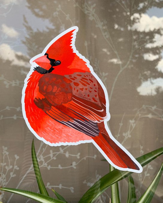
The bright colours & contrast help keep birds from striking your windows.
For optimal efficacy, stick these decals no further than 15cm apart, and cover your whole window!
https://t.co/77pNilunVH

- Keep control of your art
(This is something I strongly associate with Waterson. He wanted to keep his work only as a comic strip, in contrast to say, Peanuts)
The article doesn't say it, but a biggee might be
- Know when to stop


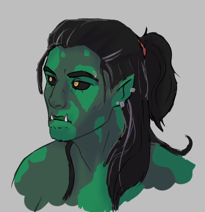
The contrast between June's human form and elf form scares me a little, but I just love her even more💕💕
.
.
Yes this is the same person-


Então eu prefiro ajustar a camada do GM e pintar com ela ativa usando PB, vendo o resultado diretamente na cor. Quando olhamos somente para os valores PB sem o GM todas as areas ficam pesadas, sem muita distinção de valores, mas o resultado colorido é muito superior em contraste


Se eu pintasse os valores visualizando a arte em PB, ficaria mais ou menos assim e com as camadas de GM aplicadas as cores perderiam contraste.


So here are some notes, that I keep in mind as im working in the piece. Number one is main focus and than I try to see where I want the eye to travel using shapes, light and contrast.


here they are without the filters / contrast turned on!! i care them very deeply