HUEのTwitterイラスト検索結果。 37ページ目

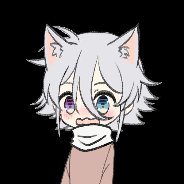


@CupcakeGoth There's also A Blackish Red Hue. I think I got the last copy though, because it was "damaged."


@sofia_marigold I am a bellydancing shapeshifting succubus, cute lewd rude, trying to make the world a better place.
Rules to my shapeshifting: eyes are always a purple hue [from nearly black to nearly white, from very pink to very blue, just a purple hue] and no matter the hairstyle and length/


I've been experimenting with giving Lilli a more natural-looking complexion, but I dunno, I don't think it quite works. Maybe I've just drawn too many vampires but the pinky hue just doesn't feel right. She should look cold, I guess? What do you think?


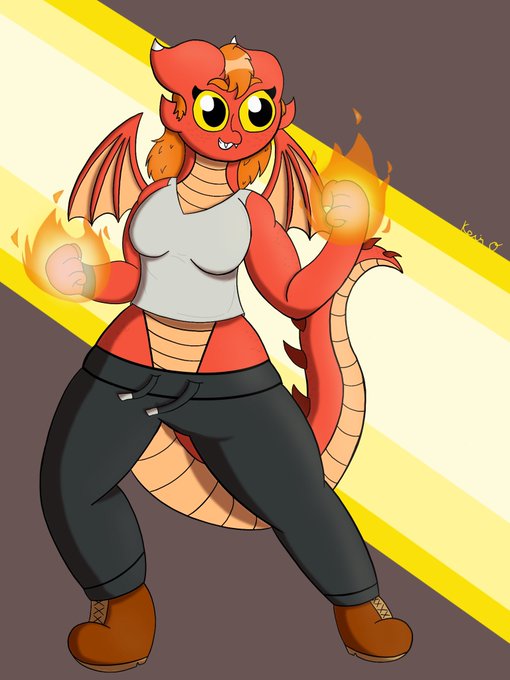
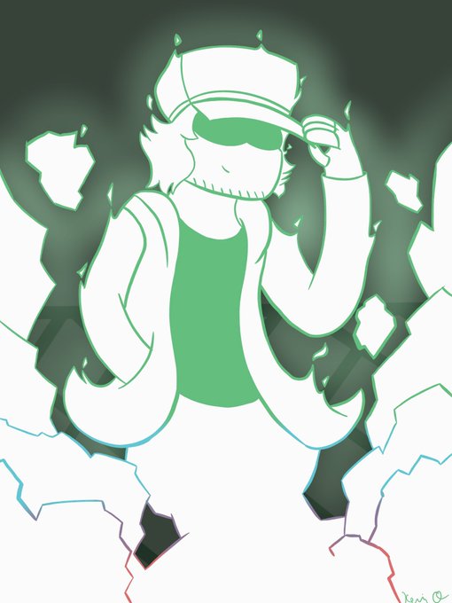
@TwistedFaeArt Heyo! My name’s Hue, and I mostly draw my ocs and the occasional bit of fanart! Behold my vast and numerous skrunglies
Friends! @k0yfish @Crazy_Crash08 @NightRideArts @x_AshesandGhost @DamiDraws_vt @IshaBoiAlex @renegadeafterb1 @Princess_BLND67 @Feralroku


@Famished4Blonds @TheHomeCurrent @WarminsterRadio Thank you David & Matthew! It's my pleasure.
Great photo too, I love the hue of the blue!🦚🦚🦚


For illustrations it's basically the same principle, a gradient map recolors the values as opposed to the hue or saturation
Basically it sees the image on the left as the image on the right

So from what I've learned, gradient maps focus on transforming the values of the art, and not the saturation or hue themselves, into the colors of the set
If you notice, where the sketch's lines are lower or higher value/opacity, the gradient map chose a different color


Some color hue and value studies with my study group. I like marbles lol.


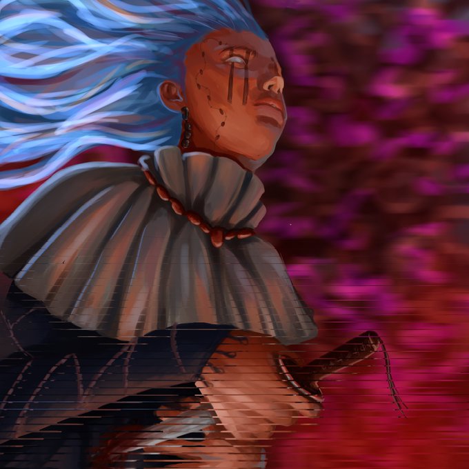


Available pieces from the Hue and cerebrum collection.
Floor: 0.2ETH
https://t.co/TlL1QejQtP


1⃣ The 60-30-10 Golden Ratio 💫
A timeless rule of thumb that helps you delivers the best composition balance.
60%- Main dominant hue
30% - Secondary color
10% - Accent color


can't decide on the hue I wanna use so here are a few more alternatives


🍻Art Tip🍻 Values are very important and easily forgotten. The values are basically your darks and lights. There are many ways to check the values, but the easy and dirty way is to create a hue/saturation adjustment layer and drop the saturation to 0. Check the example below.


Suka bgt ama 4 hal ini hue hue https://t.co/5JPpfIA3MU

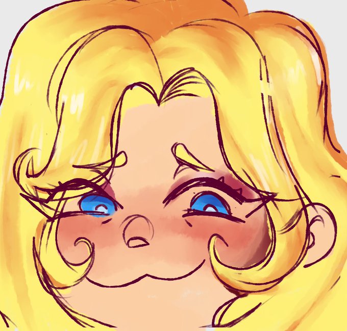


I'm doing a self challenge called #HueJune which is create a character based off of a Hue and a Prompt, so today was Plant and a Green! This will be going on all June, so wish me luck!


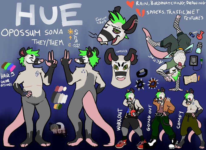
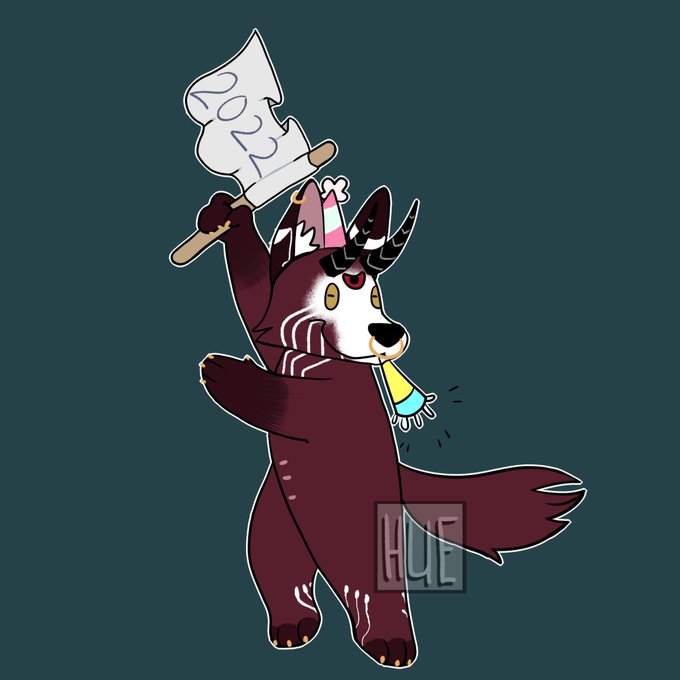
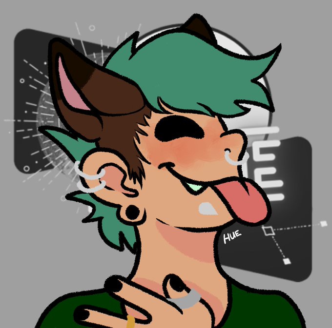
@imbluewisp Hi I’m Hue! I’m a queer pan non-binary artist saving up to move out and hopefully get top surgery in the future! I love to paint and make fun characters!!
I wish you all a happy and joyous Pride Month 🏳️🌈💞🏳️⚧️ and thank you to @imbluewisp for the art share opportunity!

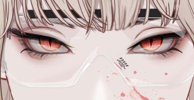
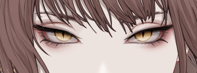
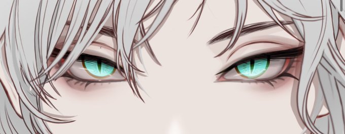
I double checked to see if other eyes “reflected” their effects, and so far in my search i have found that the 3 types of “Elegant” eyes reflect a golden-ish hue, which would match them with yellow/gold effect traits. 8/