contrasのTwitterイラスト検索結果。 10,746 件中 37ページ目


Decided to make the background this greenish color, in contrast to the purple and white! Painted most of the face and hair, still lots of painting to be done.

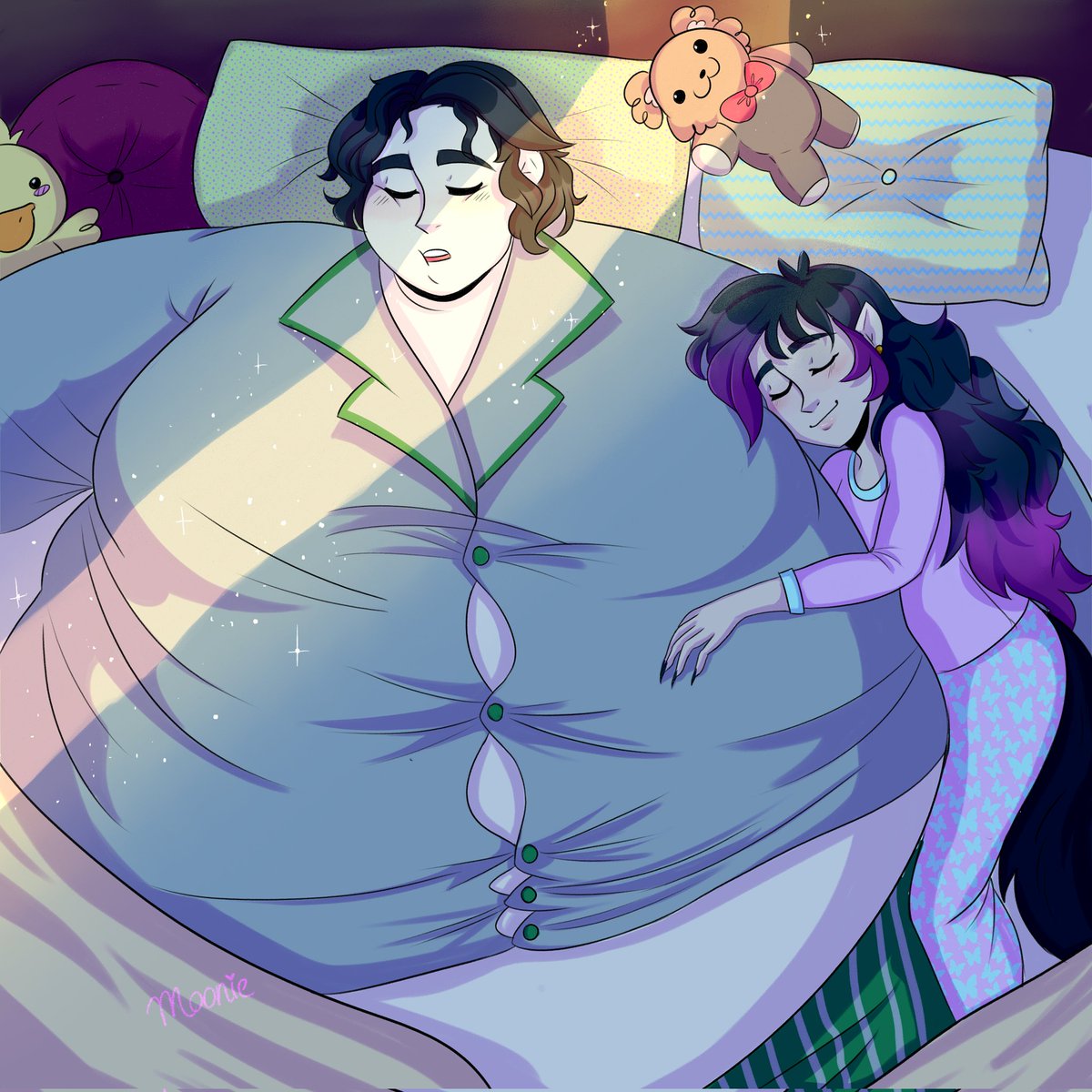
@riu_incognito Congrats!!! Here my beloved contrast couple, 🥺🥺💖 Will and Christa


Something about his ^O^ face
He looks like a a tortured soul BUT HE'S CUTE??? LIKE WOW these contrasting reactions I have to him simultaneously are incredibly amusing to experience. HE'S CUTE AND NOSTALGIC-LOOKING BUT IF I SAW HIS FACE AT NIGHT?



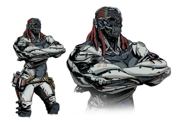
In a visual sense, the color black creates great contrast, and as a designer, I know the importance of it. It's a great way to catch the viewer's attention and create a sense of moodiness.
But there is more to the story than simple visual tricks.
2/5


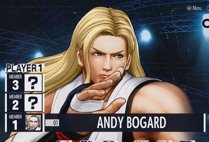
The name placement was also much better before.
Names didn't get in the way of the characters' faces, and the dark square under the names made the names have more contrast to anything else.
The square with the color was unnecessary though, but is still welcomed.


the contrast between their cards are so delicious.. obsessed with how malleus is donned in light to accentuate his brightness as a person meanwhile silver standing under the setting sun to highlight his soft features.. i'm obsessed


'Contrasted tones in a monochrome world... Do they still dull out in this locked room?'
#digitalart




Dark color patterns with strong contrasts or very strong colors, also a bizarre and grotesque side🦑🤙 https://t.co/ReAWNi7FdM


reworking another old piece
and the face already looks so much better
and i didnt even do something with the contrast yet
but better colors for the lines already did so much difference

🎮🎮🎮🎮 #builddivers #ahead #クロス新ビジョン #ガンダムワールドCONTRAST #ガンダム国勢調査
Source: https://t.co/bOBoyWcIlR


Another edit of this mickey design
It shows that this design was meant to fit with the oswald villian concept perfectly, having their designs contrast each other.


Angel wings are being used as a symbol to give a sense of classical beauty and an "angelic" character to the Carbonized Soul that is designed for slaughter. It creates a sense of irony, as the angelic imagery is being used in contrast to the machine's intended purpose.

In order to create a dramatic atmosphere, I applied a painting method that was frequently used in Renaissance paintings - Chiaroscuro.
Chiaroscuro, in art, is the use of strong contrasts between light and dark, usually bold contrasts affecting the whole composition.



@VexingTopology It's absolutely the best. It's so iconic! The contrast between her poofy flowing hair and puffy yet short jacket on top of her skin tight superhero spandex (and those knee high boots!) is SO GOOD.


I'm very happy with the combination of contrasts but unite at the same time, the legend @creepy_nft collaborated with me 2022 💀
"The Mask of Jerumaat" on @foundation


There's a lot of intrigue in how a generation of orcs would grow up without the identity of a clan, and the contrast between the two.
The MU orcs didn't have a choice, they grew up in chains, and had their identities stripped from them. It was born of trauma and liberation.