contrastのTwitterイラスト検索結果。 11,163 件中 37ページ目


There's a lot of intrigue in how a generation of orcs would grow up without the identity of a clan, and the contrast between the two.
The MU orcs didn't have a choice, they grew up in chains, and had their identities stripped from them. It was born of trauma and liberation.


@kolectxyz @wackybycc @undermooder @Alexa_arrrt @_Art_DA Hey💜
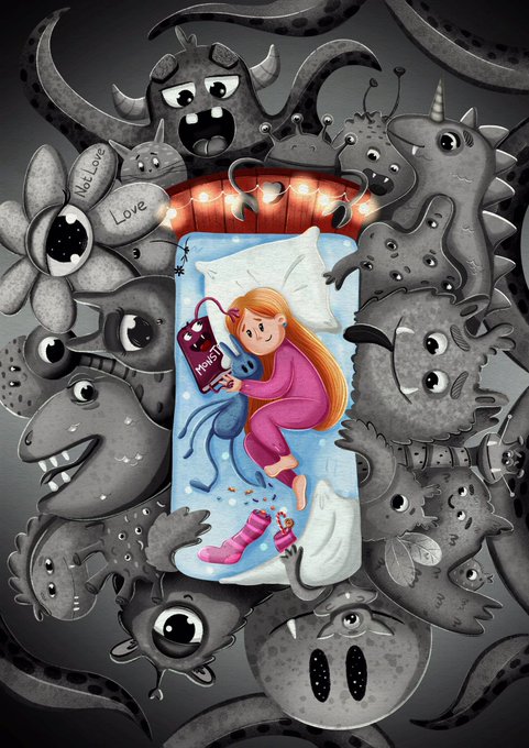
Dive into my fantastic world of amazing stories and unusual characters, bright colors, contrasts, and lots of cute details! It's about emotions and feelings here. My illustrations are a bit childish and naive, and that's the beauty of them.
@TheLittleShishi @mystery__eye


@AzurLane_EN Pure white outfit for a (probably) pure girl. Usually I like contrasting colors more but this one actually fits Theseus well. Her lovely white wings and clothes making her smile all the brighter.


@MadAboutPaper @1SonuvaGunn Consider, as a contrast, that one I did recently that I said I liked. Bottom left:
That face is genuine. It is ‘alive.’ The others, pretty as they may or may not be, are not genuine in that same way. I drew the bottom left face confidently, without hesitating and fretting.


Finally another page complete!!! I’m proud of how the contrast came out 🥳
#artmoots #arttwt #digitalart


@blackyasha0 oh thank you, that's rlly helpful!🙏✨
the first is the original, then i enhanced the contrast + made it darker, then on the 2nd one i enhanced the red and de-enhanced the blue, on the 3rd i de-enhanced the red and enhanced the blue.. i also have these two, which are in between🤔


TaiTang and Kenkudo as Shiver and Frye from Splatoon 3!
I love the style and contrast in Splatoon 3 character design
Idea from my puppy:
https://t.co/PKIh7FIc2s


Preview of a FFXIV sin eater inspired design. Still need to figure out quite a bit about it. But it's been really interesting working with a lighter color scheme and really sharp shapes in contrast to most of my works!


It's hard to say which of these 31 tips is the most fundamental, but this one is in the running, for sure. For me, making everything "readable" is job #1 as an illustrator. And beefing up the contrast is almost always a key part of how that is achieved.


ustedes no entienden lo mucho q me gusta este contraste entre los dos #fhs


【VOCALOID4】The vocal synth of the hour is Masaoka Azuki.
Azuki is a cheerful girl who tends to act first and think later, in contrast to her best friend Kobayashi Matcha.
Originally released for VOCALOID2, her voicebank wasn’t public until her V4 release.


Maybe its just me but i genuinely do like the villain design. i think it contrast well with her daydream design https://t.co/Lf3rhslflQ


1/x Male Peasant
- I like the hat, so I try to choose a cloth that match the hat.
- I choose a darker background to have some contrast.

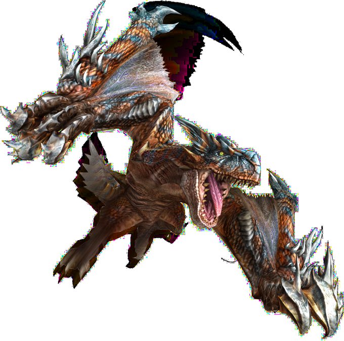

@AlatreonBestBoy If I ever had to choose actual redesigns I really don't like from Frontier it would be these two and they both do the same thing that I hate - they don't expand the designs and instead slap some sharp contrasting as hell edges on top of the sleek body of the OG monster.

🌸Vtuber vs IRL🌸
Perdón quise unirme a esto que he estado viendo por twitter jeje
Obviamente el contraste si es muy grande (╥ω╥)
Link https://t.co/XRgzXtQ6Ck
#Picrew #遊び屋さんちゃん


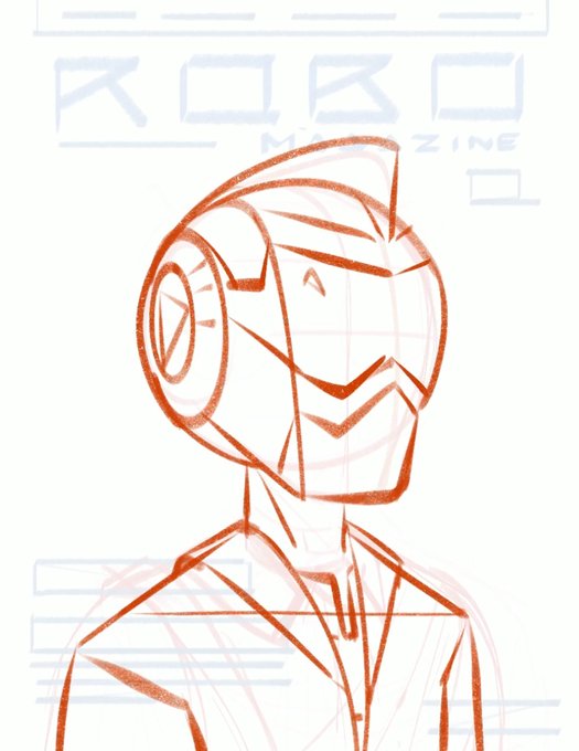

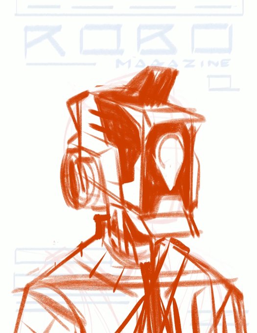

2. Design character
The character should fit the world and story you're creating.
In this case, I wanted the robot to feel more robotic/mechanical, less human to contrast the human outfit.
Tip: Design options to extremes to find out what you actually want/fits the story


