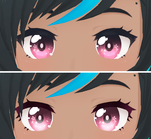
compareのTwitterイラスト検索結果。 22,421 件中 368ページ目


Once again, I feel my style shines through here when I compare this to the reference art. A lot of creative liberties were had with the goal of conveying sheer ✨️Fabulousness✨️


In honor of @AaronLeupp creating us the SHINY version of the save milk waifu. I WILL BE DOING A GIVEAWAY FOR THE FIRST ONE EVER TO BE GIVEN AWAY.
LIKE AND RT AND TOMORROW I WILL CHOOSE THE WINNER
Very limited quantity compared to the regular waifu!!!


@Solar_Sparky i’ve seen people compare him to lucian. i think the hair color matches better but who knows


I know I do this alot but I just love looking back at some of my first pieces of art compared to my most recent. I've learned alot and it makes me really happy to see the improvement

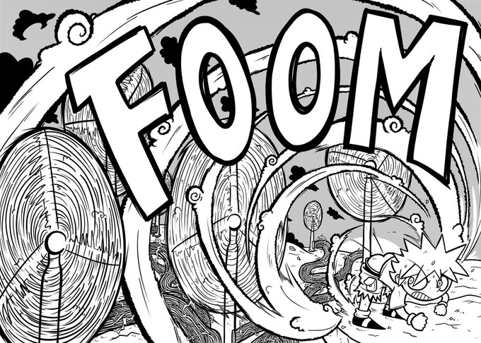
Today's wind ain't nothing compared to Guff's. Check out indie comic BUMSTORM today and witness the fury of his gale force farts.
https://t.co/mYa6gdDY6D💨
https://t.co/hysxSIjPKf💨

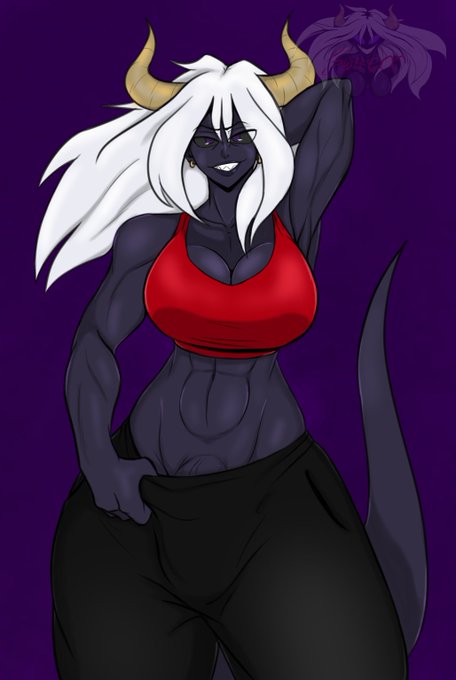

Hey Synfuls. I'm at a crossroads. As much as I like the current design of Syndark as a futa. I kinda miss the original concept of Syndark. Idk why but I just miss it. Also they were slightly shorter compared to the futa design. And I love drawing short gremlins of mass horniness


@FendeVilliers @smts57 @BDSixsmith Interesting how this compares to "Humans of Flat". Both being simple but one is full while the other is empty.


I'm not too sure how I feel about the #MDZS cover tbh? It's lacking compared to the many illustrations of the series I've seen so far?
I'm good with #TGCF & #SVSSS covers, especially TGCF, the prettiest so far!
#MoDaoZuShi #HeavensOfficialBlessing #ScumVillainsSelfSavingSystem


#WordOfHonor
#山河令
WKX vs ZJ compared to WKX vs MHY. Beside the use of a sword, WKX's movements & form against MHY was all over the fucking place. Using everything & the kitchen sink. But honestly, less grace & more of a blunt force instrument. I love WKX, the murder toaster.


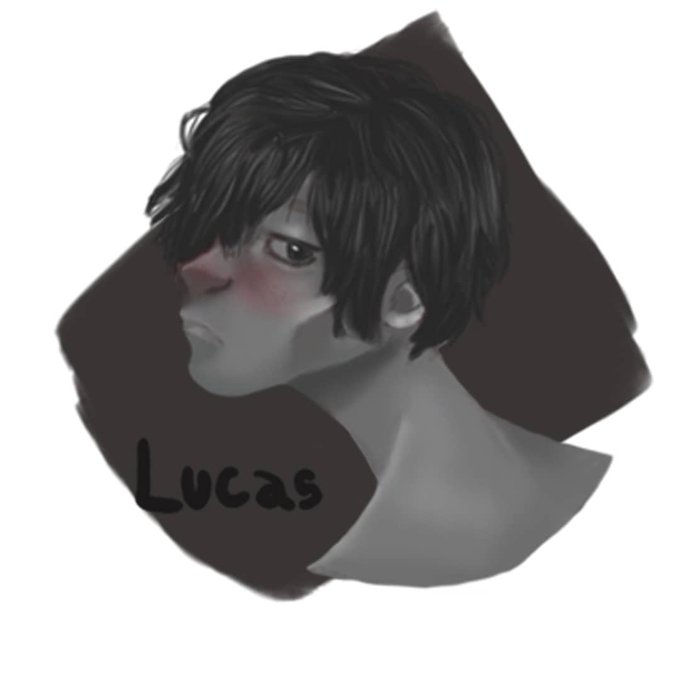
Esse é um dos que eu mais me orgulho de ter feito, pois depois de muito tempo eu resolvi fazer um estudo de cabeças, e comparei algumas artes anteriores com essa e me surpreende com minha evolução. https://t.co/h1Px5fqGxB



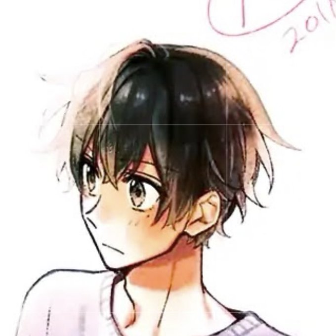
hmmm idk how ppl see brown hair on kagiura to me it looks black (miyano for comp) just looks like a warm black rather than cold black compared to other miyano pics


this compared to my first designs of her , not much of a difference but it is for me ALHSLDFKH


Through 5 Decades research we've rediscovered Two of Rembrandt van Rijn's V/rare Seascapes"Port of Amsterdam"1635 & recorded lost"Ferry approaching a Pier in a Storm"1632-1.Infra-red-2.Compared with"Sea of Galilee"3."Pentimenti Study"of
"Rembrandt's"1632 Self-portrait"in Sails👨🎨


How to live and not compare yourself with someone forever.....
YCH for: @dart25
.
.
.
#mlp #pony #ponyart #mylittlepony #ponyoc #ponyartist #didgitalart #didgital #cute #originalcharacter #ych #drawing #artist #brony #artwork #illustration