ContrastのTwitterイラスト検索結果。 10,505 件中 369ページ目


Howdy lovely people 😊✨
Here’s another #DailyDoodle with this #Japanese #shrine #landscape / #seascape 🌊✍🏻
Wishing y’all a terrific Friday & week-end 🍀🌸❤️
#VectorArt #FlatDesign #color #contrast #GraphocDesign #illustration

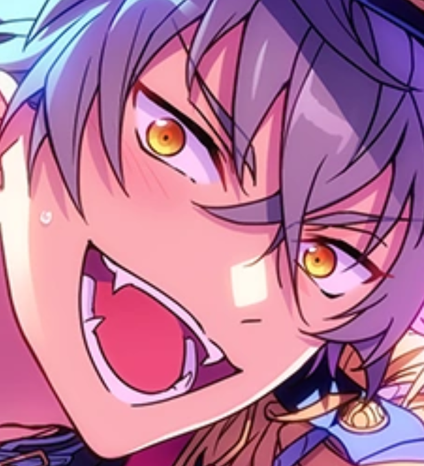

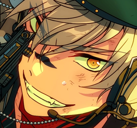
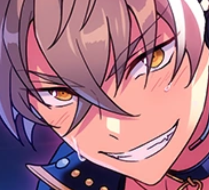
ppl are talking about eyes and i just gotta say
i like the gleaming and fierce intensity, but the contrasting soft and deep softness that koga's eyes radiate :3


$10 b/w headshots/ $15 Flat colour headshots. Need a new monitor, and i dont trust my back up with full colours cause its like 10 years old and has no contrast. Post character references or DM me, please. Female characters only.
#digitalart #commissions


Fixed Fractal Onion Procedural Glow Cube in @notchvfx #madewithnotch . Made a list of things i wasn't super happy with on Today's render, so made some tweaks and let it grind away in the background. Fixed Fractal animation speed, added the glow pulses and raised the contrast.


@AsheIllustrates Hi, I’m Citri, and I draw,,, a lot of things!! Sharp contrast and soft lines are my favorite :>


#Grotta is a #font family created by Due Studio 🇮🇹 It is an irreverent, contemporary and neo-Grotesk typeface with strong geometric accents and sharp contrasts in its form. It can now be purchased from @type01_ curated marketplace https://t.co/tIVfeuOnrK #type01 #typedepartment


I upped the contrast so you can see the last two panels better.

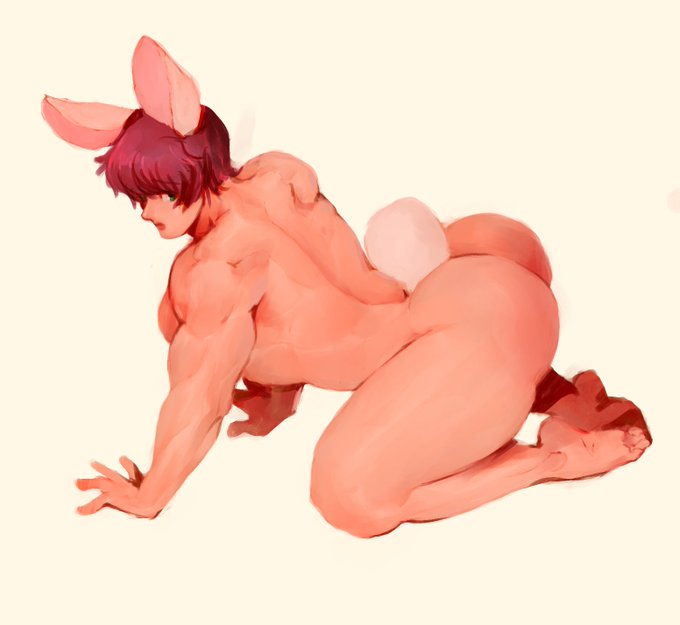
Bunny bum doodle. Aagh! Back muscles are hard! And so is controlling my color contrast 😑


First some KH shoes and now this gorgeous cover art! Wow, such an amazing week! 🥰 🥰
I like how, from Kairi's POV, everybody is smiling. It's quite sweet. Also, it's really interesting how this image contrast with the previous one of Sora's, all in black and with blank frames.


🥰 I've decided on a bg already and it'll actually kinda contrast with the jasper one I drew previously... I guess the images could work as a pair


#kingdomhearts Can we just talk about how amazing the contrast between the KH3 official art of Sora on the throne and the #melodyofmemory version with Kairi is. Sora was surrounded by darkness while Kairi is surrounded by light. The portraits were empty for Sora while Kairi's -



Bon, ça contraste un peu avec le déluge de nouvelles terribles depuis 2-3 jours: These Savage Shores est l’un des plus gros lancements de Comics indé’ en France cette année, et j’ai presque du mal à y croire tant c’était inespéré. Merci infiniment à tous ceux qui ont déjà craqué.

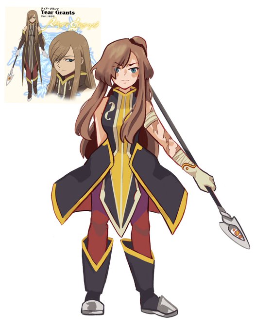
did a light redesign on tear bc i have beef with her lack of contrast, tried to keep as many things similar as i could while bumping up the contrast and shape dynamics


@Psyched_Slash I think the third one looks best. Nice contrast between parts of the outfit.

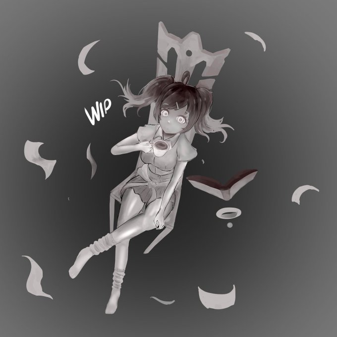


reposting bc i wanted to fix some contrast issues. i did the original piece years ago and it was severely faded, so i decided to draw over it to give it some new life :) the second pic is what the original looked like before it faded


New Reference sheet of my gfs fursona. Tweaked her colors so they were a little cooler and had some more contrast. She is a kit fox who has a passion for being cute/edgy and crimes.
@ThotPepper13


Acceleration of SUGURI 2 August update, version 1.7.3 is now live, adds Military Sora costume for everyone, High Contrast mode + gray background options for accessibility, Input Display for training, new avatars and more!
Full notes here:
https://t.co/olivAAzjnl #AoS2 #STG


This is the concept art of Voldo. The design is based on "Spider" and is reversible, a design inherited from the 2P of SC3. The front and back are contrasting with "Man and Woman" and "Squire and Noble". The crescent silhouette of the head is also a key point.(1/2)
#SOULCALIBUR