comparisonのTwitterイラスト検索結果。 22,161 件中 369ページ目




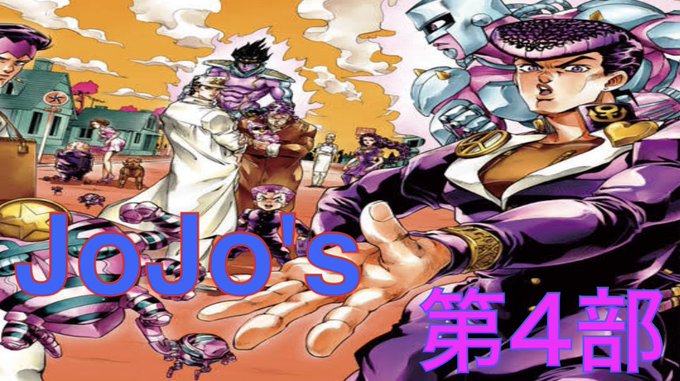
【ジョジョの奇妙な冒険】声優CV集 第4部まとめ JoJo's voice comparison Part 4 https://t.co/J3zDwE3ODG @YouTubeより
今日の #ジョジョの奇妙な冒険 は、オールスターだせ〜😆✨
ドラドラ ドラ〜👊😆


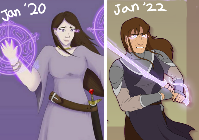
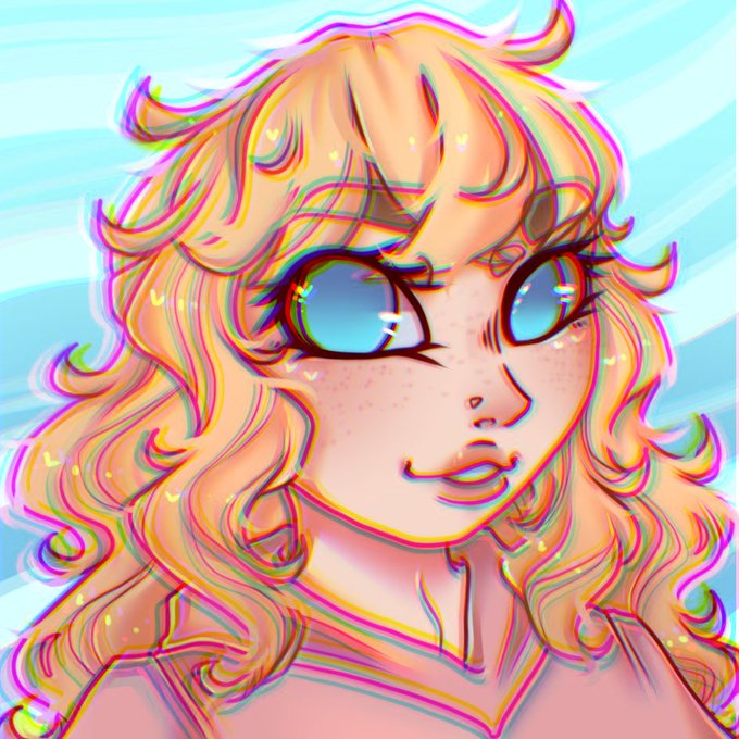
For comparison, heres the same character drawn back in 2009






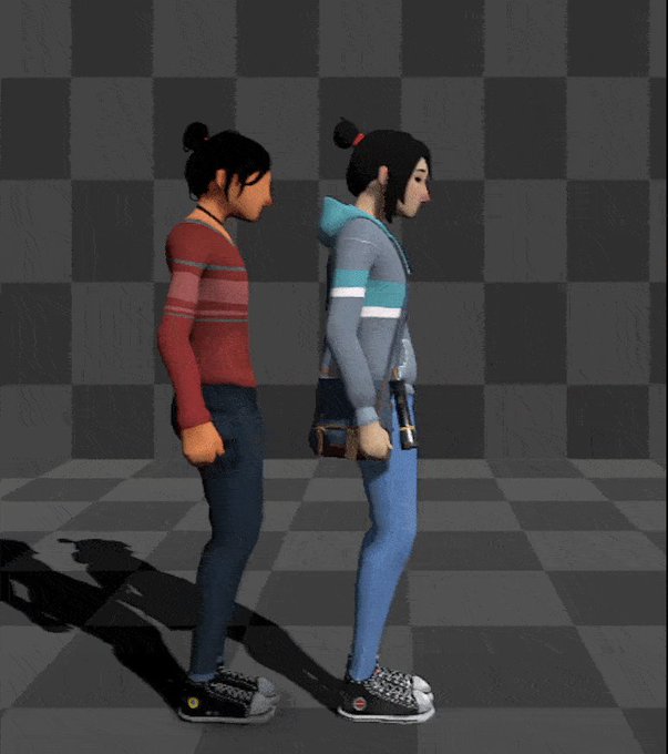
June has a whole new look, and she has eyes now😍✨
Here is a comparison with the old model on the left!
Demo on Steam https://t.co/qOHLGnwRBb
#indiegame #indiedev #gamedev #lowpoly #gameart #unity3d #madewithunity


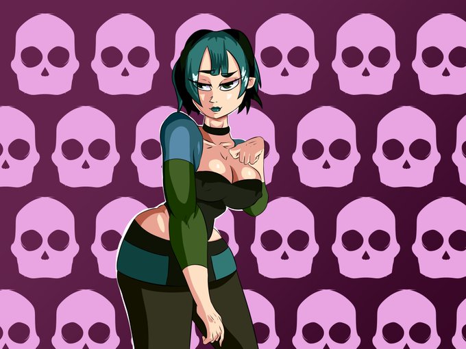
Comparison
Jan 12 2022 vs May 15 2021 I feel like its an improvement? <.>
#gwen #TotalDrama


Quick height reference of these guys! Gregory is there for comparison
Boop is so tiny… 🥺
#fnafoc #fnafsecuritybreachfanart #fnafsecuritybreachoc


Just taking a random OP panel for comparison as it’s the one people cite most next to Jojo but how do you not see that the contrast is fundamentally a part of the composition of a panel. Having fully coloured characters talking in an empty void is just a weird nightmare to read.

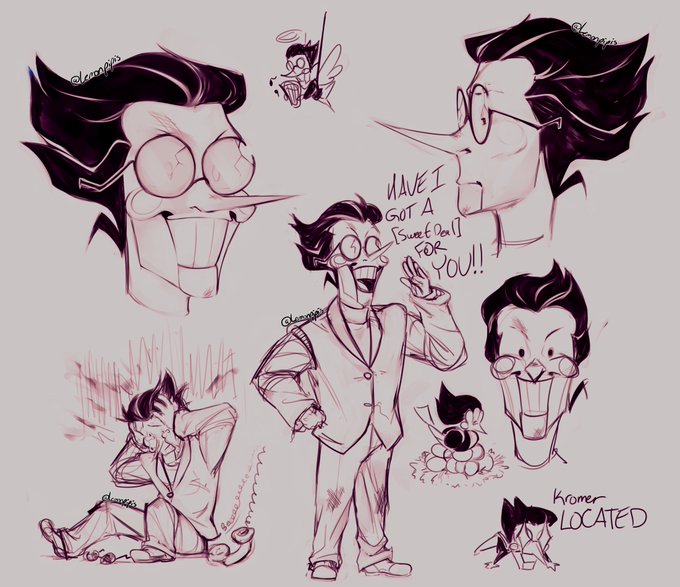
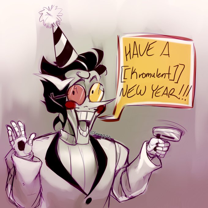
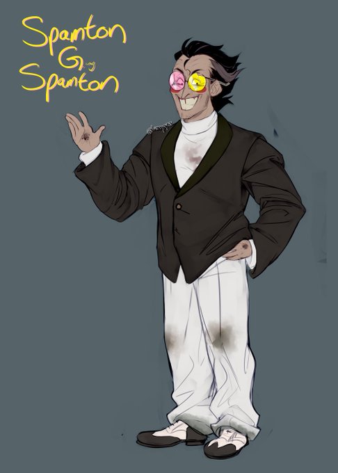

Saw the development comparison meme going around for The Skrunkly™️, so have a gander at how I've turned this man into a moeblob (bonus Gary because I draw him more)
Nov 2021 -> Jan 2022
#spamton #deltarune


Some more Carol and Rosa, with a sneaky Greta.
A full size comparison added as well.


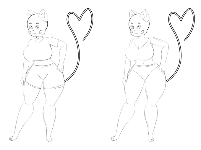
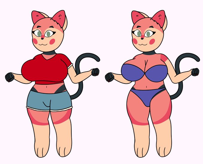
Got a sketch scheduled for next Friday and what I'm working on is far from done, so I thought it'd be fun to tease it a little. Anyway, here's a peek at Sorbet's 2022 ref (along with her 2020 design for comparison). She's changed a lot! 🐈