contrasのTwitterイラスト検索結果。 369ページ目


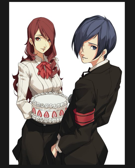


Compare and contrast.
#DonaldTrump about #GhislaineMaxwell: #IWishHerWell
Donald Trump about #BreonnaTaylor:
#JeffreyEpstein #ChildTrafficking #SexTrafficking
#BLM #SystemicRacism #CivilRights
#Vote #EveryVoteMatters #YourVoteMatters
Archival @JACKOHMAN
RT @cartoonistgroup

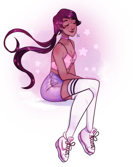


@neon_nuisance thanks for the art share!! this sounds like fun! I like how I use contrast with purples, pinks, and blues!
🌈💖


Today’s #DailyDoodle ✍🏻✨ a colorful beetle, wings wide open.
Hope you peeps like it 😊🌸🐞
Happy Thursday ! 🍀
#FlatDesign #GraphicDesign #illustration #color #contrast

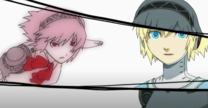


The constant contrasts between Aigis in her sundress & she exposing her robotic body are also something else. They show the juxtaposition between her nature & her human heart; and they accomplish this through the dress Aigis wears as she & Leader reunite, & she finds happiness🥺


@galiminix @bispau Hola! Me llamo Indo, soy un chico trans 😊
Ahora mismo estoy estudiando arte gráfico en la escuela joso de Barcelona
Me gusta mucho usar colores muy vivos y contrastados!

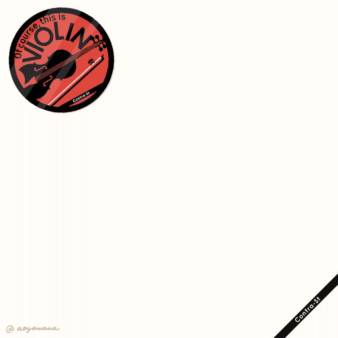
13枚の楽器ステッカーを、アニメーションで紹介します♪その楽器らしいコピーをそれぞれ考えて作りました。楽器ケースやトランクに貼ってお楽しみくだい #contrast_design
https://t.co/4qqQFSAXaO


The NieR Replicant Remaster Cover art has leaked!
I love how it contrasts nicely with Automata's Cover with the 3 Characters on top of debris, much better compared to it's original PS3 Art!


#Brisk, Best laid plans tonight - until I sprayed #ink all over this piece - so ignore the fine mist of pump marker. I was just a bit too exuberant with my priming. 😂 A bit of advice, always replace the cap before shaking! #illustration #drawing #sketch #portrait #highcontrast


I try to draw my fursona with some dark clothes!, kinda like the style of how the blue contrast with the black OwO
#Furry #furryfandom #fursona #digitalart #practice #wolfdog #wolf #dog #furrydraw #furryart #paintdraw


#Cheetah #digitalart update by adding a darker shade, for contrast. #africawildlife #bigcats


Watercolor #painting of the dramatic #storm sky, titled "Sky No. 6'" (30 x 40,8 cm, 2017). I just love those contrasting colors!
You can find the original watercolor and signed art prints of it here:
https://t.co/BO4WBzUoE0
https://t.co/cSVqObweKm


janeiro/setembro
pros: não
contras: sim https://t.co/uoncdYf5iY


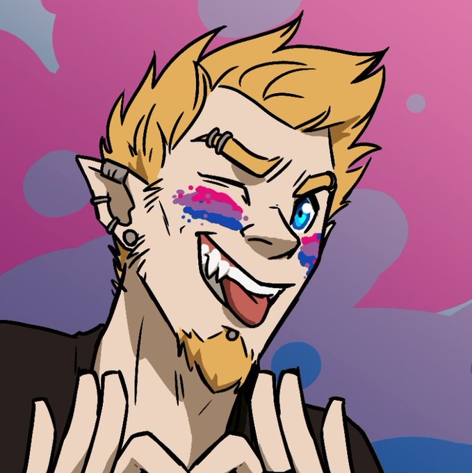
Happy Bisexuality Day!
💙💜♥️
Huge thanks to @LotMinx for drawing my giant lad Tyre sporting his colors and celebrating Bi Pride!
He's a cheeky flirt~
I love the contrast between this and Killian's Ace pic.
It's so true of them tho. 😂
#BiPrideDay #bipride #sizetwitter


Admito Que Me Encanta El Contraste De Los BattleBacks Con Las Bases <3 Con Editar Un Poco Lo Que Viene Por Defecto También Puede Quedar Bien :3
Antes De Que Llegue Alguien Ha Dañarme El Autoestima xD Los Créditos: https://t.co/4pa1JNWZ55 <3 Excelente Trabajo!... UwU

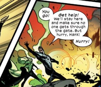

#xSpoilers
Quite a contrast of Alex and Scott's moods today...




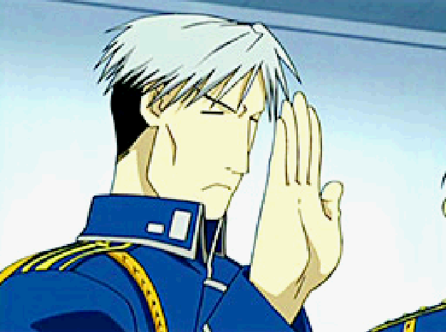
the high contrast low quality falman on the start screens slideshow makes me yearn for fma on one of those gameboy video cartridges


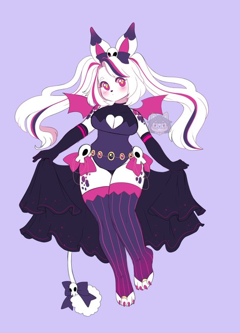
Bunni skulls Adopt! - 80usd ! i know im making a lot of white fur <w< ;;; this is the last one i promise LMAO i just love how white looks in contrast to all other colors ;w; /