ContrastのTwitterイラスト検索結果。 10,505 件中 370ページ目


Hello there #VisibleWomen !
I’m Angie, a #GraphicDesigner / #vector #artist, I pour my heart & soul into the colorful and contrasted illustrations I create 🌸✨
I hope my work can contribute to making the world a little more beautiful, and bring smiles on many faces 😊🍀


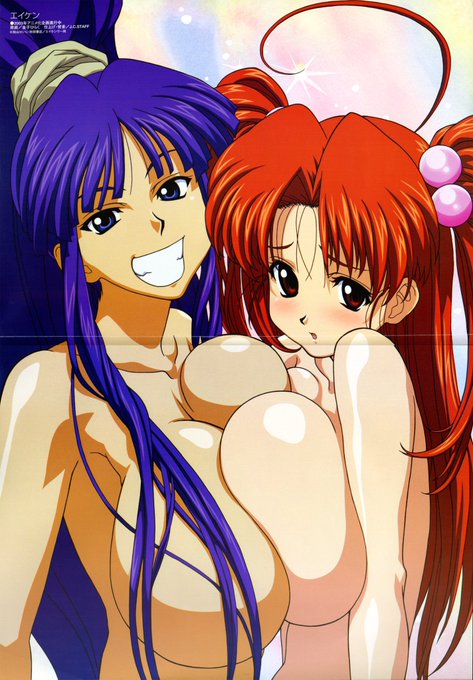
//I always like contrasting Kirika with my other Eiken account: @MissShinonome
Kirika is forward and seems to get the attention I want from her display.
Chiharu was more reserved, but could never really get the right person I was looking for.


Hi!! #VisibleWomen my name is Deya I’m an architect & illustrator and I love bright colors + contrasts ✨


#newartists “I live in one of the rainiest places on the planet, and the fog that lifts up regularly – almost every morning and night from autumn to early spring."
In Felipe OA's images, soft, hazy greens feed into sharp yellows and high-contrast shadows. https://t.co/qpM6UgHjhy


Amazing what five years of grinding can do to transform your art. I've always wanted to put more gray tones in the lineart stage for contrast, so I did. Colors up next.
#art #drawing #digitalart


Axoelote - Axolote con un elote
no soy bueno con los fondos pero quería ponerle colores bien neón y contrastantes por que quiero y puedo xd
#ilustracion #ilustration #axolotl


Decided to change Hilda's gloves white. Thought they contrasted better that way ❤


Ah I've made some more edits to add contrast since this is meant to be an icon 👍


Comisiones que hice para @RaulMedrano10 ! Muchas gracias por todo 💞
(Amo el contraste entre la jolly Roger y Kirby)
.
#commissionsopen #opencommissions #Commission #kirby #fanart #jollyroger #onepiece #nintendo


RE: Previous thread - I also think "The Dark Knight" redefined Two-Face's look in a similar fashion. Whereas before it was common for his "bad" side to be scarred/deformed with contrasting hair, now it's du jour for his skin and hair to be burnt away.


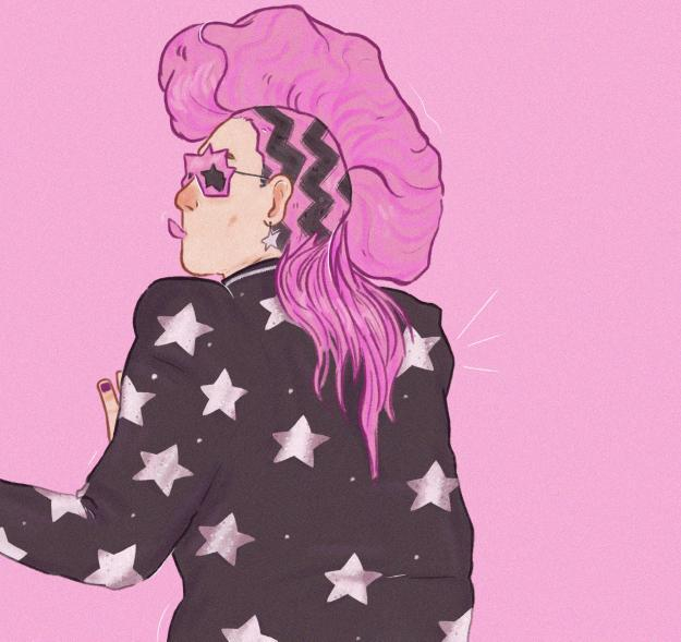

Wiktoria created these fabulous artworks of @eltonofficial for her year 2 Niche Guide, all about the incredible outfits that he wore throughout the years. 🦄 We love to use bold, bright, contrasting colours, and these characterful illustrations are 💥💖


[tales of xillia] more girls in clothes, this time with some extra contrast #agreia


before : i am still doing my bad habit (dull color, not enough contrast shade, etc)
i need to watch more tutorials for some inspirations while drawing, so i got 'slapped on the face' before doing the same mistake 😰 #digitalpractice #colortheory


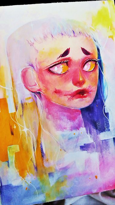

@nostr8answer I do also kawaii/slight gore ! I love pastell but aswell as contrast and abstract art!


Watercolor #painting of the dramatic #storm sky, titled "Sky No. 6'" (30 x 40,8 cm, 2017). I just love those contrasting colors!
You can find the original watercolor and signed art prints of it here:
https://t.co/BO4WBzUoE0
https://t.co/cSVqObweKm


!!! #GEARSTHEWOLF !!!
Gears was not so popular, in contrast to Gadget. However, I'm still surprised 👀

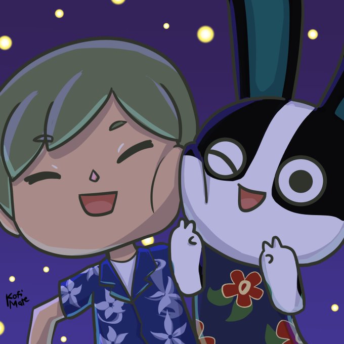


@pattymacey_art Thanks for this art share and thanks @_joshuaclarito for the tag.
I'm Kofi, and recently I like making cute art in contrast to my usual works. These are my favs so far.
I'll be tagging @JaiPinkadoodlez @annaliese_bloom @SaltedYam @plejenrose


