ContrasのTwitterイラスト検索結果。 10,824 件中 38ページ目


reworking another old piece
and the face already looks so much better
and i didnt even do something with the contrast yet
but better colors for the lines already did so much difference


🎮🎮🎮🎮 #builddivers #ahead #クロス新ビジョン #ガンダムワールドCONTRAST #ガンダム国勢調査
Source: https://t.co/bOBoyWcIlR


Another edit of this mickey design
It shows that this design was meant to fit with the oswald villian concept perfectly, having their designs contrast each other.


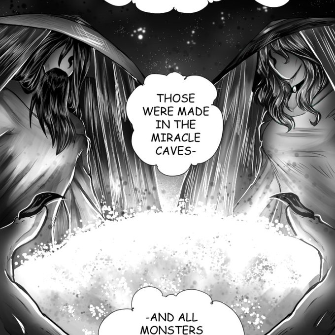
Angel wings are being used as a symbol to give a sense of classical beauty and an "angelic" character to the Carbonized Soul that is designed for slaughter. It creates a sense of irony, as the angelic imagery is being used in contrast to the machine's intended purpose.

In order to create a dramatic atmosphere, I applied a painting method that was frequently used in Renaissance paintings - Chiaroscuro.
Chiaroscuro, in art, is the use of strong contrasts between light and dark, usually bold contrasts affecting the whole composition.


@VexingTopology It's absolutely the best. It's so iconic! The contrast between her poofy flowing hair and puffy yet short jacket on top of her skin tight superhero spandex (and those knee high boots!) is SO GOOD.


I'm very happy with the combination of contrasts but unite at the same time, the legend @creepy_nft collaborated with me 2022 💀
"The Mask of Jerumaat" on @foundation


There's a lot of intrigue in how a generation of orcs would grow up without the identity of a clan, and the contrast between the two.
The MU orcs didn't have a choice, they grew up in chains, and had their identities stripped from them. It was born of trauma and liberation.


@kolectxyz @wackybycc @undermooder @Alexa_arrrt @_Art_DA Hey💜
Dive into my fantastic world of amazing stories and unusual characters, bright colors, contrasts, and lots of cute details! It's about emotions and feelings here. My illustrations are a bit childish and naive, and that's the beauty of them.
@TheLittleShishi @mystery__eye


@AzurLane_EN Pure white outfit for a (probably) pure girl. Usually I like contrasting colors more but this one actually fits Theseus well. Her lovely white wings and clothes making her smile all the brighter.


@MadAboutPaper @1SonuvaGunn Consider, as a contrast, that one I did recently that I said I liked. Bottom left:
That face is genuine. It is ‘alive.’ The others, pretty as they may or may not be, are not genuine in that same way. I drew the bottom left face confidently, without hesitating and fretting.


Finally another page complete!!! I’m proud of how the contrast came out 🥳
#artmoots #arttwt #digitalart


@blackyasha0 oh thank you, that's rlly helpful!🙏✨
the first is the original, then i enhanced the contrast + made it darker, then on the 2nd one i enhanced the red and de-enhanced the blue, on the 3rd i de-enhanced the red and enhanced the blue.. i also have these two, which are in between🤔


TaiTang and Kenkudo as Shiver and Frye from Splatoon 3!
I love the style and contrast in Splatoon 3 character design
Idea from my puppy:
https://t.co/PKIh7FIc2s


Preview of a FFXIV sin eater inspired design. Still need to figure out quite a bit about it. But it's been really interesting working with a lighter color scheme and really sharp shapes in contrast to most of my works!


It's hard to say which of these 31 tips is the most fundamental, but this one is in the running, for sure. For me, making everything "readable" is job #1 as an illustrator. And beefing up the contrast is almost always a key part of how that is achieved.


ustedes no entienden lo mucho q me gusta este contraste entre los dos #fhs


【VOCALOID4】The vocal synth of the hour is Masaoka Azuki.
Azuki is a cheerful girl who tends to act first and think later, in contrast to her best friend Kobayashi Matcha.
Originally released for VOCALOID2, her voicebank wasn’t public until her V4 release.